我的CSV文件如下:
DateTime;S1;S2;S3;S4;S5;S6
2020-07-17 09:57:27.119916;725.9926027110598;730.5730869210306;946.2937510737263;542.341137182406;758.5531610786929;512.2027881299339
2020-07-17 09:57:28.119916;761.1846087077208;984.1009029835216;974.8724733720549;576.8019892357476;751.6553704523698;855.5439493088621
2020-07-17 09:57:29.119916;618.7837289058051;823.9970681226491;594.2841714340789;873.3093170922189;770.0875733375253;681.1715820388949
2020-07-17 09:57:30.119916;515.9456035777555;533.017970929369;639.3409213385498;542.4405737836958;514.4985515824058;650.5229638670448
2020-07-17 09:57:31.119916;589.1350057317254;605.703259361724;602.3181712775759;860.9749699475683;801.7960812507487;562.400896160191
2020-07-17 09:57:32.119916;626.2528314431347;615.7078057434281;643.2023497200336;709.6997180536518;741.365852401098;712.4384053449293
2020-07-17 09:57:33.119916;553.9768845577024;961.7714859567449;519.8207498752649;551.8006708566627;511.7426656331682;849.3428394570542
2020-07-17 09:57:34.119916;994.8208541190293;700.59423301376;569.1853469890981;997.5842090634065;621.2070112896865;848.5079857917269
2020-07-17 09:57:35.119916;502.2301607876932;760.8787524302393;671.2907579865052;669.0718770518221;901.3788876259023;926.077760311429
2020-07-17 09:57:36.119916;578.3978109170034;811.407262562966;822.6244615030105;570.0016494663124;935.0853062150045;689.8800124555897
我使用了这个函数读取了一个csv文件:
df = pd.read_csv(file_name, delimiter = ';', parse_dates=['DateTime']).set_index('DateTime')
df 包含以下内容:
                                    S1          S2  ...          S5          S6
DateTime                                            ...
2020-07-17 09:57:27.119916  725.992603  730.573087  ...  758.553161  512.202788
2020-07-17 09:57:28.119916  761.184609  984.100903  ...  751.655370  855.543949
2020-07-17 09:57:29.119916  618.783729  823.997068  ...  770.087573  681.171582
2020-07-17 09:57:30.119916  515.945604  533.017971  ...  514.498552  650.522964
2020-07-17 09:57:31.119916  589.135006  605.703259  ...  801.796081  562.400896
2020-07-17 09:57:32.119916  626.252831  615.707806  ...  741.365852  712.438405
2020-07-17 09:57:33.119916  553.976885  961.771486  ...  511.742666  849.342839
2020-07-17 09:57:34.119916  994.820854  700.594233  ...  621.207011  848.507986
2020-07-17 09:57:35.119916  502.230161  760.878752  ...  901.378888  926.077760
2020-07-17 09:57:36.119916  578.397811  811.407263  ...  935.085306  689.880012

[10 rows x 6 columns]
我想使用plotly.graph_objs.Scatter()来绘制整个数据框中的数据,但是Scatter函数需要x[]和y[]。
如何在X轴上获取DateTime,并且对于每个S1,S2,S...,使用整个Dataframe上的Y值在X时间上进行绘图?
如果不可能,是否有其他使用Plotly库的方法?
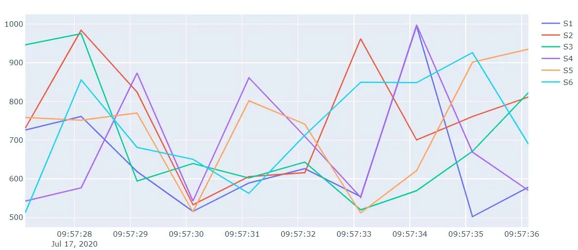
fig.add_trace(go.Scatter(x=df['DateTime'], y=df[col_name], mode='lines', name=col_name), row=i, col=1)你只需要定义每行要有多少个图(col值)。这需要另一个循环或 if 语句。 :) - Heikura