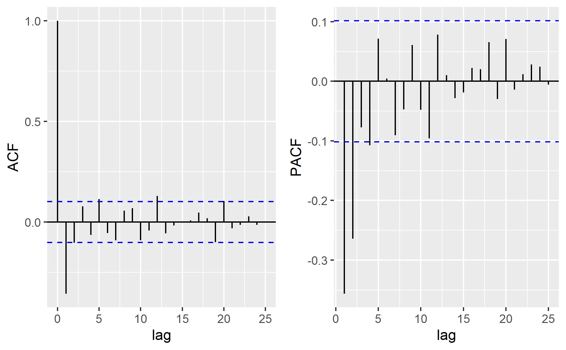
根据您的回答,我综合了一个ggplot ACF / PACF绘图方法:
require(zoo)
require(tseries)
require(ggplot2)
require(cowplot)
ts= zoo(data[[2]])
ic_alpha= function(alpha, acf_res){
return(qnorm((1 + (1 - alpha))/2)/sqrt(acf_res$n.used))
}
ggplot_acf_pacf= function(res_, lag, label, alpha= 0.05){
df_= with(res_, data.frame(lag, acf))
lim1= ic_alpha(alpha, res_)
lim0= -lim1
ggplot(data = df_, mapping = aes(x = lag, y = acf)) +
geom_hline(aes(yintercept = 0)) +
geom_segment(mapping = aes(xend = lag, yend = 0)) +
labs(y= label) +
geom_hline(aes(yintercept = lim1), linetype = 2, color = 'blue') +
geom_hline(aes(yintercept = lim0), linetype = 2, color = 'blue')
}
acf_ts= ggplot_acf_pacf(res_= acf(ts, plot= F)
, 20
, label= "ACF")
pacf_ts= ggplot_acf_pacf(res_= pacf(ts, plot= F)
, 20
, label= "PACF")
acf_pacf= plot_grid(acf_ts, pacf_ts, ncol = 2, nrow = 1)
acf_pacf
结果:
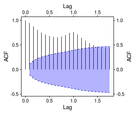
ggplot2的包装器:https://github.com/dewittpe/qwraps。使用devtools::install_github("dewittpe/qwraps")进行安装。 - krlmlrlibrary(ggfortify) p1 <- autoplot(acf(AirPassengers, plot = FALSE), conf.int.fill = '#0000FF', conf.int.value = 0.8, conf.int.type = 'ma') print(p1) library(cowplot) ggdraw(switch_axis_position(p1, axis = 'xy', keep = 'xy'))- MYaseen208