这是我的代码:
from plotly import graph_objs as go
import numpy as np
import os
from plotly.subplots import make_subplots

fig = make_subplots(rows=2, cols=1)

# Table product views
fig.add_trace(
        go.Table(
            header=dict(values=["Period", "Views"]),
            cells=dict(values=[
                [
                    "01/09/2019 - 07/09/2019",
                    "08/09/2019 - 14/09/2019",
                    "15/09/2019 - 21/09/2019",
                    "22/09/2019 - 28/09/2019"
                ],
                [15, 25, 35, 32]
            ])
        )
)

# Chart product views
fig.add_trace(

        go.Bar(
            x=[
                "01/09/2019 - 07/09/2019",
                "08/09/2019 - 14/09/2019",
                "15/09/2019 - 21/09/2019",
                "22/09/2019 - 28/09/2019"
                ],
            y=[15, 25, 35, 32],
        ),
        row=2,
        col=1

)

if not os.path.exists("files"):
    os.mkdir("files")

fig.update_yaxes(title_text="Product views", range=[0, 40], row=2, col=1)
fig.update_layout(height=600, width=600, title_text="<b>Library Shelving</b> statistic")
fig.write_image("files/statistic.pdf")
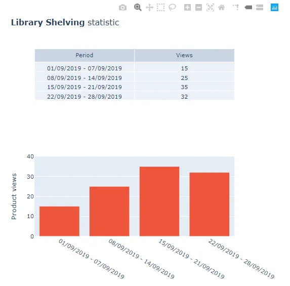
它呈现一个表格和一个条形图。在条形图的Y轴上,步长如下:
30,25,20,15,10,5,0。我该如何显示其余的数字?或者至少使步长为2(而不是5)。例如:30,28,26,24等。
当前绘图: