我正在使用pylab绘制一些图表。 例如,我希望绘制这个图表:
x = [0,1,2,3,4,5,6,7,8,9,10]
y = [0,0,0,1,1,0,0,1,0,0,0]

plt.plot(x,y,'g')
plt.show()
但是每次 [y = 1] 我想把线的颜色改为红色。
这个是否可能?
我正在使用pylab绘制一些图表。 例如,我希望绘制这个图表:
x = [0,1,2,3,4,5,6,7,8,9,10]
y = [0,0,0,1,1,0,0,1,0,0,0]
plt.plot(x,y,'g')
plt.show()
但是每次 [y = 1] 我想把线的颜色改为红色。
这个是否可能?
受这个答案的启发:
from matplotlib import collections  as mc
from matplotlib import pyplot as plt

x = [0,1,2,3,4,5,6,7,8,9,10]
y = [0,0,0,1,1,0,0,1,0,0,0]

def getLines(points):
    lines = []
    lastX, lastY = points[0]
    for x,y in points[1:]:
        lines.append([(lastX,lastY), (lastX+1,lastY)])
        if y!=lastY:
            lines.append( [(x, lastY), (x,y)] )
        lastX, lastY = (x,y)
    return lines

def getColor(point0, point1):
    x0,y0 = point0
    x1,y1 = point1
    return "r" if (y1==y0) and (y1==1) else "g"

points = [(i,j) for i,j in zip(x,y)]
lines = getLines(points)
colors = [getColor(*line) for line in lines]


lc = mc.LineCollection(lines, colors=colors, linewidths=2)
fig, ax = plt.subplots()
ax.add_collection(lc)
ax.autoscale()
ax.margins(0.1)
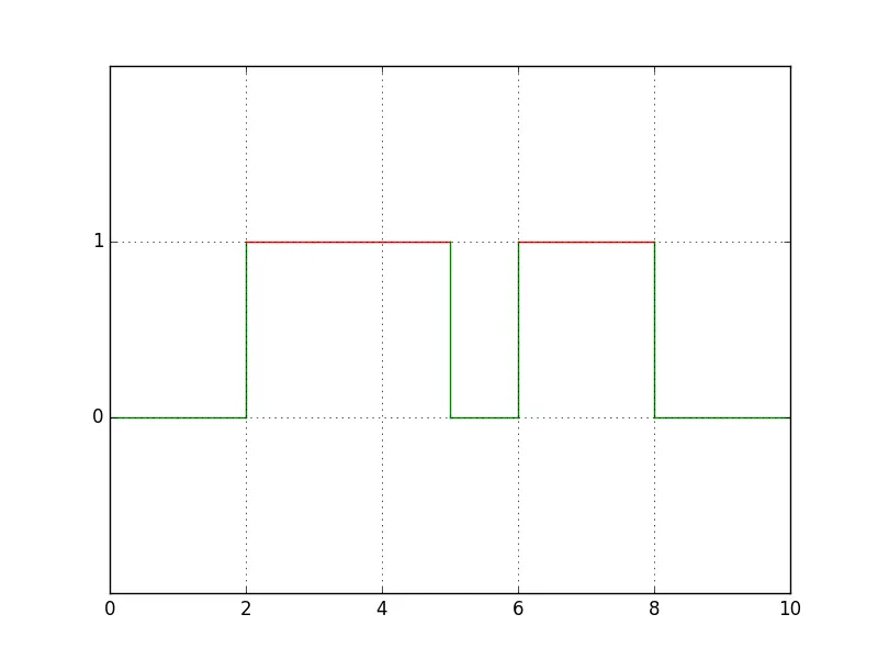
输出:
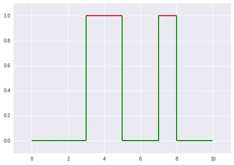
@michael_j_ward 给出了很好的答案 (+1)。只是为了给出使用普通绘图命令的替代方案,这也是一种可能的解决方法。
首先需要考虑的是,您需要将数据从现有格式进行转换:
x = [0, 1, 2, 3, 4, 5, 6, 7, 8, 9, 10]
y = [0, 0, 0, 1, 1, 0, 0, 1, 0, 0, 0]
你想绘制什么:
import matplotlib.pyplot as plt
x = [0, 1, 2, 3, 4, 5, 6, 7, 8, 9, 10]
y = [0, 0, 0, 1, 1, 0, 0, 1, 0, 0, 0]
nx, ny = [x[0]], [y[0]]
for i in range(0, len(y)-1):
nx.append(x[i])
ny.append(y[i])
if y[i] == 0 and y[i+1] == 1:
nx.append(x[i])
ny.append(y[i+1])
elif y[i] == 1 and y[i+1] == 0:
nx.append(x[i+1])
ny.append(y[i])
nx.append(x[-1])
ny.append(y[-1])
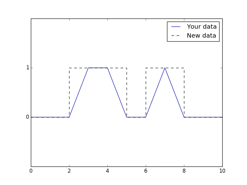
plt.plot(x, y, c='blue', label='Your data')
plt.plot(nx, ny, c='black', linestyle='--', label='New data')
plt.ylim(-1, 2)
plt.yticks([0, 1], ['0', '1'])
plt.legend()
plt.show()
其比较如下:
使用新数据,您只需执行以下操作:
import matplotlib.pyplot as plt

x = [0, 1, 2, 3, 4, 5, 6, 7, 8, 9, 10]
y = [0, 0, 0, 1, 1, 0, 0, 1, 0, 0, 0]
nx, ny = [x[0]], [y[0]]

for i in range(0, len(y)-1):
    nx.append(x[i])
    ny.append(y[i])
    if y[i] == 0 and y[i+1] == 1:
        nx.append(x[i])
        ny.append(y[i+1])
    elif y[i] == 1 and y[i+1] == 0:
        nx.append(x[i+1])
        ny.append(y[i])
nx.append(x[-1])
ny.append(y[-1])

for i in range(1,len(ny)):
    if ny[i] == 1 and ny[i-1] == 1:
        choice = 'r'
    else:
        choice = 'g'
    plt.plot([nx[i-1], nx[i]], [ny[i-1], ny[i]], c=choice)

plt.ylim(-1, 2)
plt.yticks([0, 1], ['0', '1'])
plt.grid()
plt.show()
会产生这个结果: