我正在尝试获得一条正态分布曲线,以便表示我的中心极限数据分布。
下面是我尝试过的实现方式。
import pandas as pd
import numpy as np
import matplotlib.pyplot as plt
import scipy.stats as stats
import math

# 1000 simulations of die roll
n = 10000

avg = []
for i in range(1,n):#roll dice 10 times for n times
    a = np.random.randint(1,7,10)#roll dice 10 times from 1 to 6 & capturing each event
    avg.append(np.average(a))#find average of those 10 times each time

plt.hist(avg[0:])

zscore = stats.zscore(avg[0:])

mu, sigma = np.mean(avg), np.std(avg)
s = np.random.normal(mu, sigma, 10000)

# Create the bins and histogram
count, bins, ignored = plt.hist(s, 20, normed=True)

# Plot the distribution curve
plt.plot(bins, 1/(sigma * np.sqrt(2 * np.pi)) *np.exp( - (bins - mu)**2 / (2 * sigma**2)))
我得到了以下图形:
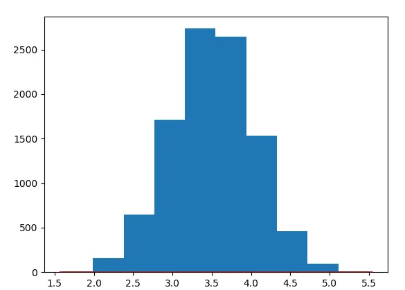
您可以在底部看到红色的正常曲线。
有人能告诉我为什么曲线不适合吗?

ax.twinx()。 - f.wue