seaborn.displot 是一个图形级别(figure-level)的绘图,其中kind参数指定了绘图方法。当kind='hist'时,可以使用seaborn.histplot的参数。
seaborn.axisgrid.FacetGrid.map期望数据框列名作为输入,因此,要将pdf映射到seaborn.displot中,数据需要在数据框中。- 一个问题是每个
axes都会计算x_pdf:
x0, x1 = p1.axes[0][0].get_xlim()- 如果多个Facets的
axes不同(sharex=False),则无法在.map内获取每个axes的xlim。
- 参考文献:
- 在
python 3.8.11,pandas 1.3.2,matplotlib 3.4.2和seaborn 0.11.2中进行了测试
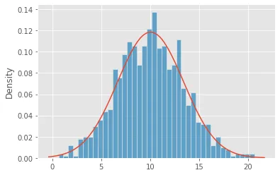
单一方面
import pandas as pd
import seaborn as sns
import numpy as np
import scipy
np.random.seed(365)
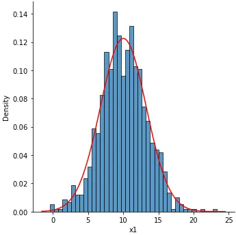
x1 = np.random.normal(10, 3.4, size=1000)
df = pd.DataFrame({'x1': x1})
x1
0 10.570932
1 11.779918
2 12.779077
def map_pdf(x, **kwargs):
mu, std = scipy.stats.norm.fit(x)
x0, x1 = p1.axes[0][0].get_xlim()
x_pdf = np.linspace(x0, x1, 100)
y_pdf = scipy.stats.norm.pdf(x_pdf, mu, std)
plt.plot(x_pdf, y_pdf, c='r')
p1 = sns.displot(data=df, x='x1', kind='hist', bins=40, stat='density')
p1.map(map_pdf, 'x1')
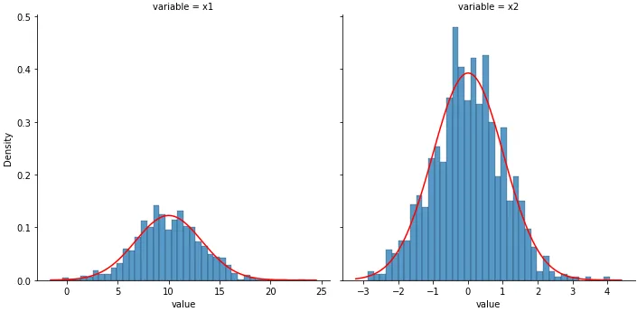
单个或多个维度
np.random.seed(365)
x1 = np.random.normal(10, 3.4, size=1000)
x2 = np.random.standard_normal(1000)
df = pd.DataFrame({'x1': x1, 'x2': x2}).melt()
variable value
0 x1 10.570932
1 x1 11.779918
2 x1 12.779077
p1 = sns.displot(data=df, x='value', col='variable', kind='hist', bins=40, stat='density', common_bins=False,
common_norm=False, facet_kws={'sharey': True, 'sharex': False})
axes = p1.axes.ravel()
for ax in axes:
var = ax.get_title().split(' = ')[1]
data = df[df.variable.eq(var)]
mu, std = scipy.stats.norm.fit(data['value'])
x0, x1 = ax.get_xlim()
x_pdf = np.linspace(x0, x1, 100)
y_pdf = scipy.stats.norm.pdf(x_pdf, mu, std)
ax.plot(x_pdf, y_pdf, c='r')