在3D中绘制正态分布曲线

12

我试图绘制两个正态分布变量的共同分布。下面的代码绘制一个正态分布变量。如果要绘制两个正态分布变量,代码该怎么写?

下面是绘制一个正态分布变量的代码。请问如何修改代码以绘制两个正态分布变量的共同分布图?

import matplotlib.pyplot as plt
import numpy as np
import matplotlib.mlab as mlab
import math

mu = 0
variance = 1
sigma = math.sqrt(variance)
x = np.linspace(-3, 3, 100)
plt.plot(x,mlab.normpdf(x, mu, sigma))

plt.show()

你能定义“comun”分布吗?matplotlib3d有许多示例,可以帮助你完成所需的操作。http://matplotlib.org/mpl_toolkits/mplot3d/tutorial.html - jm22b
3个回答

27

听起来你需要的是多元正态分布。在scipy中,它被实现为scipy.stats.multivariate_normal。请记住,你需要向函数传递一个协方差矩阵。因此,为了保持简单,将非对角线元素设为零:

[X variance ,     0    ]
[     0     ,Y Variance]

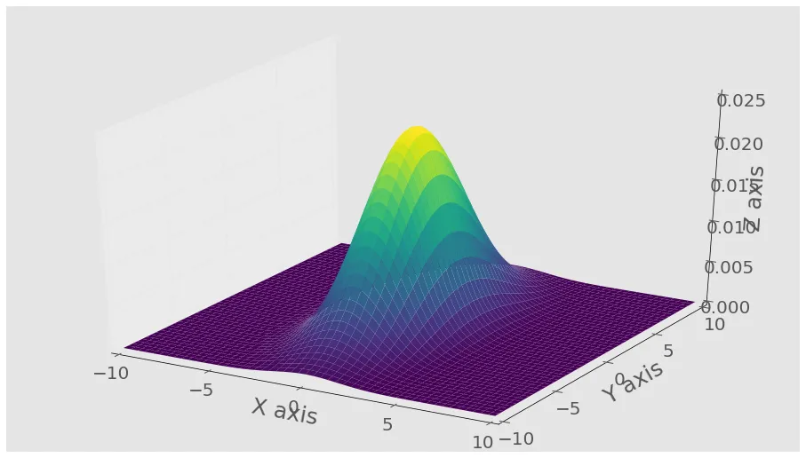
以下是使用此函数生成结果分布的三维图形示例。我添加了颜色映射以使曲线更易于观察,但可以随意删除它。

import numpy as np
import matplotlib.pyplot as plt
from scipy.stats import multivariate_normal
from mpl_toolkits.mplot3d import Axes3D

#Parameters to set
mu_x = 0
variance_x = 3

mu_y = 0
variance_y = 15

#Create grid and multivariate normal
x = np.linspace(-10,10,500)
y = np.linspace(-10,10,500)
X, Y = np.meshgrid(x,y)
pos = np.empty(X.shape + (2,))
pos[:, :, 0] = X; pos[:, :, 1] = Y
rv = multivariate_normal([mu_x, mu_y], [[variance_x, 0], [0, variance_y]])

#Make a 3D plot
fig = plt.figure()
ax = fig.gca(projection='3d')
ax.plot_surface(X, Y, rv.pdf(pos),cmap='viridis',linewidth=0)
ax.set_xlabel('X axis')
ax.set_ylabel('Y axis')
ax.set_zlabel('Z axis')
plt.show()

给您这个图:

enter image description here

编辑:下面的方法在Matplotlib v2.2中已被弃用,并在v3.1中删除

可通过matplotlib.mlab.bivariate_normal获得一个更简单的版本, 它接受以下参数,因此您不需要担心矩阵问题: matplotlib.mlab.bivariate_normal(X, Y, sigmax=1.0, sigmay=1.0, mux=0.0, muy=0.0, sigmaxy=0.0) 
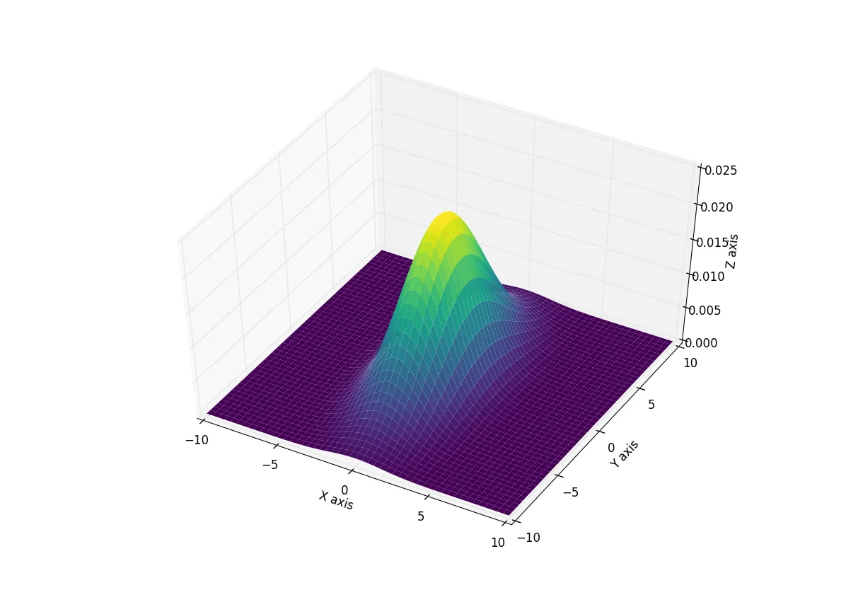
这里X和Y再次是meshgrid的结果,因此可以使用它来重新创建上面的图:

import numpy as np
import matplotlib.pyplot as plt
from matplotlib.mlab import bivariate_normal
from mpl_toolkits.mplot3d import Axes3D

#Parameters to set
mu_x = 0
sigma_x = np.sqrt(3)

mu_y = 0
sigma_y = np.sqrt(15)

#Create grid and multivariate normal
x = np.linspace(-10,10,500)
y = np.linspace(-10,10,500)
X, Y = np.meshgrid(x,y)
Z = bivariate_normal(X,Y,sigma_x,sigma_y,mu_x,mu_y)

#Make a 3D plot
fig = plt.figure()
ax = fig.gca(projection='3d')
ax.plot_surface(X, Y, Z,cmap='viridis',linewidth=0)
ax.set_xlabel('X axis')
ax.set_ylabel('Y axis')
ax.set_zlabel('Z axis')
plt.show()

给予: 在此输入图片描述


1
应该是 from matplotlib.mlab import bivariate_normal - Vlad
1
似乎bivariate_normal最终将被移除:MatplotlibDeprecationWarning: The bivariate_normal function was deprecated in Matplotlib 2.2 and will be removed in 3.1. - mgalardini
假设高斯函数是我的似然函数,但我想将其乘以其相关的先验概率(Pa)。我该如何在这段代码中包含Pa? - vicemagui

7
以下是对@Ianhi上面代码的改编,返回了一个轮廓图版本的上面的3D图。
import matplotlib.pyplot as plt
from matplotlib import style
style.use('fivethirtyeight')
import numpy as np
from scipy.stats import multivariate_normal


#Parameters to set
mu_x = 0
variance_x = 3

mu_y = 0
variance_y = 15

x = np.linspace(-10,10,500)
y = np.linspace(-10,10,500)
X,Y = np.meshgrid(x,y)

pos = np.array([X.flatten(),Y.flatten()]).T


rv = multivariate_normal([mu_x, mu_y], [[variance_x, 0], [0, variance_y]])


fig = plt.figure(figsize=(10,10))
ax0 = fig.add_subplot(111)
ax0.contour(X, Y, rv.pdf(pos).reshape(500,500))

plt.show()

2
虽然其他答案很好,但我希望在展示样本的分布时也能实现类似的结果,并使用散点图进行说明。
更多细节可以在此处找到:Python 3d plot of multivariate gaussian distribution 结果看起来像这样: Bivariate gaussian distribution and sample plot 代码如下:
from mpl_toolkits.mplot3d import Axes3D
import numpy as np
import matplotlib.pyplot as plt
from matplotlib import cm
from scipy.stats import multivariate_normal


# Sample parameters
mu = np.array([0, 0])
sigma = np.array([[0.7, 0.2], [0.2, 0.3]])
rv = multivariate_normal(mu, sigma)
sample = rv.rvs(500)

# Bounds parameters
x_abs = 2.5
y_abs = 2.5
x_grid, y_grid = np.mgrid[-x_abs:x_abs:.02, -y_abs:y_abs:.02]

pos = np.empty(x_grid.shape + (2,))
pos[:, :, 0] = x_grid
pos[:, :, 1] = y_grid

levels = np.linspace(0, 1, 40)

fig = plt.figure()
ax = fig.gca(projection='3d')

# Removes the grey panes in 3d plots
ax.xaxis.set_pane_color((1.0, 1.0, 1.0, 0.0))
ax.yaxis.set_pane_color((1.0, 1.0, 1.0, 0.0))
ax.zaxis.set_pane_color((1.0, 1.0, 1.0, 0.0))

# The heatmap
ax.contourf(x_grid, y_grid, 0.1 * rv.pdf(pos),
            zdir='z', levels=0.1 * levels, alpha=0.9)

# The wireframe
ax.plot_wireframe(x_grid, y_grid, rv.pdf(
    pos), rstride=10, cstride=10, color='k')

# The scatter. Note that the altitude is defined based on the pdf of the
# random variable
ax.scatter(sample[:, 0], sample[:, 1], 1.05 * rv.pdf(sample), c='k')

ax.legend()
ax.set_title("Gaussian sample and pdf")
ax.set_xlim3d(-x_abs, x_abs)
ax.set_ylim3d(-y_abs, y_abs)
ax.set_zlim3d(0, 1)

plt.show()

网页内容由stack overflow 提供, 点击上面的
可以查看英文原文,
原文链接