我正在尝试弄清楚如何将轴附加到我的极坐标图中。新添加的轴应该像一个环一样包裹在原始极坐标轴周围。
为此,我尝试在通过make_axes_locatable创建的分隔符上使用append_axes,用于polar matplotlib投影ax。
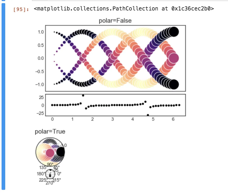
然而,在append_axes参数中没有“outer”或任何类似极坐标投影的选项。与其说是环绕轴的环,不如说我得到了一个新的轴,就在原来的轴下面(见图片)。
是否有其他替代方案,可以创建一个圆形的轴,绕在现有极坐标轴周围?
请注意,我不想将它们添加到相同的轴上,因为刻度可能不同。
import numpy as np
import matplotlib.pyplot as plt
from mpl_toolkits.axes_grid1 import make_axes_locatable

plt.style.use("seaborn-white")
def synthesize(polar=False):
    fig = plt.figure()
    ax = fig.add_subplot(111, polar=polar)
    t = np.linspace(0,2*np.pi)
    r_sin = np.sin(t)
    r_cos = np.cos(t)
    for r in [r_sin, r_cos]:
        ax.scatter(t, r, c=r, s=t*100, edgecolor="white", cmap=plt.cm.magma_r)
        ax.scatter(t, -r, c=r, s=t*100, edgecolor="white", cmap=plt.cm.magma_r)
    ax.set_title("polar={}".format(polar),fontsize=15)
    ax.set_xticklabels([])
    return fig, ax, t

# Rectilinear
fig, ax, t = synthesize(polar=False)
# Here are the plot dimensions in response to the answer below
xlim = ax.get_xlim()
ylim = ax.get_ylim()
rlim = (ax.get_rmin(), ax.get_rmax())
print(xlim, ylim, rlim)
(0.0, 6.283185307179586) (0.0, 2.2437621373846617) (0.0, 2.2437621373846617)
# Encircling axis
divider = make_axes_locatable(ax)
ax_below = divider.append_axes("bottom", size="32.8%", pad=0.1)
ax_below.scatter(t, np.tan(t), c="black", edgecolor="white")

# Polar
fig, ax, t = synthesize(polar=True)
divider = make_axes_locatable(ax)
ax_below = divider.append_axes("bottom", size="32.8%", pad=0.1)
ax_below.scatter(t, np.tan(t), c="black", edgecolor="white")