我开始尝试在Matplotlib中创建极坐标图。我需要画一个“楔形”图,而不是完整的圆形图,这可以通过设置
然而,我注意到当使用这个功能时,图形在轴内的位置似乎会以一种奇怪的方式改变;根据楔形角度孔径的不同,可能很难微调图形使其看起来漂亮。
以下是示例:
thetamin和thetamax属性来实现。我很久以前就在期待这个功能,现在他们终于做到了,真是太好了:)然而,我注意到当使用这个功能时,图形在轴内的位置似乎会以一种奇怪的方式改变;根据楔形角度孔径的不同,可能很难微调图形使其看起来漂亮。
以下是示例:
import numpy as np
import matplotlib.pyplot as plt

# get 4 polar axes in a row
fig, axes = plt.subplots(2, 2, subplot_kw={'projection': 'polar'},
                         figsize=(8, 8))

# set facecolor to better display the boundaries
# (as suggested by ImportanceOfBeingErnest)
fig.set_facecolor('paleturquoise')

for i, theta_max in enumerate([2*np.pi, np.pi, 2*np.pi/3, np.pi/3]):

    # define theta vector with varying end point and some data to plot
    theta = np.linspace(0, theta_max, 181)
    data = (1/6)*np.abs(np.sin(3*theta)/np.sin(theta/2))

    # set 'thetamin' and 'thetamax' according to data
    axes[i//2, i%2].set_thetamin(0)
    axes[i//2, i%2].set_thetamax(theta_max*180/np.pi)

    # actually plot the data, fine tune radius limits and add labels
    axes[i//2, i%2].plot(theta, data)
    axes[i//2, i%2].set_ylim([0, 1])
    axes[i//2, i%2].set_xlabel('Magnitude', fontsize=15)
    axes[i//2, i%2].set_ylabel('Angles', fontsize=15)

fig.set_tight_layout(True)
#fig.savefig('fig.png', facecolor='skyblue')
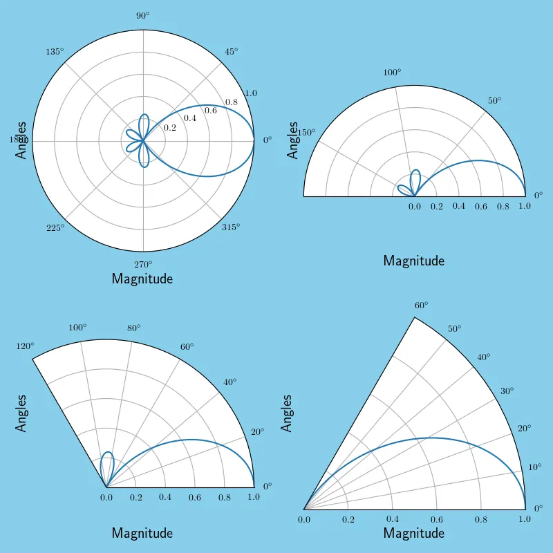
标签位置不太合适,有些覆盖了刻度标签,但是可以通过在set_xlabel和set_ylabel命令中添加额外的labelpad参数来使其靠近或远离轴线,所以这不是一个大问题。
不幸的是,我认为图表被调整以适应现有轴线尺寸,这反过来导致半圆形图表上方和下方出现非常尴尬的白色空间(当然,这正是我需要使用的部分)。
这听起来应该很容易解决 - 我的意思是楔形图自动完成了这个功能 - 但是我似乎无法找到如何对半圆形图表进行操作。是否有人能够解决这个问题?
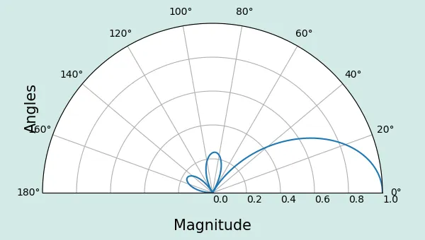
编辑:抱歉,我的问题没有表述清楚;我想创建一个半圆形极坐标图,但是使用set_thetamin()会导致图像周围出现大量的白色空间(特别是在上方和下方),如果可能的话,我希望将其删除。
这通常是tight_layout()要处理的问题,但它似乎在这里行不通。我尝试在绘制后手动更改图形窗口大小,但白色空间仍然随着更改而缩放。以下是一个最小工作示例;如果需要,我可以使xlabel靠近图像,但保存的图像文件仍然包含大量的白色空间。
是否有人知道如何去除这个白色空间?
import numpy as np
import matplotlib.pyplot as plt

# get a half circle polar plot
fig1, ax1 = plt.subplots(1, 1, subplot_kw={'projection': 'polar'})

# set facecolor to better display the boundaries
# (as suggested by ImportanceOfBeingErnest)
fig1.set_facecolor('skyblue')

theta_min = 0
theta_max = np.pi

theta = np.linspace(theta_min, theta_max, 181)
data = (1/6)*np.abs(np.sin(3*theta)/np.sin(theta/2))

# set 'thetamin' and 'thetamax' according to data
ax1.set_thetamin(0)
ax1.set_thetamax(theta_max*180/np.pi)

# actually plot the data, fine tune radius limits and add labels
ax1.plot(theta, data)
ax1.set_ylim([0, 1])
ax1.set_xlabel('Magnitude', fontsize=15)
ax1.set_ylabel('Angles', fontsize=15)

fig1.set_tight_layout(True)
#fig1.savefig('fig1.png', facecolor='skyblue')
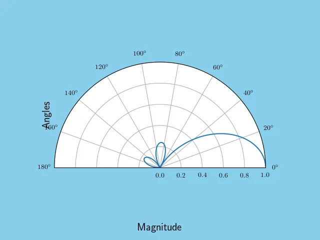
编辑2:根据ImportanteOfBeingErnest的回答建议,为图形添加背景颜色以更好地显示边界。