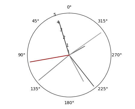
尝试在Matplotlib中创建风向玫瑰图,使用线条而不是条形。换句话说,我想要像这样的东西(使用Gnuplot创建),其中直线在整个长度上具有一致的厚度,并且沿径向从原点延伸到风速(红色是最新观测值,靛蓝色是峰值,旧的观测随着变老而变暗):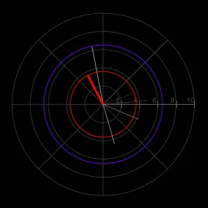 。我能做到的最接近的是这个(请忽略除了线之外的任何差异):
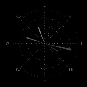 。我尝试过的所有方法都以“扇形”方式从原点绘制——无论是条形、线条、箭头还是其他什么。这里是绘图命令行:
。我能做到的最接近的是这个(请忽略除了线之外的任何差异):。我尝试过的所有方法都以“扇形”方式从原点绘制——无论是条形、线条、箭头还是其他什么。这里是绘图命令行:bars = ax.bar(wind_direction, wind_speed, width=.075, linewidth=0.1, edgecolor='black', zorder=3)
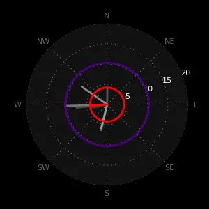
这是创建所需图形的完整代码(在此行的正上方),感谢@cphlewis的修复。当我尝试使用plot时,我的错误在于将所有数据绘制在一个命令中,而不是绘制'n'个图(plot每条线路单独处理)。
#! /usr/bin/env python2.6
# -*- coding: utf-8 -*-

import csv
import numpy as np
import matplotlib.pyplot as plt

bar_colors     = ['#333333', '#444444', '#555555', '#666666', '#777777', '#888888', '#999999', 'red']
data_source    = '/Users/username/Dropbox/Public/charts.csv'
num_obs        = 8
final_data     = []
wind_direction = []
wind_speed     = []

# Get the data.
data_file = open(data_source, "r")
csv_data  = csv.reader(data_file, delimiter=',')
[final_data.append(item) for item in csv_data]
data_file.close()

# Grab the column headings for the labels, then delete the row from final_data.
xlabel = final_data[0][24]
ylabel = final_data[0][25]
final_data.pop(0)

# Create lists of data to plot (string -> float).
[wind_direction.append(float(item[24])) for item in final_data]
[wind_speed.append(float(item[25])) for item in final_data]

# Make them the desired length based on num_obs.
wind_direction = wind_direction[len(wind_direction)-num_obs:len(wind_direction)]
wind_speed     = wind_speed[len(wind_speed)-num_obs:len(wind_speed)]

# Polar plots are in radians (not degrees.)
wind_direction = np.radians(wind_direction)


wind = zip(wind_direction, wind_speed, bar_colors) # polar(theta,r)


# Customizations.
plt.figure(figsize=(3, 3))  # Size
ax = plt.subplot(111, polar=True)  # Create subplot
plt.grid(color='#888888')  # Color the grid
ax.set_theta_zero_location('N')  # Set zero to North
ax.set_theta_direction(-1)  # Reverse the rotation
ax.set_xticklabels(['N', 'NE', 'E', 'SE', 'S', 'SW', 'W', 'NW'], color='#666666', fontsize=8)  # Customize the xtick labels
ax.spines['polar'].set_visible(False)  # Show or hide the plot spine
ax.set_axis_bgcolor('#111111')  # Color the background of the plot area.

# Create the plot.
# Note: zorder of the plot must be >2.01 for the plot to be above the grid (the grid defaults to z=2.)
for w in wind:
    ax.plot((0, w[0]), (0, w[1]), color=w[2], linewidth=2, zorder=3)

# Right-size the grid (must be done after the plot), and customize the tick labels.
if max(wind_speed) <= 5:
    ax.yaxis.set_ticks(np.arange(1, 5, 1))
    ax.set_rgrids([1, 2, 3, 4, 5], angle=67, color='#FFFFFF', horizontalalignment='left', verticalalignment='center', fontsize=8)
elif 5 < max(wind_speed) <= 10:
    ax.yaxis.set_ticks(np.arange(2, 10, 2))
    ax.set_rgrids([2, 4, 6, 8, 10], angle=67, color='#FFFFFF', horizontalalignment='left', verticalalignment='center', fontsize=8)
elif 10 < max(wind_speed) <= 20:
    ax.yaxis.set_ticks(np.arange(5, 20, 5))
    ax.set_rgrids([5, 10, 15, 20], angle=67, color='#FFFFFF', horizontalalignment='left', verticalalignment='center', fontsize=8)
elif 20 < max(wind_speed) <= 50:
    ax.yaxis.set_ticks(np.arange(10, 50, 10))
    ax.set_rgrids([10, 20, 30, 40, 50], angle=67, color='#FFFFFF', horizontalalignment='left', verticalalignment='center', fontsize=8)
elif 50 < max(wind_speed):
    plt.text(0.5, 0.5, u'Holy crap!', color='white', horizontalalignment='center', verticalalignment='center', transform=ax.transAxes, bbox=dict(facecolor='red', alpha=0.5))

# Plot circles for current obs and max wind.
fig = plt.gcf()
max_wind_circle = plt.Circle((0, 0), max(wind_speed), transform=ax.transData._b, fill=False, edgecolor='indigo', linewidth=2, alpha=1, zorder=9)
fig.gca().add_artist(max_wind_circle)
last_wind_circle = plt.Circle((0, 0), wind_speed[num_obs-1], transform=ax.transData._b, fill=False, edgecolor='red', linewidth=2, alpha=1, zorder=10)
fig.gca().add_artist(last_wind_circle)

# If latest obs is a speed of zero, plot something that we can see.
if wind_speed[num_obs-1] == 0:
    zero_wind_circle = plt.Circle((0, 0), 0.1, transform=ax.transData._b, fill=False, edgecolor='red', alpha=1)
    fig.gca().add_artist(zero_wind_circle)

# Save it to a file.
plt.savefig('/Users/username/Desktop/wind.png', facecolor='black', edgecolor='none')
注意:CSV数据(我已经没有精确的数据来生成图表;以下数据是一个近似值。)
wind_speed.csv
timestamp, wind speed
1970-01-01 00:00:00.000000,4
1970-01-01 01:00:00.000000,4
1970-01-01 02:00:00.000000,10
1970-01-01 03:00:00.000000,7
1970-01-01 04:00:00.000000,10
1970-01-01 05:00:00.000000,8
1970-01-01 06:00:00.000000,7
1970-01-01 07:00:00.000000,4
wind_dir.csv
timestamp,wind direction
1970-01-01 00:00:00.000000,1
1970-01-01 01:00:00.000000,260
1970-01-01 02:00:00.000000,267
1970-01-01 03:00:00.000000,267
1970-01-01 04:00:00.000000,269
1970-01-01 05:00:00.000000,300
1970-01-01 06:00:00.000000,190
1970-01-01 07:00:00.000000,269