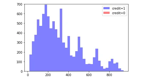
我正在尝试绘制一个包含两个列的直方图,credit 和installments。 Credit只能是1或0(批准,不批准),而installments是每月支付的金额。
df=pn.read_csv(loc)
credit=df['credit.policy']
ins=df['installment']
     _,b,_=plt.hist(ins,bins='auto',label='credit=1',alpha=0.5,color='blue')
plt.hist(credit,bins=b,label='credit=0',alpha=0.5,color='red')
plt.legend(loc='best')
plt.ylim([0,700])
plt.show()
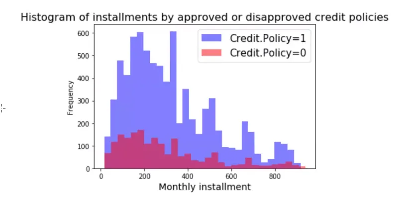
我需要生成类似下面这个的图像:
[![新代码后的效果][3]][3]