我有两个列表,x和y。
x 包含字母 A-Z,Y 包含它们在文件中出现的频率。
我尝试了研究如何在直方图中绘制这些值,但是没有成功理解如何绘制。
n, bins, patches = plt.hist(x, 26, normed=1, facecolor='blue', alpha=0.75)
在上述提到的列表中,x是否会成为列表x?
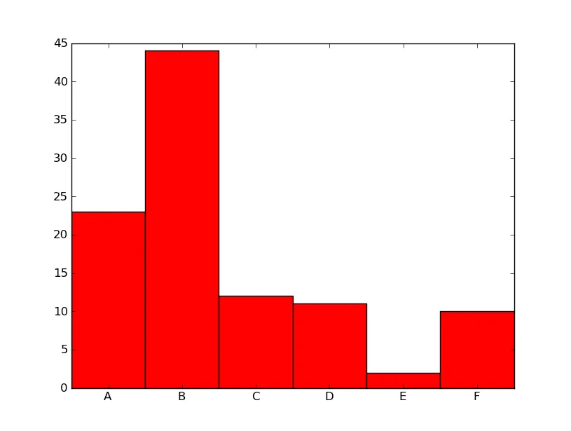
hist函数用于处理数据集合并计算绘制直方图。在您的情况下,您已经预先计算了每个组(字母)的频率。如果要以直方图形式呈现数据,请使用更好的matplotlib bar函数:
import numpy as np
import matplotlib.pyplot as plt

alphab = ['A', 'B', 'C', 'D', 'E', 'F']
frequencies = [23, 44, 12, 11, 2, 10]

pos = np.arange(len(alphab))
width = 1.0     # gives histogram aspect to the bar diagram

ax = plt.axes()
ax.set_xticks(pos + (width / 2))
ax.set_xticklabels(alphab)

plt.bar(pos, frequencies, width, color='r')
plt.show()
+ (width / 2) 的方法已经被弃用了。现在只需要使用 ax.set_xticks(pos) 即可。 - Suuuehgi