R Plotly为条形图设置自定义颜色

10

我在我的Shiny应用程序中使用了一个plotly条形图,并希望为每个柱子设置特定的颜色。

#Here's some reproducible data
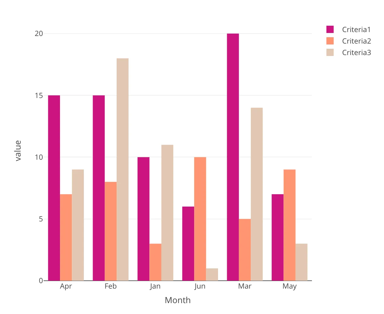
df=data.frame(Month=c("Jan","Feb","Mar","Apr","May","Jun"),Criteria1=c(10,15,20,15,7,6),Criteria2=c(3,8,5,7,9,10),Criteria3=c(11,18,14,9,3,1))

#Plot

colNames <- names(df)[-1] #Month is the first column

# Here is where I set the colors for each `Criteria`, assuming that the order of colors follows the same order as the factor levels of the `Criteria`.

p <- plotly::plot_ly(marker=list(colors=c('#CC1480', '#FF9673', '#E1C8B4')))

for(trace in colNames){
  p <- p %>% plotly::add_trace(data = df, x = ~Month, y = as.formula(paste0("~`", trace, "`")), name = trace, type = "bar")
}

p %>% 
  layout(title = "Trend Over Time",showlegend = FALSE,
         xaxis = list(title = ""),
         yaxis = list (title = "Monthly Count of QoL Tweets"))

然而,生成的图表没有显示我指定的任何颜色。

我做错了什么?有什么建议吗?非常感谢。


你能添加输入数据或一些模拟数据吗? - Maximilian Peters
1
我已经编辑了我的问题,包括一些可重现的数据。 - Varun
你不能将 df 作为 df() 进行引用。 - Mako212
抱歉,我忘记删除括号了。然而,它仍然没有按照我想要的顺序显示颜色。 - Varun
2个回答

11

我认为这里不需要循环。当df被融合时,以下提供了更多选择特定级别颜色的控制方式,即单独的级别Criteria1Criteria2Criteria3

library(plotly)
library(reshape2)

#Yout data.frame
df <- data.frame(Month = c("Jan","Feb","Mar","Apr","May","Jun"),
                 Criteria1 = c(10,15,20,15,7,6),
                 Criteria2 = c(3,8,5,7,9,10),
                 Criteria3 = c(11,18,14,9,3,1))

melt(df, id.vars = 'Month') %>% plot_ly(x = ~Month, y = ~value, type = 'bar', 
  color = ~variable,
  colors = c(Criteria1 = '#CC1480', Criteria2 = '#FF9673', Criteria3 = '#E1C8B4'))

enter image description here


2
您可以将颜色分配给向量:
colors <- c('#CC1480', '#FF9673', '#E1C8B4')

然后在略微修改的循环中添加跟踪。

p <- plotly::add_trace(p, 
                       x = df$Month, 
                       y = df[,trace], 
                       marker = list(color = colors[[match(trace, colNames)]]), 
                       name = trace, 
                       type = "bar")
}

这将会给你以下图表:

enter image description here

完整代码

library("plotly")
df=data.frame(Month=c("Jan", "Feb","Mar", "Apr", "May", "Jun"),
              Criteria1 = c(10, 15,20,15,7,6),
              Criteria2 = c(3, 8, 5, 7, 9, 10),
              Criteria3 = c(11, 18, 14, 9, 3, 1))

colNames <- names(df)[-1] #Month is the first column
colors <- c('#CC1480', '#FF9673', '#E1C8B4')
p <- plotly::plot_ly()

#colNames = c('Criteria1')
for(trace in colNames){
  p <- plotly::add_trace(p, 
                         x = df$Month, 
                         y = df[,trace], 
                         marker = list(color = colors[[match(trace, colNames)]]), 
                         name = trace, 
                         type = "bar")
}

p

网页内容由stack overflow 提供, 点击上面的
可以查看英文原文,
原文链接