对于嵌入R shiny输出的交互式3D图,R包
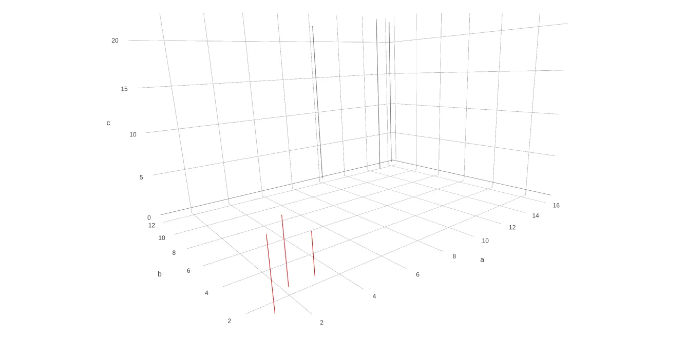
plotly现在提供了一些不错的选项,特别是考虑到替代方案shiny-rgl的维护最近似乎已经消失了。但是,是否可以使用plotly创建3D条形图呢?创建 3D 条形图的一个技巧是绘制误差条。
如下面的代码中所注释的,为了制作想要的条形图维度的值,在通过 add_trace 提供之前,需要将其减半,并将它们调整到可见性以下(或使它们透明)。然后,减半值的对称误差条就会简单地导致条形图。在下面的示例中添加了两组数据 df1 和 df2。
library(shiny)
library(plotly)

ui <- fluidPage(
    plotlyOutput("plotlii", width = "100%", height = "700px")
)

server <- function(input, output) {
    output$plotlii <- renderPlotly({
        # the data:
        obs1 <- matrix(ncol=3,
            c(1,2,3,1,2,2,6,6,4)
        )
        df1 <- setNames(data.frame(obs1), c("a", "b", "c"))
        df1$c<-(.5*df1$c) # half values to make them the centre point of the bars
        obs2 <- matrix(ncol=3,
            c(14,16,10,11,12,12,23,23,22)
        )
        df2 <- setNames(data.frame(obs2), c("a", "b", "c"))
        df2$c<-(.5*df2$c) # half values to make them the centre point of the bars
        # the plot:
        p <- plot_ly(type="scatter3d",mode="markers",showlegend=FALSE)%>%
        add_trace(p,
            x = ~a, y = ~b, z = ~c,
            data = df1,
            color=I("red"),
            size = I(1),
            name = "Group a",
            error_z=list(
                color="red",
                thickness=0,
                symmetric = TRUE,
                type = "data" ,
                array = df1$c
            )
        )%>%
        add_trace(p,
            x = ~a, y = ~b, z = ~c,
            data = df2,
            color=I("gray"),
            size = I(1),
            name = "Group a",
            error_z=list(
                color="gray",
                symmetric = TRUE,
                type = "data" ,
                array = df2$c
            )
        )
    })
}

shinyApp(ui, server)