R Plotly 改变堆叠条形图的颜色

3
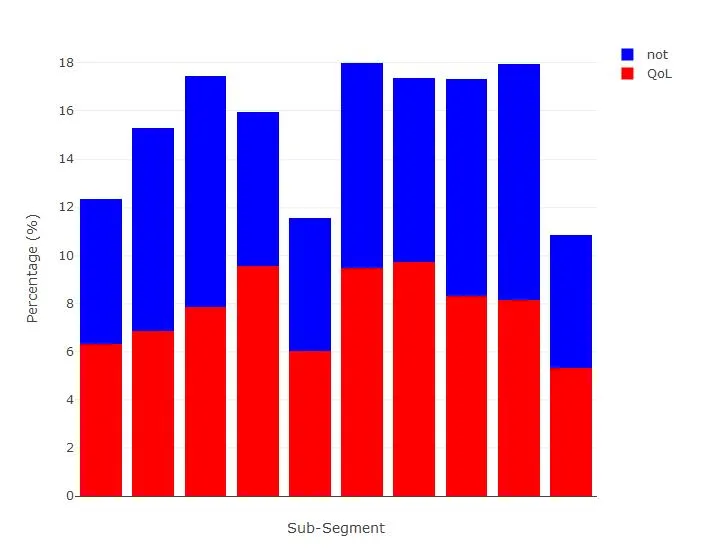
我有一个 Plotly 堆叠条形图。我想将条形的颜色更改为红色和深蓝色,而不是您在下面看到的默认颜色。

enter image description here

以下是我的代码。我尝试使用marker函数,但它将整个图形转换为单一颜色。希望得到帮助。

pie_subsegment_split %>%
plot_ly(x = ~Segment, y = ~Not*100, type = 'bar', name = 'Not') %>%
add_trace(y = ~QoL*100, name = 'QoL') %>%
layout(yaxis = list(title = 'Percentage (%)'),barmode = "stack",showlegend=T) %>%
layout(xaxis = list(title="Sub-Segment",showticklabels=FALSE))
1个回答

8

marker按预期工作,您只需要为每个迹线指定它。如果您只提供一种颜色,我怀疑可能会出现inheritance问题。请尝试以下内容 -

library(plotly)
set.seed(1)
y1 <- runif(10, 5, 10)
set.seed(5)
y2 <- runif(10, 5, 10)
x <- 1:10
plot_ly(x = x, y = y1, type = 'bar', name = 'QoL', marker = list(color = 'red')) %>% 
  add_trace(y = y2, name = 'not', marker = list(color = 'blue')) %>% 
  layout(
    barmode = 'stack', yaxis = list(title = 'Percentage (%)'), 
    xaxis = list(title = 'Sub-Segment', showticklabels = FALSE)
  )

您需要获取以下内容 - 输入图像描述

网页内容由stack overflow 提供, 点击上面的
可以查看英文原文,
原文链接