ggplot有两个图例,颜色图例中显示错误的形状。

3
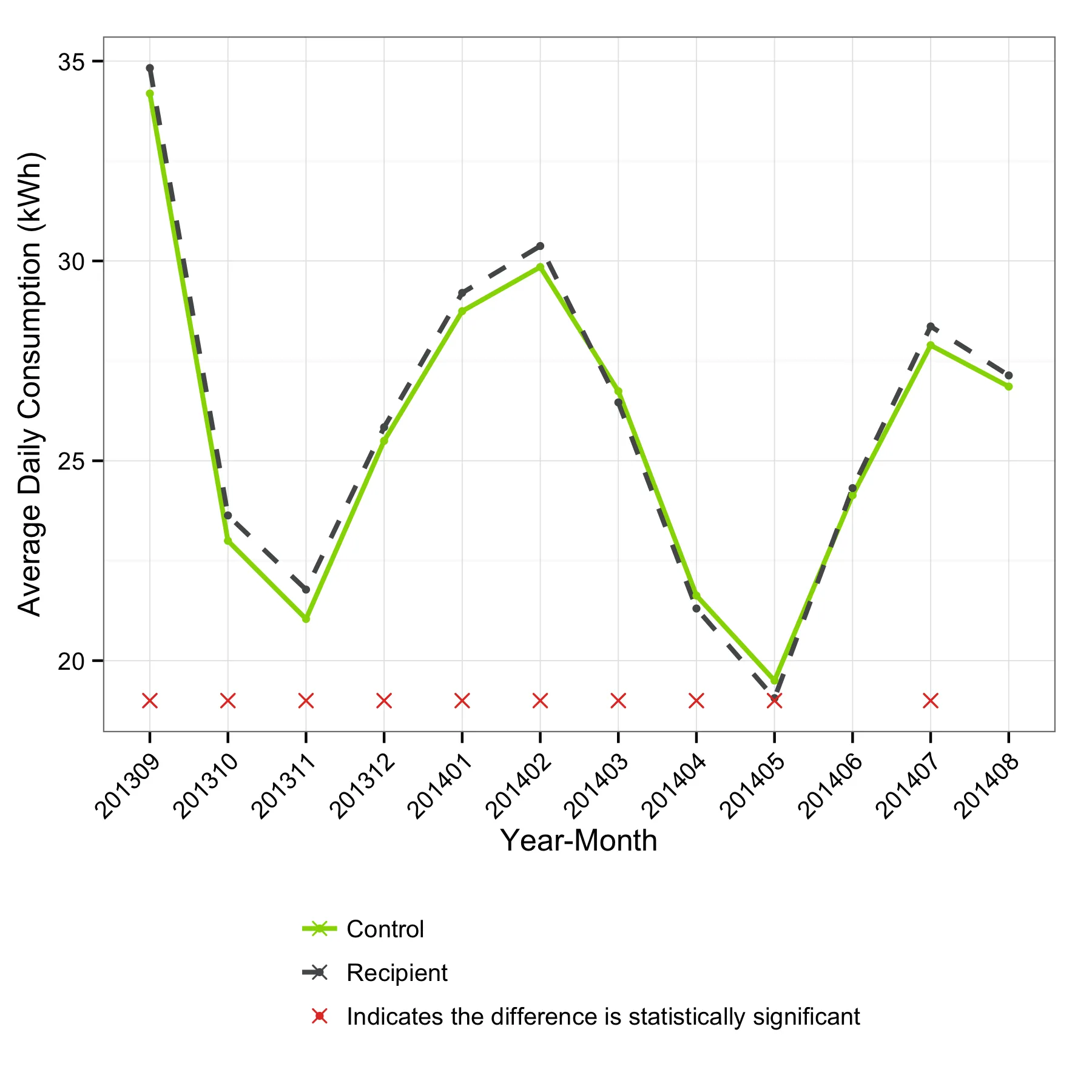
我正在使用R中的ggplot创建图形,但图例显示不正确。首先,我得到了两个图例,一个用于颜色,一个用于线型。尽管我已经按照其他帖子上建议的在scale_color_manual和scale_linetype_manual中放置了相同的项目,但这两个图例都显示出来了。此外,颜色图例显示每个项目的形状都相同(一条带有点和x的线),而它们实际上应该是不同的(前两个应该是带点的线,第三个应该是没有线的x)。
以下是可重现的示例。
library(ggplot2)
library(dplyr)

#specify color palette
b.navHexRGB <- c(green=rgb(149,214,0, maxColorValue=255),
             red=rgb(229,60,46, maxColorValue=255),
             gray=rgb(85,87,89, maxColorValue=255),
             dark_green=rgb(100,140,26, maxColorValue=255),
             yellow=rgb(255,183,24, maxColorValue=255),
             purple=rgb(139,24,155, maxColorValue=255),
             blue=rgb(0,147,201, maxColorValue = 255))

#create plot
ggplot(data = df, aes(x=as.character(bill_yrmo), y=mean_kwh)) +
geom_line(aes(group = treatment, colour = treatment, linetype = treatment),
        size = .9) +
geom_point(aes(group = treatment, colour=treatment),
         size = 1.5) +
geom_point(data = df %>% mutate(treatment= 'Indicates the difference is statistically significant'),
         aes(y=stat_sig, colour=treatment),
         size = 2.5,
         shape=4,
         na.rm=T) +
guides(colour=guide_legend(nrow=3)) +
scale_color_manual(name= "Variable",values=c(palette(b.navHexRGB)), breaks=c("Control","Recipient","Indicates the difference is statistically significant")) +
scale_linetype_manual(name="Variable",values=c(1,2), breaks=c("Control","Recipient","Indicates the difference is statistically significant")) +
ylab("Average Daily Consumption (kWh)") +
xlab("Year-Month") +
theme_bw() +
theme(legend.title = element_blank(),
    legend.justification = c(0,0), 
    legend.position = "bottom",
    legend.key = element_rect(fill = "white",colour = "white"),
    #legend.key.width = unit(1.1, "cm"),
    axis.text.x = element_text(angle=45, hjust=1, color="black"),
    axis.text.y = element_text(color="black"),
    axis.title.y = element_text(vjust=1)
)

数据

df <- structure(list(treatment = structure(c(1L, 2L, 1L, 2L, 1L, 2L, 
1L, 2L, 1L, 2L, 1L, 2L, 1L, 2L, 1L, 2L, 1L, 2L, 1L, 2L, 1L, 2L, 
1L, 2L), .Label = c("Control", "Recipient"), class = "factor"), 
    bill_month = c(9, 9, 10, 10, 11, 11, 12, 12, 1, 1, 2, 2, 
    3, 3, 4, 4, 5, 5, 6, 6, 7, 7, 8, 8), bill_year = c(2013, 
    2013, 2013, 2013, 2013, 2013, 2013, 2013, 2014, 2014, 2014, 
    2014, 2014, 2014, 2014, 2014, 2014, 2014, 2014, 2014, 2014, 
    2014, 2014, 2014), bill_yrmo = c(201309, 201309, 201310, 
    201310, 201311, 201311, 201312, 201312, 201401, 201401, 201402, 
    201402, 201403, 201403, 201404, 201404, 201405, 201405, 201406, 
    201406, 201407, 201407, 201408, 201408), mean_kwh = c(34.1891698781763, 
    34.8263665605318, 22.998584869823, 23.6329516672246, 21.0428206185862, 
    21.7774153609304, 25.4992975653725, 25.8397296039854, 28.74368522348, 
    29.200670842288, 29.8474912589325, 30.373483172434, 26.7411627390396, 
    26.4600472396878, 21.628265542195, 21.3047667878863, 19.502019234349, 
    19.062337524723, 24.1381516068859, 24.3165665754673, 27.8915927136898, 
    28.3625761820341, 26.8570348685593, 27.1359185596385), p.value = c(9.36594553258583e-07, 
    9.36594553258583e-07, 1.76373182797948e-13, 1.76373182797948e-13, 
    2.12425701682086e-15, 2.12425701682086e-15, 0.00415203493379312, 
    0.00415203493379312, 0.00109178463449181, 0.00109178463449181, 
    0.00122110380638705, 0.00122110380638705, 0.0438138636035026, 
    0.0438138636035026, 0.00140538140516743, 0.00140538140516743, 
    5.74367939388898e-07, 5.74367939388898e-07, 0.100848768452669, 
    0.100848768452669, 0.000172505914392074, 0.000172505914392074, 
    0.145110211153141, 0.145110211153141), stat_sig = c(19, 19, 
    19, 19, 19, 19, 19, 19, 19, 19, 19, 19, 19, 19, 19, 19, 19, 
    19, NA, NA, 19, 19, NA, NA)), .Names = c("treatment", "bill_month", 
"bill_year", "bill_yrmo", "mean_kwh", "p.value", "stat_sig"), class = c("tbl_df", 
"tbl", "data.frame"), row.names = c(NA, -24L))

这只是一个指定的颜色调色板。 - undefined
4个回答

0

如果在主要的 ggplot 调用中处理绘图的通用美学映射,你可以简化一些对 geom_linegeom_point 的调用。但主要问题是在 scale 调用中指定颜色和线型的方式。 如果您为 values 参数提供一个命名向量,这些函数就会更少出错,并且您可以完全控制映射。

这段代码:

ggplot(data = df, aes(x=as.character(bill_yrmo), y=mean_kwh, color = treatment, lty = treatment)) +
  geom_line(size = .9, aes(group = treatment)) +
  geom_point(size = 1.5) +
  geom_point(data = df %>% mutate(treatment= 'Indicates the difference is statistically significant'),
             aes(y=stat_sig, colour=treatment),
             size = 2.5,
             shape=4,
             na.rm=T) +
  scale_color_manual(name = "Variable", values = c("Recipient" = b.navHexRGB[["gray"]], "Control" = b.navHexRGB[["green"]], "Indicates the difference is statistically significant" = b.navHexRGB[["red"]]), breaks=c("Control","Recipient","Indicates the difference is statistically significant")) +
  scale_linetype_manual(name="Variable",values = c("Recipient" = 2, "Control" = 1, "Indicates the difference is statistically significant" = 0), breaks=c("Control","Recipient","Indicates the difference is statistically significant")) +
  labs(x = "Year-Month", y = "Average Daily Consumption (kWh)") +
  theme_bw() +
  theme(legend.title = element_blank(),
        legend.justification = c(0,0), 
        legend.position = "bottom",
        legend.key = element_rect(fill = "white",colour = "white"),
        legend.direction = "vertical",
        axis.text.x = element_text(angle=45, hjust=1, color="black"),
        axis.text.y = element_text(color="black"),
        axis.title.y = element_text(vjust=1)
  )

生成以下图表:

enter image description here


0

在调用ggplot之前,我经常发现将数据排列起来很有用。我会使用rbind将“统计显著”的行添加到主数据框中,并将“统计显著”行的“y”美学与其他数据保持一致(mean_kwh = stat_sig):

dd <- rbind(df, df %>% 
  mutate(treatment= 'Indicates the difference is statistically significant',
         mean_kwh = stat_sig))

然后调用ggplot。请注意,“statistically significant”也有一个linetype,只是它的值是0
#create plot
ggplot(data = dd, aes(x=as.character(bill_yrmo), y=mean_kwh)) +
  geom_point(aes(group = treatment, colour = treatment, shape = treatment),
             size = 1.5) +
  geom_line(aes(group = treatment, colour = treatment, linetype = treatment),
             size = .9) +
  scale_shape_manual(values = c(1, 2, 4)) +
  scale_color_manual(values = c(palette(b.navHexRGB)), 
                     breaks = c("Control", "Recipient", "Indicates the difference is statistically significant")) +
  scale_linetype_manual(values = c(1, 2, 0), 
                        breaks = c("Control","Recipient","Indicates the difference is statistically significant")) +
  labs(y = "Average Daily Consumption (kWh)",
       x = "Year-Month") +
  theme_bw() +
  theme(legend.title = element_blank(),
        legend.justification = c(0,0), 
        legend.position = "bottom",
        legend.key = element_rect(fill = "white",colour = "white"),
        axis.text.x = element_text(angle=45, hjust=1, color="black"),
        axis.text.y = element_text(color="black"),
        axis.title.y = element_text(vjust=1)
  )

输出:

enter image description here


0
谢谢大家。我结合了上面两个回答,得到了我需要的东西。
ggplot(data = avgkwh_pre2, aes(x=as.character(bill_yrmo), y=mean_kwh)) +
      geom_point(aes(group = treatment, colour = treatment, shape = treatment),
                 size = 2) +
      geom_line(aes(group = treatment, colour = treatment, linetype = treatment),
                size = .9) +
      scale_shape_manual(values = c("Recipient" = 16, "Control" = 16, "Indicates the difference is statistically significant" = 4)) +
      scale_color_manual(values = c("Recipient" = b.navHexRGB[["gray"]], "Control" = b.navHexRGB[["green"]], "Indicates the difference is statistically significant" = b.navHexRGB[["red"]]), 
                         breaks = c("Control", "Recipient", "Indicates the difference is statistically significant")) +
      scale_linetype_manual(values = c("Recipient" = 1,"Control" = 2, "Indicates the difference is statistically significant" = 0), 
                            breaks = c("Control","Recipient","Indicates the difference is statistically significant")) +
      ylab("Average Daily Consumption (kWh)") +
      xlab("Year-Month") +
      ggtitle(paste("Group Starting", rct_start)) +
      theme_bw() +    
      theme(legend.title = element_blank(),
            legend.justification = c(0,0), 
            legend.position = "bottom",
            legend.key = element_rect(fill = "white",colour = "white"),
            #legend.key.width = unit(1.1, "cm"),
            axis.text.x = element_text(angle=45, hjust=1, color="black"),
            axis.text.y = element_text(color="black"),
            axis.title.y = element_text(vjust=1)
      )

0

我遇到了类似的问题。在scale_color_manual()、scale_shape_manual()和scale_linetype_manual()中指定name="Variable"解决了这个问题。对于我来说,将命名向量用作values参数并没有改变结果。


网页内容由stack overflow 提供, 点击上面的
可以查看英文原文,
原文链接