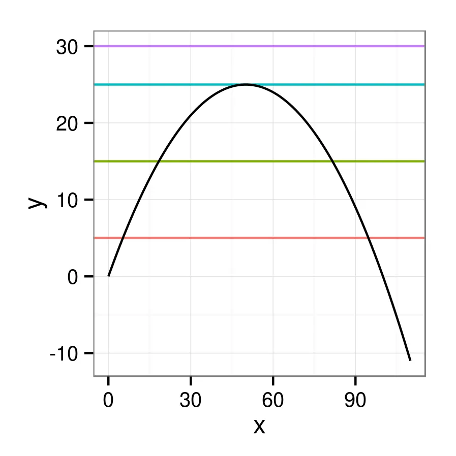
我希望创建一个二次曲线图,黑色表示,水平线以不同颜色在各个水平位置,同时还需要有一个标签(指南),用于标记水平线的颜色。我无法完全理解 -- 我尝试了几个变化对我来说似乎很有意义,但是我似乎不能强制让图例显示出来。
这是我最新的尝试:
我得到了一条曲线和一个图例,但曲线的颜色是错误的。如果我通过设置
这是我最新的尝试:
library(ggplot2)
theme_set(theme_bw()) ## cosmetic
hdat <- data.frame(harvest_rate=c(5,15,25,30))
r <- 1; K <- 100
ggplot(hdat)+
    geom_hline(data=hdat,aes(yintercept=harvest_rate,
               colour=factor(harvest_rate)))+
    stat_function(fun=function(x) r*x*(1-x/K),colour="black")+
    expand_limits(x=c(0,110))
这些代码行没有问题,但是图例/指南并没有显示出来。
如果我改为以下方式:
ggplot(hdat,aes(yintercept=harvest_rate,
               colour=factor(harvest_rate)))+
    geom_hline()+
    stat_function(fun=function(x) r*x*(1-x/K),colour="black")+
    expand_limits(x=c(0,110))
令我惊讶的是,水平线根本没有被绘制出来!
我也尝试过(最开始就是这么做的)使用x和y变量设置数据框架,
 d <- data.frame(x=0:110)
 d <- transform(d,y=r*x*(1-x/K))
 ggplot(d,aes(x,y))+geom_line()+
      geom_hline(data=hdat,aes(yintercept=harvest_rate,
               colour=factor(harvest_rate)))+
      scale_colour_brewer(palette="Set1")
指南也没有以那种方式显示。
如果在最初的ggplot调用中设置colour=NA,则图例将出现,但曲线将消失。 如果我如下设置colour=factor(1)
 ggplot(d,aes(x,y,colour=factor(1)))+geom_line()+
      geom_hline(data=hdat,aes(yintercept=harvest_rate,
               colour=factor(harvest_rate)))+
      scale_colour_brewer(palette="Set1")
我得到了一条曲线和一个图例,但曲线的颜色是错误的。如果我通过设置
geom_line(colour="black")来重写,则图例会再次消失...我非常感激(1)一个有效的解决方法和(2)一个解释我所缺少的逻辑!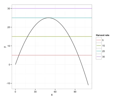
show_guide=TRUE(可能经常用作注释,因此不包括在图例中)。 - baptiste