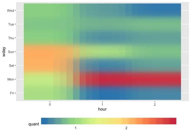
我正在尝试在ggplot上制作热力图。我有一个类似于下面的数据框:
wday    hour    quant
Mon 0   1.2346944
Tue 0   0.8418860
Wed 0   0.8904375
Thu 0   0.8906767
Fri 0   1.0761553
Sat 0   2.1095617
Sun 0   2.1421696
Mon 1   2.9178615
Tue 1   0.7481875
Wed 1   0.6200556
Thu 1   0.5530000
Fri 1   0.3852611
Sat 1   0.4791192
Sun 1   1.0958043
Mon 2   2.8627222
Tue 2   0.7989769
Wed 2   0.4209105
Thu 2   0.6512810
Fri 2   0.5047176
Sat 2   0.6544059
Sun 2   0.8167846
我的代码是:
ggplot(df , aes(x = hour, y = wday)) +
  geom_raster(aes(fill = quant), interpolate=TRUE) +
  scale_fill_distiller(palette = "Spectral") +
  theme(legend.position = "bottom")
它呈现了类似于以下的图形:
您可以看到图例的颜色条非常紧凑,如何水平扩展图例以使其变得更宽?