在 Plotly 中,是否可以反转柱状图?

3

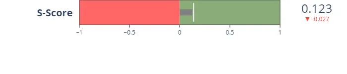
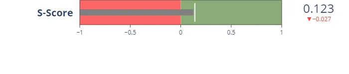
我使用plotly.go创建了一张带正负维度的子弹图。但是,当我绘制柱状图时,它总是从-1开始。有没有办法将起始点设置为零,这样它就可以从两个维度都对齐?

可重现示例:

act = 0.123
avg = 0.13
before = 0.15
fig = go.Figure(go.Indicator(
        mode="number+gauge+delta", value=act,
        domain={'x': [0.1, 1], 'y': [0, 1]},
        title={'text': "<b>S-Score</b>"},
        delta={'reference': before},
        gauge={
            'shape': "bullet",
            'tick0':0,
            'axis': {'range': [-1, 1]},
            'threshold': {
                'line': {'color': "white", 'width': 2},
                'thickness': 0.75, 'value': avg},
            'steps': [
                {'range': [-1, 0], 'color': "#ff6666"},
                {'range': [0, 1], 'color': "#89ac76"}
            ],
            'bar': {'color': "grey"}}))

实际输出: 输入图像描述

我想要的输出: 输入图像描述


你是否因为不理解预期的输出图像而无法获得预期的图形输出? - r-beginners
期望的输出结果类似于上面的图,但没有在红色区域范围内的条形。因此,我希望它从中间开始,并根据需要向左或向右对齐。您知道是否有一种实现方式吗?有什么解决方法或其他东西吗? - LK1999
1个回答

2

我已经做了很多研究,但没有找到解决方案。我提出了一个巧妙的方法和改变x轴的建议。这可能与您期望的答案有些不同。

import plotly.graph_objects as go

act = 0.123
avg = 0.13
before = 0.15

fig = go.Figure(go.Indicator(
    mode = "number+gauge+delta", value = act,
    domain = {'x': [0.1, 1], 'y': [0, 1]},
    title = {'text' :"<b>S-Score</b>"},
    delta = {'reference': before},
    gauge = {
        'shape': "bullet",
        'axis': {'range': [-1, 1]},
        'threshold': {
            'line': {'color': "white", 'width': 2},
            'thickness': 0.75,
            'value': avg},
        'steps': [
            {'range': [-1, 0], 'color': "#ff6666"},
            {'range': [0, 1], 'color': "#89ac76"}],
        'bar': {'color':'#ff6666'}

    }))

fig.update_layout(height = 250)
fig.show()

enter image description here

import plotly.graph_objects as go

act = 0.123
avg = 0.13
before = 0.15

fig = go.Figure(go.Indicator(
    mode = "number+gauge+delta", value = act,
    domain = {'x': [0.1, 1], 'y': [0, 1]},
    title = {'text' :"<b>S-Score</b>"},
    delta = {'reference': before},
    gauge = {
        'shape': "bullet",
        'axis': {'range': [0, 1]},
        'threshold': {
            'line': {'color': "white", 'width': 2},
            'thickness': 0.75,
            'value': avg},
        'steps': [
            {'range': [-1, 0], 'color': "#ff6666"},
            {'range': [0, 1], 'color': "#89ac76"}],
        'bar': {'color':'grey',
                'line': {'color':'#444', 'width':2},
    }}))

fig.update_layout(height = 250)
fig.show()

enter image description here


网页内容由stack overflow 提供, 点击上面的
可以查看英文原文,
原文链接