有没有一种方法可以在plotly的热力图中反转y轴的顺序?

11

所以我有

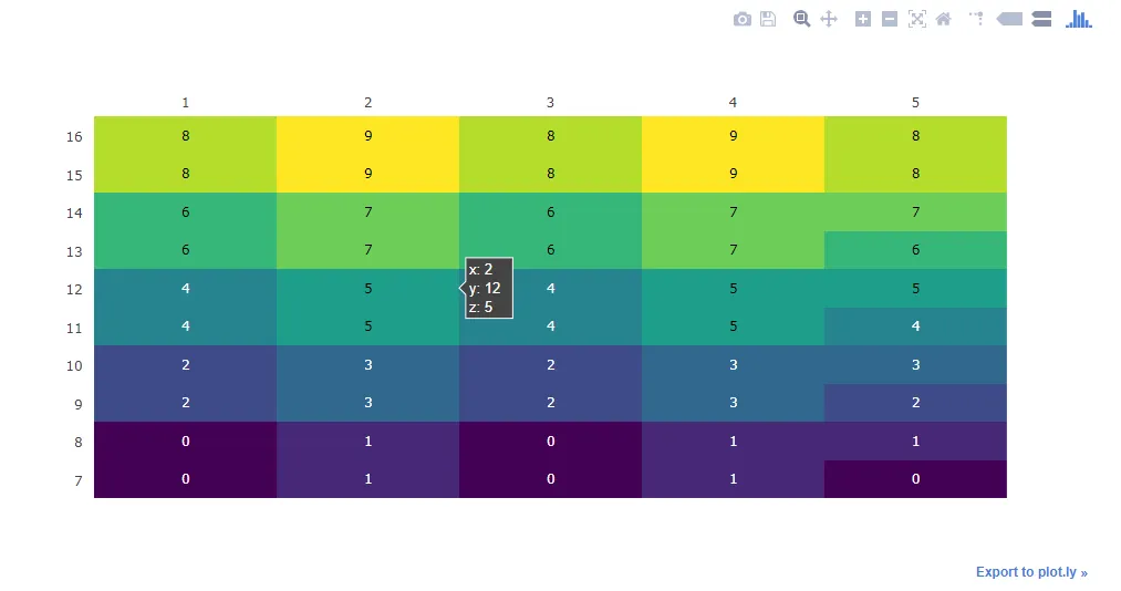
hours = [x for x in range(7,18)]
columns = [1, 2, 3, 4, 5]

    matrixDatos = [[0,1,0,1,0],
                   [0,1,0,1,1],
                   [2,3,2,3,2],
                   [2,3,2,3,3],
                   [4,5,4,5,4],
                   [4,5,4,5,5],
                   [6,7,6,7,6],
                   [6,7,6,7,7],
                   [8,9,8,9,8],
                   [8,9,8,9,8]
                    ]


    table = ff.create_table(matrixDatos)

    fig = ff.create_annotated_heatmap(matrixDatos, x=columns, y=hours, colorscale='Viridis')

但是它打印的热力图的y轴从18到7,有没有办法将其从7到18打印出来?

2个回答

27

嗨,我尝试了提供的代码,但是遇到了一个错误,提示Y轴(小时数)的数量与Z轴(matrixDatos)的数量不相等。因此,我将代码中的范围从7到16减少以使其正常工作。

我在布局对象中使用了xaxis对象的"autorange"参数来反转轴,如果需要反转轴,则需要使用"reversed"参数。

原始代码(在问题中提供)输出: plotly heatmap annotated 代码更改:

hours = [x for x in range(7,17)]
columns = [1, 2, 3, 4, 5]

matrixDatos = [[0,1,0,1,0],
               [0,1,0,1,1],
               [2,3,2,3,2],
               [2,3,2,3,3],
               [4,5,4,5,4],
               [4,5,4,5,5],
               [6,7,6,7,6],
               [6,7,6,7,7],
               [8,9,8,9,8],
               [8,9,8,9,8]
                ]


table = ff.create_table(matrixDatos)

fig = ff.create_annotated_heatmap(matrixDatos, x=columns, y=hours, colorscale='Viridis')
fig['layout']['yaxis']['autorange'] = "reversed"
iplot(fig)

代码更改输出: plotly annotated heatmap reversed

希望这是你所需要的。

参考文献:

  1. plotly布局x轴参考

5

添加

fig.update_yaxes(autorange="reversed")

显示图像前。


对我来说不起作用,显示相同的输出:/ - undefined

网页内容由stack overflow 提供, 点击上面的
可以查看英文原文,
原文链接