据我所知,这并不容易实现。在
用户文档或
Github文档中没有任何东西表明有一个参数可以让您修改每个层的比例。然而,深入挖掘也无妨。
如果我们看以下代码示例:
import plotly.express as px
data = dict(
    character=["Eve", "Cain", "Seth", "Enos", "Noam", "Abel", "Awan", "Enoch", "Azura"],
    parent=["", "Eve", "Eve", "Seth", "Seth", "Eve", "Eve", "Awan", "Eve" ],
    value=[10, 14, 12, 10, 2, 6, 6, 4, 4])

fig =px.sunburst(
    data,
    names='character',
    parents='parent',
    values='value'
)
如果我们运行这个Python代码,并输入
fig.layout.template.data,我们可以看到生成旭日图所使用的图表类型和相应参数:
layout.template.Data({
    'bar': [{'error_x': {'color': '#2a3f5f'},
             'error_y': {'color': '#2a3f5f'},
             'marker': {'line': {'color': '#E5ECF6', 'width': 0.5}},
             'type': 'bar'}],
    'barpolar': [{'marker': {'colorbar': {'len': 0.9, 'lenmode': 'fraction'}, 'line': {'color': '#E5ECF6', 'width': 0.5}},
                  'type': 'barpolar'}],
    'carpet': [{'aaxis': {'endlinecolor': '#2a3f5f',
                          'gridcolor': 'white',
                          'linecolor': 'white',
                          'minorgridcolor': 'white',
                          'startlinecolor': '#2a3f5f'},
                'baxis': {'endlinecolor': '#2a3f5f',
                          'gridcolor': 'white',
                          'linecolor': 'white',
                          'minorgridcolor': 'white',
                          'startlinecolor': '#2a3f5f'},
                'type': 'carpet'}],
    'choropleth': [{'colorbar': {'outlinewidth': 0, 'ticks': ''}, 'type': 'choropleth'}],
    'contour': [{'colorbar': {'outlinewidth': 0, 'ticks': ''},
                 'colorscale': [[0.0, '#0d0887'], [0.1111111111111111, '#46039f'],
                                [0.2222222222222222, '#7201a8'],
                                [0.3333333333333333, '#9c179e'],
                                [0.4444444444444444, '#bd3786'],
                                [0.5555555555555556, '#d8576b'],
                                [0.6666666666666666, '#ed7953'],
                                [0.7777777777777778, '#fb9f3a'],
                                [0.8888888888888888, '#fdca26'], [1.0, '#f0f921']],
                 'type': 'contour'}],
    'contourcarpet': [{'colorbar': {'outlinewidth': 0, 'ticks': ''}, 'type': 'contourcarpet'}],
    'heatmap': [{'colorbar': {'outlinewidth': 0, 'ticks': ''},
                 'colorscale': [[0.0, '#0d0887'], [0.1111111111111111, '#46039f'],
                                [0.2222222222222222, '#7201a8'],
                                [0.3333333333333333, '#9c179e'],
                                [0.4444444444444444, '#bd3786'],
                                [0.5555555555555556, '#d8576b'],
                                [0.6666666666666666, '#ed7953'],
                                [0.7777777777777778, '#fb9f3a'],
                                [0.8888888888888888, '#fdca26'], [1.0, '#f0f921']],
                 'type': 'heatmap'}],
    'heatmapgl': [{'colorbar': {'outlinewidth': 0, 'ticks': ''},
                   'colorscale': [[0.0, '#0d0887'], [0.1111111111111111,
                                  '#46039f'], [0.2222222222222222, '#7201a8'],
                                  [0.3333333333333333, '#9c179e'],
                                  [0.4444444444444444, '#bd3786'],
                                  [0.5555555555555556, '#d8576b'],
                                  [0.6666666666666666, '#ed7953'],
                                  [0.7777777777777778, '#fb9f3a'],
                                  [0.8888888888888888, '#fdca26'], [1.0,
                                  '#f0f921']],
                   'type': 'heatmapgl'}],
    'histogram': [{'marker': {'colorbar': {'outlinewidth': 0, 'ticks': ''}}, 'type': 'histogram'}],
    'histogram2d': [{'colorbar': {'outlinewidth': 0, 'ticks': ''},
                     'colorscale': [[0.0, '#0d0887'], [0.1111111111111111,
                                    '#46039f'], [0.2222222222222222, '#7201a8'],
                                    [0.3333333333333333, '#9c179e'],
                                    [0.4444444444444444, '#bd3786'],
                                    [0.5555555555555556, '#d8576b'],
                                    [0.6666666666666666, '#ed7953'],
                                    [0.7777777777777778, '#fb9f3a'],
                                    [0.8888888888888888, '#fdca26'], [1.0,
                                    '#f0f921']],
                     'type': 'histogram2d'}],
    'histogram2dcontour': [{'colorbar': {'outlinewidth': 0, 'ticks': ''},
                            'colorscale': [[0.0, '#0d0887'], [0.1111111111111111,
                                           '#46039f'], [0.2222222222222222,
                                           '#7201a8'], [0.3333333333333333,
                                           '#9c179e'], [0.4444444444444444,
                                           '#bd3786'], [0.5555555555555556,
                                           '#d8576b'], [0.6666666666666666,
                                           '#ed7953'], [0.7777777777777778,
                                           '#fb9f3a'], [0.8888888888888888,
                                           '#fdca26'], [1.0, '#f0f921']],
                            'type': 'histogram2dcontour'}],
    'mesh3d': [{'colorbar': {'outlinewidth': 0, 'ticks': ''}, 'type': 'mesh3d'}],
    'parcoords': [{'line': {'colorbar': {'outlinewidth': 0, 'ticks': ''}}, 'type': 'parcoords'}],
    'pie': [{'automargin': True, 'type': 'pie'}],
    'scatter': [{'marker': {'colorbar': {'outlinewidth': 0, 'ticks': ''}}, 'type': 'scatter'}],
    'scatter3d': [{'line': {'colorbar': {'outlinewidth': 0, 'ticks': ''}},
                   'marker': {'colorbar': {'outlinewidth': 0, 'ticks': ''}},
                   'type': 'scatter3d'}],
    'scattercarpet': [{'marker': {'colorbar': {'outlinewidth': 0, 'ticks': ''}}, 'type': 'scattercarpet'}],
    'scattergeo': [{'marker': {'colorbar': {'outlinewidth': 0, 'ticks': ''}}, 'type': 'scattergeo'}],
    'scattergl': [{'marker': {'colorbar': {'outlinewidth': 0, 'ticks': ''}}, 'type': 'scattergl'}],
    'scattermapbox': [{'marker': {'colorbar': {'outlinewidth': 0, 'ticks': ''}}, 'type': 'scattermapbox'}],
    'scatterpolar': [{'marker': {'colorbar': {'outlinewidth': 0, 'ticks': ''}}, 'type': 'scatterpolar'}],
    'scatterpolargl': [{'marker': {'colorbar': {'outlinewidth': 0, 'ticks': ''}}, 'type': 'scatterpolargl'}],
    'scatterternary': [{'marker': {'colorbar': {'outlinewidth': 0, 'ticks': ''}}, 'type': 'scatterternary'}],
    'surface': [{'colorbar': {'outlinewidth': 0, 'ticks': ''},
                 'colorscale': [[0.0, '#0d0887'], [0.1111111111111111, '#46039f'],
                                [0.2222222222222222, '#7201a8'],
                                [0.3333333333333333, '#9c179e'],
                                [0.4444444444444444, '#bd3786'],
                                [0.5555555555555556, '#d8576b'],
                                [0.6666666666666666, '#ed7953'],
                                [0.7777777777777778, '#fb9f3a'],
                                [0.8888888888888888, '#fdca26'], [1.0, '#f0f921']],
                 'type': 'surface'}],
    'table': [{'cells': {'fill': {'color': '#EBF0F8'}, 'line': {'color': 'white'}},
               'header': {'fill': {'color': '#C8D4E3'}, 'line': {'color': 'white'}},
               'type': 'table'}]
这有点混乱,但据我所知,Sunburst图表基本上是使用Plotly的其他各种图表构建的,包括Barpolar和pie graph_objects。
从Plotly user documentation中可以看到,Barpolar图形对象如下所示:
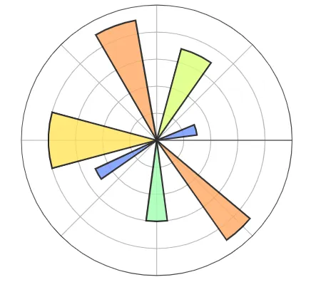
您可以指定每个条的半径,但默认情况下它们都会从原点向外辐射。但如果您真的想创建具有不均匀层厚度的Sunburst图表,并且愿意努力实现它,您可以尝试在Barchart之上构建它:我的建议是在白色条形图上叠加彩色条形图,并为每个条形图测试不同的半径。这是一个您可以真正实现的示例:
import plotly.graph_objects as go
fig = go.Figure()
fig.add_trace(go.Barpolar(
r=[5, 5],
theta=[67.5, 180],
width=[135, 90],
marker_color=["salmon","yellow"],
marker_line_color="white",
marker_line_width=2,
opacity=1
)
)
fig.add_trace(go.Barpolar(
r=[2, 2],
theta=[67.5, 180],
width=[135, 90],
marker_color=["blue","green"],
marker_line_color="white",
marker_line_width=2,
opacity=1
)
)
fig.add_trace(go.Barpolar(
r=[1],
theta=[0],
width=[360],
marker_color=["white"],
marker_line_color="white",
marker_line_width=2,
opacity=1
)
)
fig.update_layout(
template=None,
polar = dict(
radialaxis = dict(range=[0, 6], showticklabels=False, ticks=''),
angularaxis = dict(showticklabels=False, ticks='')
)
)
fig.show()
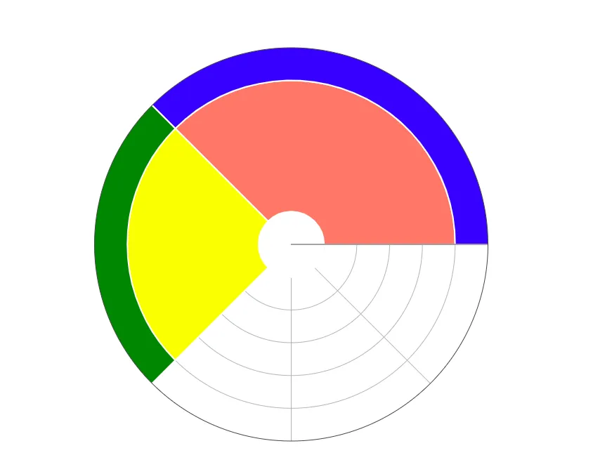
您需要为名称和hovertemplate中的值添加注释。您基本上是从头开始构建图表,所以我承认这将是一个痛苦的过程。
注意:任何比我更有Plotly经验的人,请纠正我是否错误,并且如果每个层的厚度确实可以由Sunburst graph_object中的参数控制。
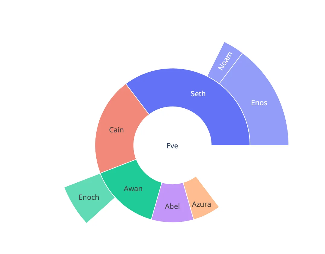 这是我想要的分割位置:
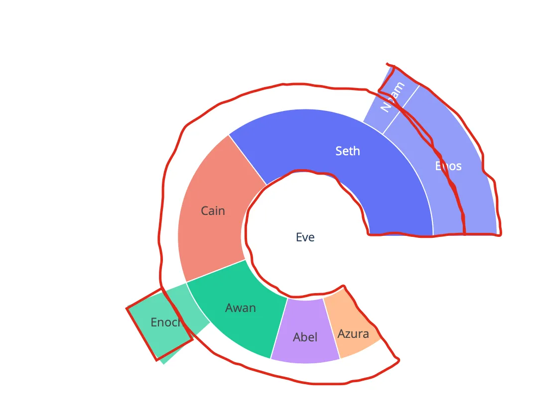 这是否可能?