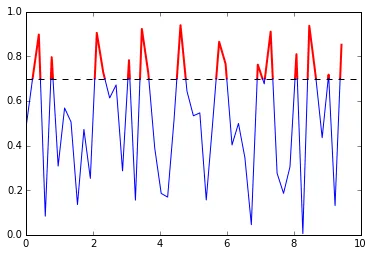
你可以使用掩码数组来绘制多条线。这是一个示例:
找到曲线和阈值线之间的交点,并将这些点插入原始数据中。然后,您可以使用掩码数组两次调用
plot():
import numpy as np
import pylab as pl

def threshold_plot(x, y, th, fmt_lo, fmt_hi):
    idx = np.where(np.diff(y > th))[0]
    x_insert = x[idx] + (th - y[idx]) / (y[idx+1] - y[idx]) * (x[idx+1] - x[idx])
    y_insert = np.full_like(x_insert, th)

    xn, yn = np.insert(x, idx+1, x_insert), np.insert(y, idx+1, y_insert)

    mask = yn < th
    pl.plot(np.ma.masked_where(mask, xn), np.ma.masked_where(mask, yn), fmt_hi, lw=2)

    mask = yn > th
    pl.plot(np.ma.masked_where(mask, xn), np.ma.masked_where(mask, yn), fmt_lo)
    pl.axhline(th, color="black", linestyle="--")

x = np.linspace(0, 3 * np.pi, 50)
y = np.random.rand(len(x))
threshold_plot(x, y, 0.7, "b", "r")
结果:
(注:该内容为HTML标签,已翻译为中文)