当值超过某个y值时,是否可以更改绘图中的线条颜色? 示例:
import numpy as np
import matplotlib.pyplot as plt
a = np.array([1,2,17,20,16,3,5,4])
plt.plt(a)
这个代码会产生如下结果:
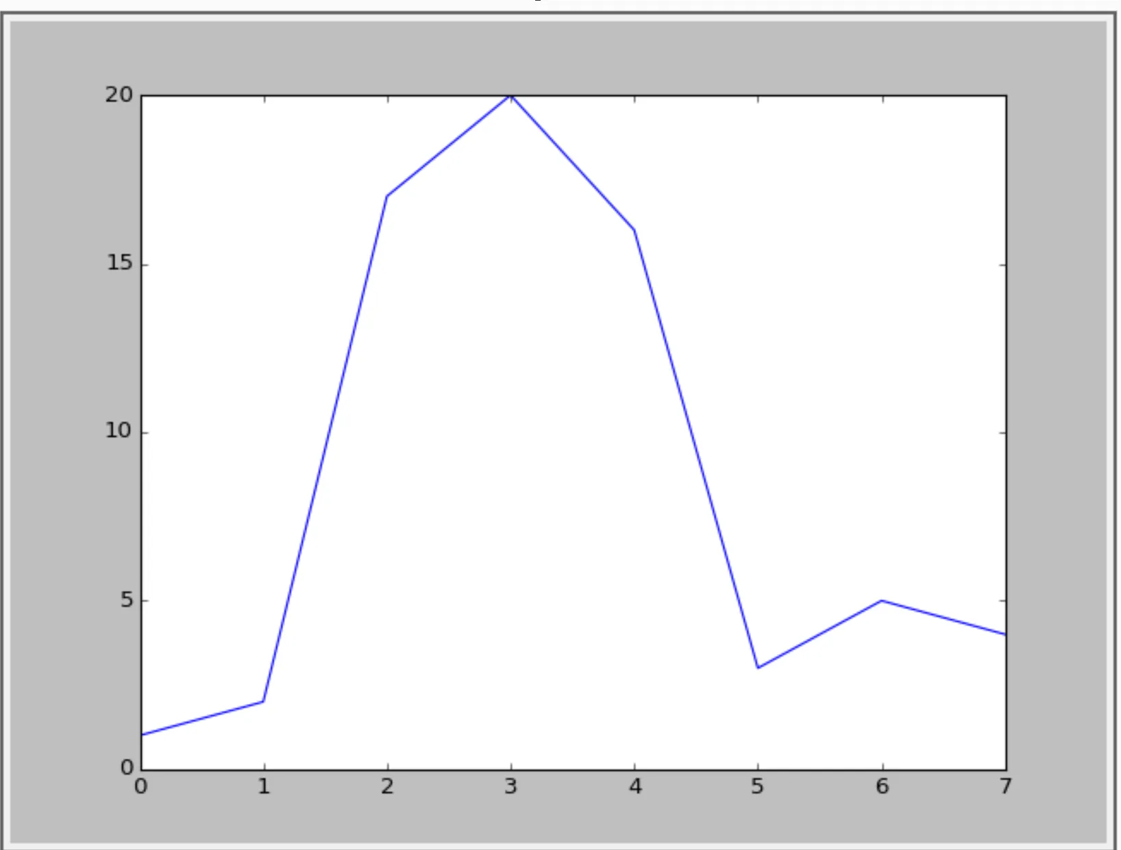
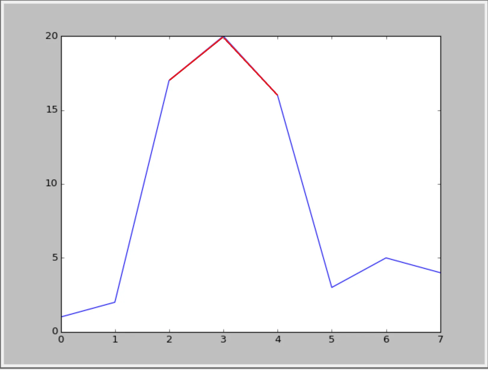
我想要将超过y=15的数值可视化,像这张图一样:
或者像这样(使用循环线样式):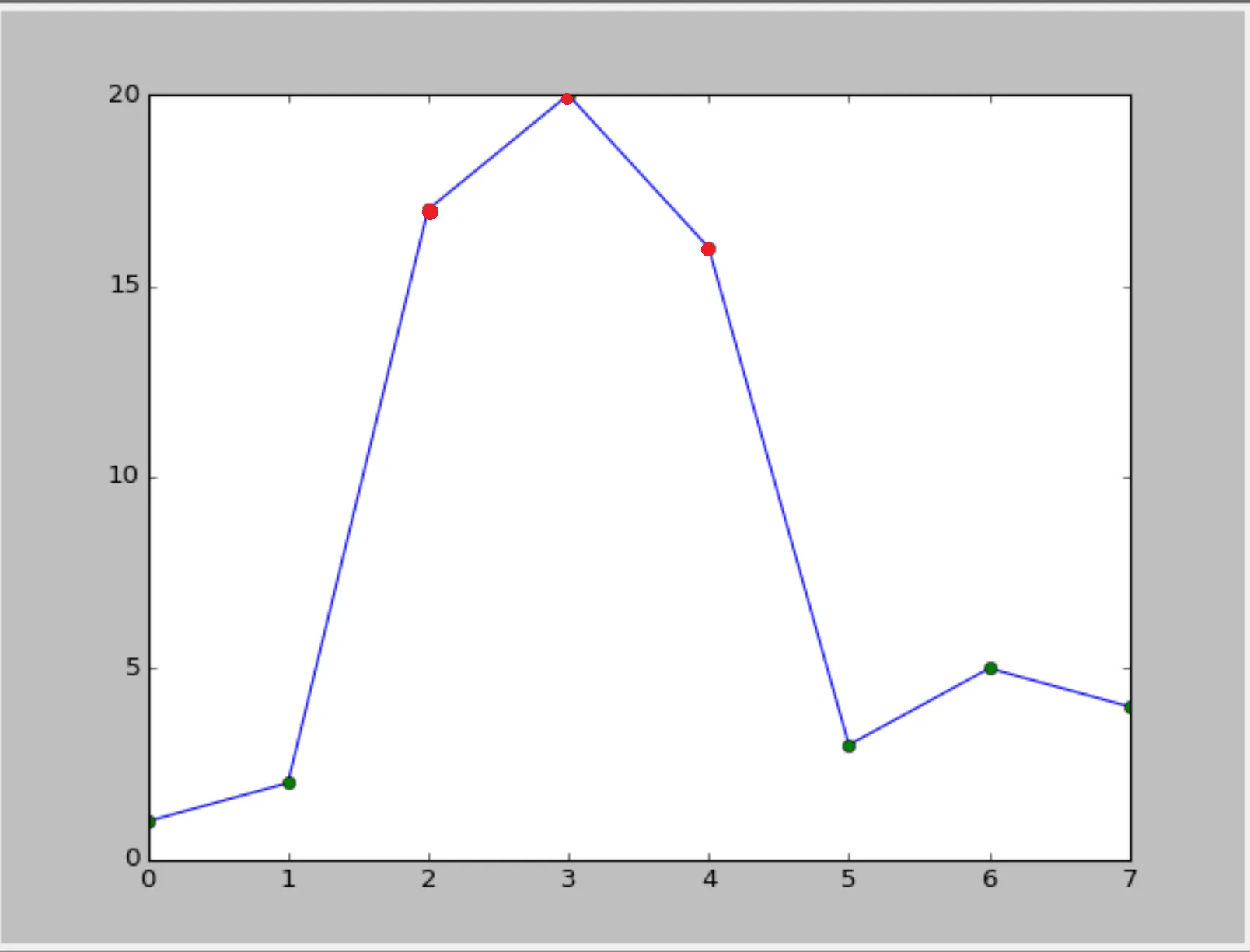 :
:
有可能吗?
当值超过某个y值时,是否可以更改绘图中的线条颜色? 示例:
import numpy as np
import matplotlib.pyplot as plt
a = np.array([1,2,17,20,16,3,5,4])
plt.plt(a)
这个代码会产生如下结果:
我想要将超过y=15的数值可视化,像这张图一样:
或者像这样(使用循环线样式)::
有可能吗?
定义一个辅助函数(这只是一个基本的函数,可以添加更多功能)。此代码是对文档中此示例的轻微重构。
import numpy as np
import matplotlib.pyplot as plt
from matplotlib.collections import LineCollection
from matplotlib.colors import ListedColormap, BoundaryNorm

def threshold_plot(ax, x, y, threshv, color, overcolor):
    """
    Helper function to plot points above a threshold in a different color

    Parameters
    ----------
    ax : Axes
        Axes to plot to
    x, y : array
        The x and y values

    threshv : float
        Plot using overcolor above this value

    color : color
        The color to use for the lower values

    overcolor: color
        The color to use for values over threshv

    """
    # Create a colormap for red, green and blue and a norm to color
    # f' < -0.5 red, f' > 0.5 blue, and the rest green
    cmap = ListedColormap([color, overcolor])
    norm = BoundaryNorm([np.min(y), threshv, np.max(y)], cmap.N)

    # Create a set of line segments so that we can color them individually
    # This creates the points as a N x 1 x 2 array so that we can stack points
    # together easily to get the segments. The segments array for line collection
    # needs to be numlines x points per line x 2 (x and y)
    points = np.array([x, y]).T.reshape(-1, 1, 2)
    segments = np.concatenate([points[:-1], points[1:]], axis=1)

    # Create the line collection object, setting the colormapping parameters.
    # Have to set the actual values used for colormapping separately.
    lc = LineCollection(segments, cmap=cmap, norm=norm)
    lc.set_array(y)

    ax.add_collection(lc)
    ax.set_xlim(np.min(x), np.max(x))
    ax.set_ylim(np.min(y)*1.1, np.max(y)*1.1)
    return lc
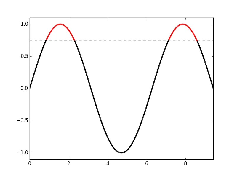
使用示例
fig, ax = plt.subplots()

x = np.linspace(0, 3 * np.pi, 500)
y = np.sin(x)

lc = threshold_plot(ax, x, y, .75, 'k', 'r')
ax.axhline(.75, color='k', ls='--')
lc.set_linewidth(3)
并输出
如果你只想改变标记的颜色,使用相同的 norm 和 cmap 并将它们传递给 scatter
cmap = ListedColormap([color, overcolor])
norm = BoundaryNorm([np.min(y), threshv, np.max(y)], cmap.N)
sc = ax.scatter(x, y, c=c, norm=norm, cmap=cmap)
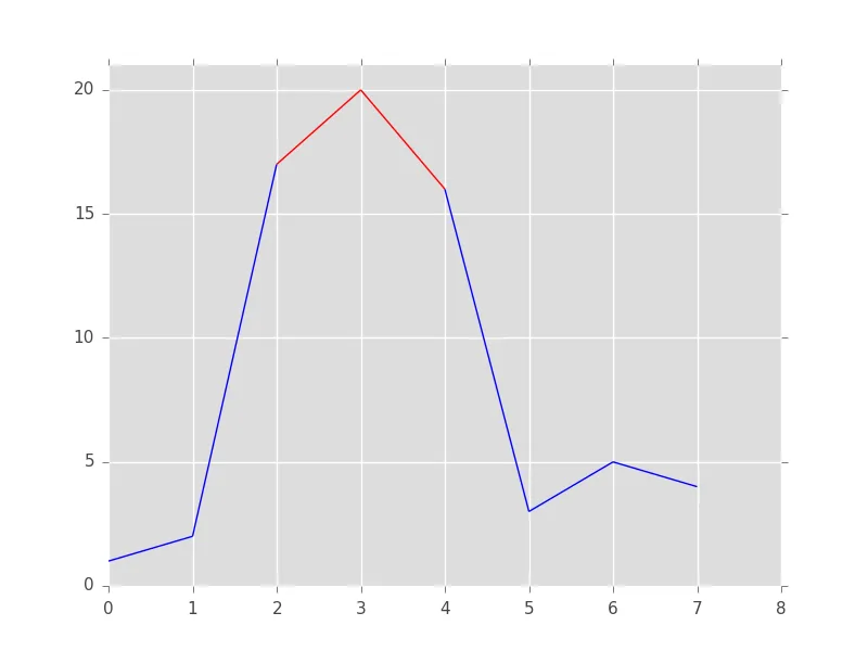
很遗憾,matplotlib没有一个简单的选项可以仅更改线的一部分的颜色。我们必须自己编写逻辑。诀窍是将线切成一组线段,然后为每个线段分配颜色,最后绘制它们。
from matplotlib import pyplot as plt
from matplotlib.collections import LineCollection
import numpy as np

# The x and y data to plot
y = np.array([1,2,17,20,16,3,5,4])
x = np.arange(len(y))

# Threshold above which the line should be red
threshold = 15

# Create line segments: 1--2, 2--17, 17--20, 20--16, 16--3, etc.
segments_x = np.r_[x[0], x[1:-1].repeat(2), x[-1]].reshape(-1, 2)
segments_y = np.r_[y[0], y[1:-1].repeat(2), y[-1]].reshape(-1, 2)

# Assign colors to the line segments
linecolors = ['red' if y_[0] > threshold and y_[1] > threshold else 'blue'
              for y_ in segments_y]

# Stamp x,y coordinates of the segments into the proper format for the
# LineCollection
segments = [zip(x_, y_) for x_, y_ in zip(segments_x, segments_y)]

# Create figure
plt.figure()
ax = plt.axes()

# Add a collection of lines
ax.add_collection(LineCollection(segments, colors=linecolors))

# Set x and y limits... sadly this is not done automatically for line
# collections
ax.set_xlim(0, 8)
ax.set_ylim(0, 21)
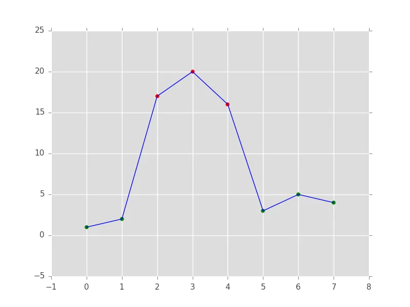
第二个选项更加容易。我们先画线,然后在其上方添加标记,形成散点图:
from matplotlib import pyplot as plt
import numpy as np

# The x and y data to plot
y = np.array([1,2,17,20,16,3,5,4])
x = np.arange(len(y))

# Threshold above which the markers should be red
threshold = 15

# Create figure
plt.figure()

# Plot the line
plt.plot(x, y, color='blue')

# Add below threshold markers
below_threshold = y < threshold
plt.scatter(x[below_threshold], y[below_threshold], color='green')

# Add above threshold markers
above_threshold = np.logical_not(below_threshold)
plt.scatter(x[above_threshold], y[above_threshold], color='red')
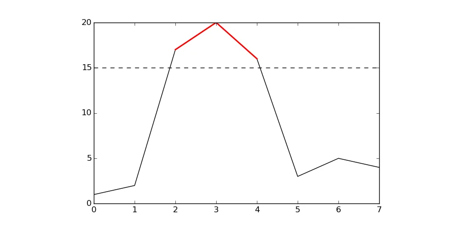
基本上@RaJa提供了解决方案,但我认为您可以在不加载其他软件包(pandas)的情况下使用numpy中的掩码数组来完成相同的操作:
基本上@RaJa提供了解决方案,但我认为您可以在不加载其他软件包(pandas)的情况下使用numpy中的掩码数组来完成相同的操作:
import numpy as np
import matplotlib.pyplot as plt

a = np.array([1,2,17,20,16,3,5,4])

# use a masked array to suppress the values that are too low
a_masked = np.ma.masked_less_equal(a, 15)

# plot the full line
plt.plot(a, 'k')

# plot only the large values
plt.plot(a_masked, 'r', linewidth=2)

# add the threshold value (optional)
plt.axhline(15, color='k', linestyle='--')
plt.show()
结果:
我不确定matplolib中是否有内置函数,但是你可以将numpy数组转换为pandas序列,然后与布尔选择/掩码结合使用plot函数。
import numpy as np
import pandas as pd

a = np.array([1,2,17,20,16,3,5,4])
aPandas = pd.Series(a)
aPandas.plot()
aPandas[aPandas > 15].plot(color = 'red')