使用Python中的pandas groupby进行绘图,多个图表

3

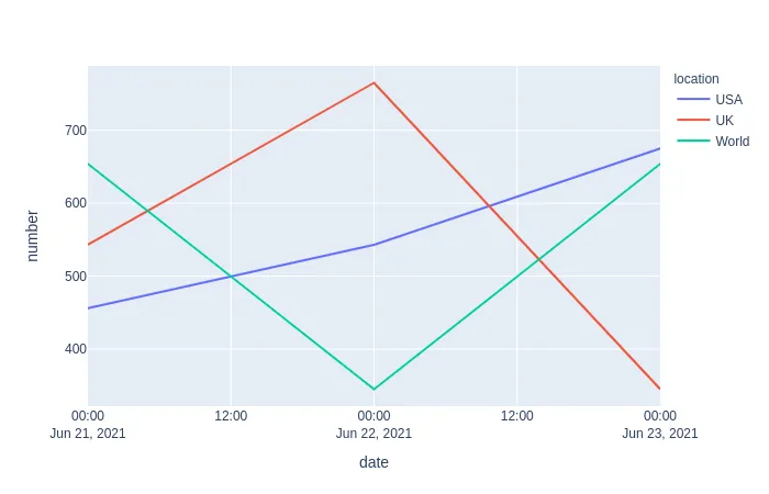
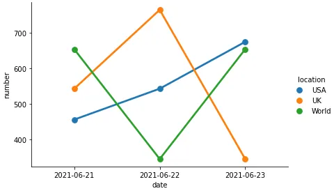
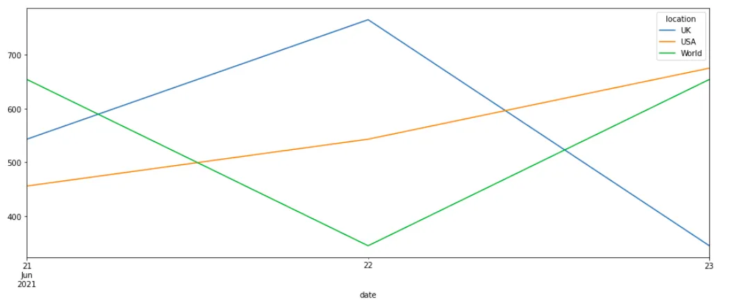
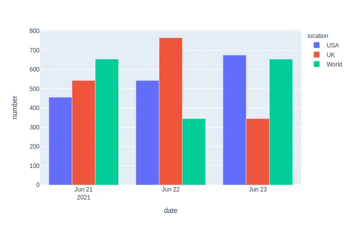
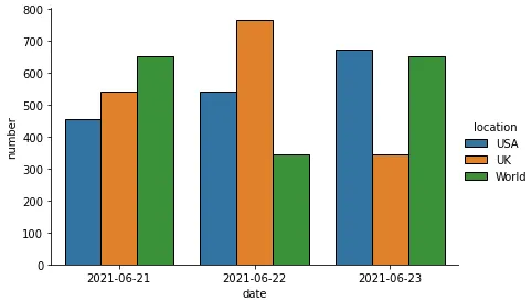
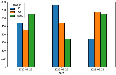
我希望能够创建三个不同的图表(按位置分组),使用与我下面创建的df类似的数据。在x轴上,我需要日期,在y轴上是数字。最好是每个日期都有一个条形图。

是否可以使用例如groupby函数来几行代码完成此操作?

谢谢!

data = {"location": ["USA", "USA", "USA", "UK", "UK", "UK", "World", "World", "World"], "date": ["21-06-2021", "22-06-2021", "23-06-2021", "21-06-2021", "22-06-2021", "23-06-2021", "21-06-2021", "22-06-2021", "23-06-2021"], "number": [456, 543, 675, 543, 765, 345, 654, 345, 654]}

import pandas as pd
df = pd.DataFrame (data, columns = ['location','date','number'])
df["date"] = pd.to_datetime(df["date"])
df
1个回答

3

这里不是在进行分组操作,你只想为每个位置创建一行不同的数据。

样本数据

# using data from OP
df = pd.DataFrame (data, columns = ['location','date','number'])

# using .dt.date will remove the time component for nicer x-axis labels
df["date"] = pd.to_datetime(df["date"]).dt.date

线性图

Plotly

import plotly.express as px

px.line(df, x='date', y="number", color="location")

enter image description here

Seaborn

import seaborn as sns

p = sns.catplot(data=df, x='date', y="number", hue='location', kind='point', height=4, aspect=1.5)

enter image description here

Pandas

如果您只想使用Pandas,您可以参照这个答案

pv = df.pivot(index="date", columns='location', values='number')

ax = pv.plot(figsize=(16, 6))

这里输入图片描述

我建议尝试使用plotly。您可以获得漂亮的交互式图表,语法简单明了。

条形图

Plotly

px.bar(df, x='date', y="number", color="location", barmode='group')

enter image description here

Seaborn

p = sns.catplot(data=df, x='date', y="number", hue='location', kind='bar', height=4, aspect=1.5)

enter image description here

Pandas

ax = pv.plot(kind='bar', figsize=(8, 5), rot=0)

enter image description here


网页内容由stack overflow 提供, 点击上面的
可以查看英文原文,
原文链接