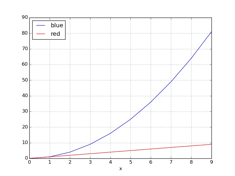
使用pandas数据框绘制多条不同颜色的线

100

我有一个数据框看起来像下面这样

   color  x   y
0    red  0   0
1    red  1   1
2    red  2   2
3    red  3   3
4    red  4   4
5    red  5   5
6    red  6   6
7    red  7   7
8    red  8   8
9    red  9   9
10  blue  0   0
11  blue  1   1
12  blue  2   4
13  blue  3   9
14  blue  4  16
15  blue  5  25
16  blue  6  36
17  blue  7  49
18  blue  8  64
19  blue  9  81

我最终想要两条线,一条蓝色,一条红色。红色线应该基本上是y=x,蓝色线应该是y=x^2。
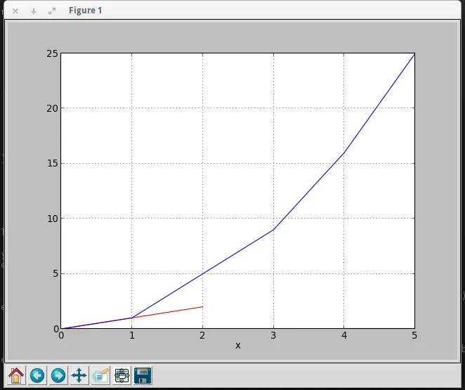
当我执行以下操作时:

df.plot(x='x', y='y')

输出结果如下:

有没有办法让pandas知道有两个集合?并且相应地将它们分组。我想能够指定列color作为集合的区分标志。

6个回答

113
另一种简单的方法是使用 pandas.DataFrame.pivot 函数格式化数据。
使用 pandas.DataFrame.plot 进行绘图。如果提供的颜色在 'color' 列中存在于 matplotlib: List of named colors 中,它们可以传递给 color 参数。
# sample data
df = pd.DataFrame([['red', 0, 0], ['red', 1, 1], ['red', 2, 2], ['red', 3, 3], ['red', 4, 4], ['red', 5, 5], ['red', 6, 6], ['red', 7, 7], ['red', 8, 8], ['red', 9, 9], ['blue', 0, 0], ['blue', 1, 1], ['blue', 2, 4], ['blue', 3, 9], ['blue', 4, 16], ['blue', 5, 25], ['blue', 6, 36], ['blue', 7, 49], ['blue', 8, 64], ['blue', 9, 81]],
                  columns=['color', 'x', 'y'])

# pivot the data into the correct shape
df = df.pivot(index='x', columns='color', values='y')

# display(df)
color  blue  red
x               
0         0    0
1         1    1
2         4    2
3         9    3
4        16    4
5        25    5
6        36    6
7        49    7
8        64    8
9        81    9

# plot the pivoted dataframe; if the column names aren't colors, remove color=df.columns
df.plot(color=df.columns, figsize=(5, 3))

enter image description here


4
这更加优雅。 - nivniv

90

你可以使用groupby根据颜色将DataFrame拆分为子组:

for key, grp in df.groupby(['color']):

import numpy as np
import pandas as pd
import matplotlib.pyplot as plt

df = pd.read_table('data', sep='\s+')
fig, ax = plt.subplots()

for key, grp in df.groupby(['color']):
    ax = grp.plot(ax=ax, kind='line', x='x', y='y', c=key, label=key)

plt.legend(loc='best')
plt.show()
产生 这里输入图片的描述

5
无法让解决方案奏效,因为我的数据集不是颜色,而参数“c”恰好是绘图线条颜色。在提问者的情况下这没问题,但对其他人来说将失败。如果删除该参数,则这个绝妙的解决方案也可以适用于所有其他数据集。 - JKJ

30
如果您已经安装了seaborn,则有一种更简单的方法,无需执行pivot:
import seaborn as sns

sns.lineplot(data=df, x='x', y='y', hue='color')

3
你也可以尝试使用以下代码,在Pandas数据框中绘制多条不同颜色的线。
import matplotlib.pyplot as plt
import matplotlib as mpl
import numpy as np
from pandas import DataFrame

value1 = [10, 20, 30, 40, 50] 
value2 = [5, 10, 15, 20, 25]
value3 = [8, 9, 10, 15, 20]

results1 = DataFrame({'SAC': value1, 'TD3': value2, 'DDPG': value3})

results1.plot()
plt.legend(loc='lower right')
plt.xlabel("Episode")
plt.ylabel("Rewards")
plt.show()

输出:

在此输入图片描述


你的意思是可以将数据框转换为每列代表不同颜色吗? - Jean Paul

1
最常见的方法是根据颜色组来绘制不同的颜色。也就是说,我们使用Dataframe.groupby将颜色分组,然后在相关轴上绘制数据。
例如:
import numpy as np, pandas as pd, matplotlib.pyplot as plt
n = 1000
xy = np.random.rand(n,  2) + np.random.rand(n)[:, None]
color = np.random.randint(0, 3, size = n)
data = dict(x = xy[:, 0], y = xy[:, 1], color = color)
df = pd.DataFrame(data)

fig, ax = plt.subplots()
for labels, dfi in df.groupby("color"):
    dfi.plot(ax = ax, x = 'x', y = 'y', label = labels)
ax.legend(title = 'color')
fig.show()

enter image description here


-5

你可以使用这段代码来获得你想要的输出

import pandas as pd
import matplotlib.pyplot as plt
df = pd.DataFrame({'color': ['red','red','red','blue','blue','blue'], 'x': [0,1,2,3,4,5],'y': [0,1,2,9,16,25]})
print df

  color  x   y
0   red  0   0
1   red  1   1
2   red  2   2
3  blue  3   9
4  blue  4  16
5  blue  5  25

绘制图形
a = df.iloc[[i for i in xrange(0,len(df)) if df['x'][i]==df['y'][i]]].plot(x='x',y='y',color = 'red')
df.iloc[[i for i in xrange(0,len(df)) if df['y'][i]== df['x'][i]**2]].plot(x='x',y='y',color = 'blue',ax=a)

plt.show()

输出 输出结果将如下所示


网页内容由stack overflow 提供, 点击上面的
可以查看英文原文,
原文链接