如何使用seaborn pairgrid和seaborn barplot为每个图添加颜色和星号

3

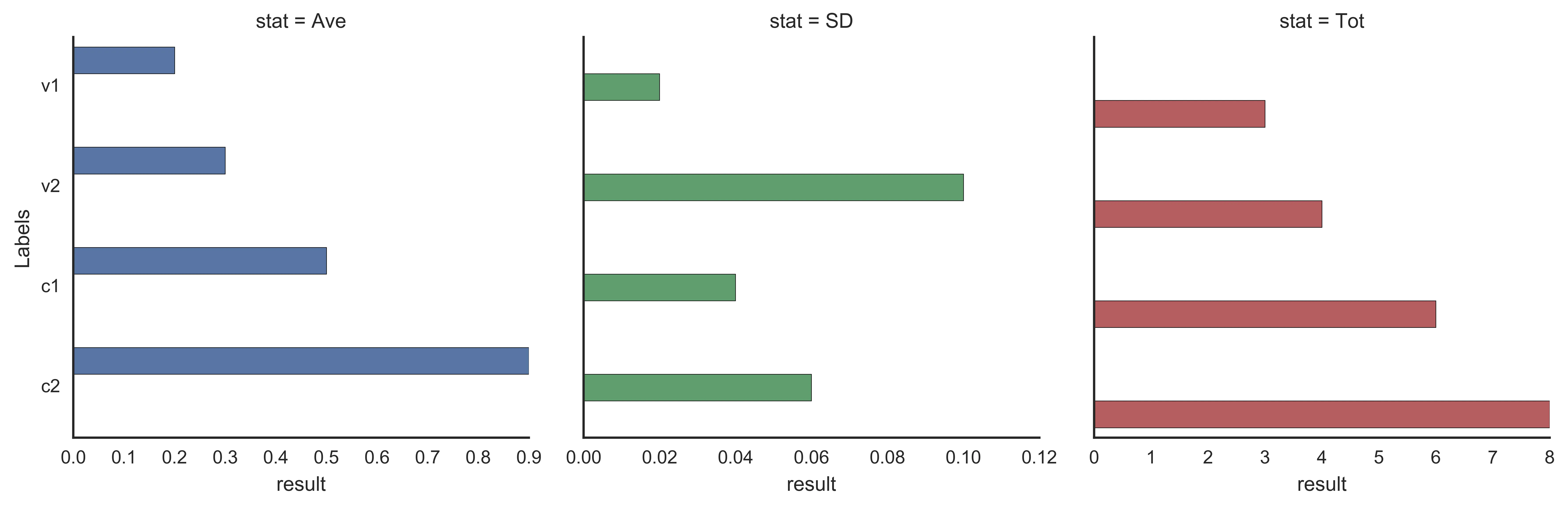
我想绘制3个水平条形图,标签作为y轴,数据作为x轴,并且我希望每个图都是不同的颜色,并具有某种类型的注释,例如一个星号,这取决于数据中表示显着性的列,例如:

dat = pd.DataFrame({
    'Labels':['v1','v2','c1','c2'],
    'Ave': [.2, .3, .5, .9],
    'SD': [0.02, 0.1, 0.04, 0.06],
    'Tot': [3, 4, 6, 8],
    'Sig': [0.05, 0.001, 0.0001, 0.05]
})

sns.set_style('white')

g = sns.PairGrid(dat, x_vars=['Ave', 'SD', 'Tot'], y_vars=['Labels'])
g.map(sns.barplot) 

我想要得到这样的东西:

enter image description here

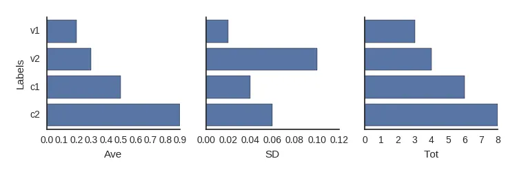
如何使每个图表,“Ave”“SD”和“ToT”都有自己的颜色?我该如何添加注释以表示由“Sig”列给出的显着性?

2个回答

1
您可以通过将数据重塑为长格式(整洁格式),并使用 factorplot 来接近目标。

重塑:

dat = (
  pandas.DataFrame({
      'Labels':['v1','v2','c1','c2'],
      'Ave': [.2, .3, .5, .9],
      'SD': [0.02, 0.1, 0.04, 0.06],
      'Tot': [3, 4, 6, 8],
      'Sig': [0.05, 0.001, 0.0001, 0.05]
  }).set_index('Labels')
    .unstack()
    .reset_index()
    .rename(columns={
      'level_0': 'stat',
      0: 'result'
  })
)

print(dat.head(8))

  stat Labels  result
0  Ave     v1    0.20
1  Ave     v2    0.30
2  Ave     c1    0.50
3  Ave     c2    0.90
4   SD     v1    0.02
5   SD     v2    0.10
6   SD     c1    0.04
7   SD     c2    0.06

并且factorplot:

seaborn.factorplot('result', 'Labels', data=dat,
                   kind='bar', sharex=False,
                   hue='stat', hue_order=stats,
                   col='stat', col_order=stats)

enter image description here

问题在于条形图被偏移了,因为使用了 hue ,这告诉 seaborn 在每个 y 位置上留出不同类别的空间。

在下一个版本中,您将能够说 dodge=False 来避免这种偏移。


0

还没有想出如何使用seaborn完成这个任务,但是使用matplotlib可以实现

import pandas as pd

dat = pd.DataFrame({
    'Labels':['v1','v2','c1','c2'],
    'Ave': [.2, .3, .5, .9],
    'SD': [0.02, 0.1, 0.04, 0.06],
    'Tot': [3, 4, 6, 8],
    'Sig':[0.05, 0.005, 0.0001, 0.05],
    'Sig_mask': [1,2,3,1],
})   

import matplotlib.pyplot as plt
fig = plt.figure()

# multiple plots 
ax1 = fig.add_subplot(131)

# horizontal bar plot and set color
ax1.barh(dat.index.values, dat['SD'], color='r', align='center')

# SET SPINES VISIBLE
ax1.spines['right'].set_visible(False)
ax1.spines['top'].set_visible(False)

# SET X, Y LABELS
ax1.set(yticks=dat.index.values, yticklabels=dat.Labels.values)
ax1.set(xlabel='SD')

# ADD SIG NOTATION
for idx, val in enumerate(dat.SD.values):
    ax1.text(x=val+.003, y=idx, s='*'*dat.Sig_mask[idx], va='center')

# ADD SECOND PLOT
ax2 = fig.add_subplot(132)
# everything else much in the same manner, change color and data column


# ADD THIRD PLOT
ax3 = fig.add_subplot(133)
# same as above

网页内容由stack overflow 提供, 点击上面的
可以查看英文原文,
原文链接