使用Python Plotly自定义Networkx图表(或散点图)

5
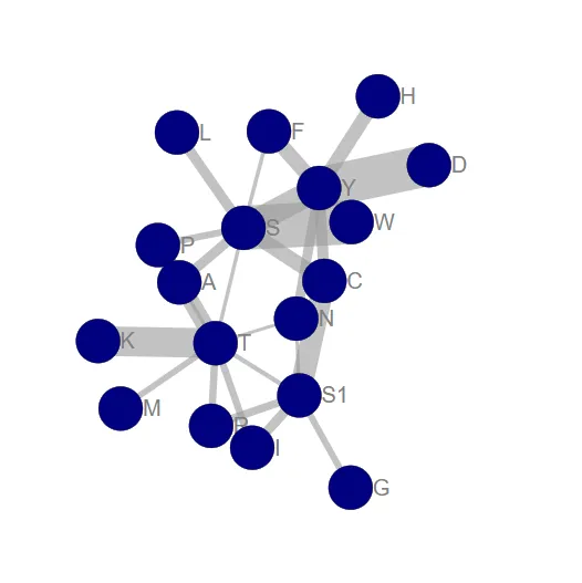
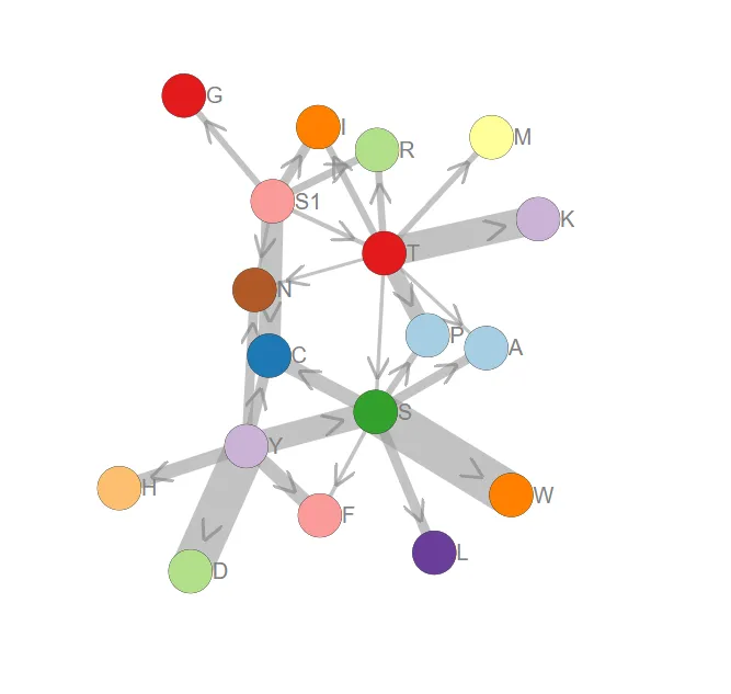
我正在使用Plotly的Python接口生成网络。我已经成功创建了一个具有所需节点和边的网络,并控制了节点的大小。 我急切地寻求以下帮助:
  1. 添加节点标签
  2. 根据权重列表添加边标签
  3. 根据权重列表控制边线宽度
所有这些都不能使用“悬停”选项,因为它必须在非交互式论文中运行。非常感谢任何帮助! Plotly输出 | 如果失败,图形本身 | matrix.csv 这是我的代码(大部分是从Networkx的Plotly教程中复制的):
import pandas as pd
import plotly.plotly as py
from plotly.graph_objs import *
import networkx as nx

matrix = pd.read_csv("matrix.csv", sep = "\t", index_col = 0, header = 0)

G = nx.DiGraph()

# add nodes:
G.add_nodes_from(matrix.columns)

# add edges:
edge_lst = [(i,j, matrix.loc[i,j])
            for i in matrix.index
            for j in matrix.columns
            if matrix.loc[i,j] != 0]
G.add_weighted_edges_from(edge_lst)

# create node trace:
node_trace = Scatter(x = [], y = [], text = [], mode = 'markers',
                    marker = Marker(
                    showscale = True,
                    colorscale = 'YIGnBu',
                    reversescale = True,
                    color = [],
                    size = [],
                    colorbar = dict(
                        thickness = 15,
                        title = 'Node Connections',
                        xanchor = 'left',
                        titleside = 'right'),
                    line = dict(width = 2)))

# set node positions
pos = nx.spring_layout(G)
for node in G.nodes():
    G.node[node]['pos']= pos[node]

for node in G.nodes():
    x, y = G.node[node]['pos']
    node_trace['x'].append(x)
    node_trace['y'].append(y)

# create edge trace:
edge_trace = Scatter(x = [], y = [], text = [],
                     line = Line(width = [], color = '#888'),
                     mode = 'lines')

for edge in G.edges():
    x0, y0 = G.node[edge[0]]['pos']
    x1, y1 = G.node[edge[1]]['pos']
    edge_trace['x'] += [x0, x1, None]
    edge_trace['y'] += [y0, y1, None]
    edge_trace['text'] += str(matrix.loc[edge[0], edge[1]])[:5]

# size nodes by degree
deg_dict = {deg[0]:int(deg[1]) for deg in list(G.degree())}
for node, degree in enumerate(deg_dict):
    node_trace['marker']['size'].append(deg_dict[degree] + 20)

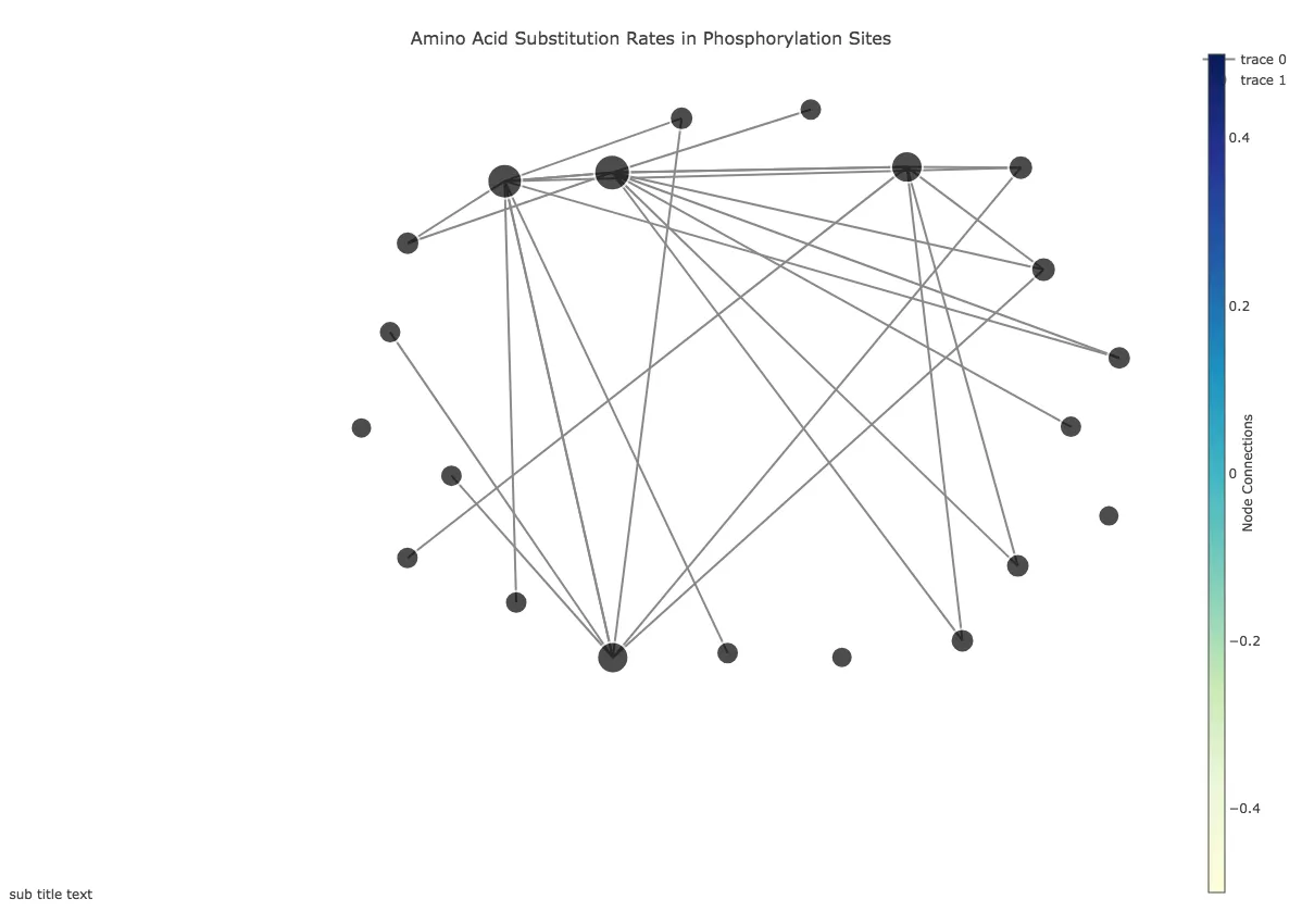
fig = Figure(data = Data([edge_trace, node_trace]),
             layout = Layout(
                 title = '<br>AA Substitution Rates',
                 titlefont = dict(size = 16),
                 showlegend = True,
                 margin = dict(b = 20, l = 5, r = 5, t = 40),
                 annotations = [dict(
                     text = "sub title text",
                     showarrow = False,
                     xref = "paper", yref = "paper",
                     x = 0.005, y = -0.002)],
                 xaxis = XAxis(showgrid = False, 
                               zeroline = False, 
                               showticklabels = False),
                 yaxis = YAxis(showgrid = False, 
                               zeroline = False, 
                               showticklabels = False)))

py.plot(fig, filename = 'networkx')
2个回答

5

所以

1. 解决这个问题相对简单,您可以创建一个包含节点ID的列表,并将其设置为散点图的text属性。然后将模式设置为"markers+text",就完成了。

2. 这有点棘手。您需要计算每条线的中心并创建一个包括线的中心位置和权重的字典列表。然后将其添加为布局的annotation

3. 我认为使用plotly太复杂了。目前,我正在使用networkx spring_layout函数计算每个节点的位置。如果您想根据其权重设置每条线的宽度,则需要使用一个函数来修改位置,该函数考虑到每条线所附加的所有标记。

奖励 我给你提供了将图形的每个组件颜色不同的选项。

这是我之前写的一个(稍作修改的)函数,可以做到12

import pandas as pd
import plotly.plotly as py
import plotly.graph_objs as go
from plotly.offline import download_plotlyjs, init_notebook_mode, plot, iplot
import networkx as nx

def scatter_plot_2d(G, folderPath, name, savePng = False):
    print("Creating scatter plot (2D)...")

    Nodes = [comp for comp in nx.connected_components(G)] # Looks for the graph's communities
    Edges = G.edges()
    edge_weights = nx.get_edge_attributes(G,'weight')

    labels = [] # names of the nodes to plot
    group = [] # id of the communities
    group_cnt = 0

    print("Communities | Number of Nodes")
    for subgroup in Nodes:
        group_cnt += 1
        print("      %d     |      %d" % (group_cnt, len(subgroup)))
        for node in subgroup:
            labels.append(int(node))
            group.append(group_cnt)

    labels, group = (list(t) for t in zip(*sorted(zip(labels, group))))

    layt = nx.spring_layout(G, dim=2) # Generates the layout of the graph
    Xn = [layt[k][0] for k in list(layt.keys())]  # x-coordinates of nodes
    Yn = [layt[k][1] for k in list(layt.keys())]  # y-coordinates
    Xe = []
    Ye = []

    plot_weights = []
    for e in Edges:
        Xe += [layt[e[0]][0], layt[e[1]][0], None]
        Ye += [layt[e[0]][1], layt[e[1]][1], None]
        ax = (layt[e[0]][0]+layt[e[1]][0])/2
        ay = (layt[e[0]][1]+layt[e[1]][1])/2
        plot_weights.append((edge_weights[(e[0], e[1])], ax, ay))

    annotations_list =[
                        dict(   
                            x=plot_weight[1],
                            y=plot_weight[2],
                            xref='x',
                            yref='y',
                            text=plot_weight[0],
                            showarrow=True,
                            arrowhead=7,
                            ax=plot_weight[1],
                            ay=plot_weight[2]
                        ) 
                        for plot_weight in plot_weights
                    ]

    trace1 = go.Scatter(  x=Xe,
                          y=Ye,
                          mode='lines',
                          line=dict(color='rgb(90, 90, 90)', width=1),
                          hoverinfo='none'
                        )

    trace2 = go.Scatter(  x=Xn,
                          y=Yn,
                          mode='markers+text',
                          name='Nodes',
                          marker=dict(symbol='circle',
                                      size=8,
                                      color=group,
                                      colorscale='Viridis',
                                      line=dict(color='rgb(255,255,255)', width=1)
                                      ),
                          text=labels,
                          textposition='top center',
                          hoverinfo='none'
                          )

    xaxis = dict(
                backgroundcolor="rgb(200, 200, 230)",
                gridcolor="rgb(255, 255, 255)",
                showbackground=True,
                zerolinecolor="rgb(255, 255, 255)"
                )
    yaxis = dict(
                backgroundcolor="rgb(230, 200,230)",
                gridcolor="rgb(255, 255, 255)",
                showbackground=True,
                zerolinecolor="rgb(255, 255, 255)"
                )

    layout = go.Layout(
        title=name,
        width=700,
        height=700,
        showlegend=False,
        plot_bgcolor="rgb(230, 230, 200)",
        scene=dict(
            xaxis=dict(xaxis),
            yaxis=dict(yaxis)
        ),
        margin=dict(
            t=100
        ),
        hovermode='closest',
        annotations=annotations_list
        , )
    data = [trace1, trace2]
    fig = go.Figure(data=data, layout=layout)
    plotDir = folderPath + "/"

    print("Plotting..")

    if savePng:
        plot(fig, filename=plotDir + name + ".html", auto_open=True, image = 'png', image_filename=plotDir + name,
         output_type='file', image_width=700, image_height=700, validate=False)
    else:
        plot(fig, filename=plotDir + name + ".html")

关于第二点,边缘标签,您可以在此处找到完整的文档[https://plotly.com/python/reference/#layout-annotations],了解您可以调整和修改的属性。 - Bendemann
2021年10月:plotly已被弃用,应该使用chart_studio进行替换。 - Filipe Pinto

1

d3graph库提供了您所需的功能。

pip install d3graph

我已经下载了您的数据并将其导入进行演示:
# Import data
df = pd.read_csv('data.csv', index_col=0)

# Import library
from d3graph import d3graph

# Convert your Pvalues. Note that any edge is set when a value in the matrix is >0. The edge width is however based on this value. A conversion is therefore useful when you work with Pvalues.
df[df.values==0]=1
df = -np.log10(df)
# Increase some distance between edges. Maybe something like this.
df = (np.exp(df)-1)/10

# Make the graph with default settings
d3 = d3graph()

# Make the graph by setting some parameters
d3.graph(df)

# Set edge properties
d3.set_edge_properties(directed=True)

# Set node properties
d3.set_node_properties(color=df.columns.values, size=size, edge_size=10, edge_color='#000000', cmap='Set2')

这将生成一个交互式网络图。两张截图:一张是默认设置,另一张是调整后的设置。更多示例可在此处找到。

Default settings Tweaked d3graph


网页内容由stack overflow 提供, 点击上面的
可以查看英文原文,
原文链接