Matplotlib:绘制连接点并忽略缺失数据的线

89

我有一组数据,想要将其绘制成折线图。对于每个系列,都有一些缺失的数据(但是每个系列的缺失数据不同)。目前,matplotlib无法绘制遗漏数据的线条,例如:

import matplotlib.pyplot as plt

xs = range(8)
series1 = [1, 3, 3, None, None, 5, 8, 9]
series2 = [2, None, 5, None, 4, None, 3, 2]

plt.plot(xs, series1, linestyle='-', marker='o')
plt.plot(xs, series2, linestyle='-', marker='o')

plt.show()

绘图结果中存在线条间断的空洞。我该如何告诉matplotlib在这些空洞中绘制连续的线条?(我不想插值数据)。

8个回答

113

您可以使用以下方式掩盖NaN值:

import numpy as np
import matplotlib.pyplot as plt

xs = np.arange(8)
series1 = np.array([1, 3, 3, None, None, 5, 8, 9]).astype(np.double)
s1mask = np.isfinite(series1)
series2 = np.array([2, None, 5, None, 4, None, 3, 2]).astype(np.double)
s2mask = np.isfinite(series2)

plt.plot(xs[s1mask], series1[s1mask], linestyle='-', marker='o')
plt.plot(xs[s2mask], series2[s2mask], linestyle='-', marker='o')

plt.show()

这导致

图表


1
你是否了解关于numpy.double(None)返回nan的参考资料?我在NumPy数据类型页面上找不到任何信息。 - Eric O. Lebigot
太棒了!非常感谢,我有点迷失在这个问题上了!+1 - OParker
1
这只适用于整数x吗?如何解决字符串x值(例如['1H','2H','3O',...])的问题? - Joonho Park

12

引用 @Rutger Kassies (链接):

Matplotlib 仅在连续(有效)数据点之间绘制线条,并在 NaN 值处留下间隙。

如果您正在使用 Pandas,则可以采取以下解决方案:

#pd.Series 
s.dropna().plot() #masking (as @Thorsten Kranz suggestion)

#pd.DataFrame
df['a_col_ffill'] = df['a_col'].ffill()
df['b_col_ffill'] = df['b_col'].ffill()  # changed from a to b
df[['a_col_ffill','b_col_ffill']].plot()

3
将来参考:至少在 pandas 0.17+ 版本中,应该使用 df.ffill()df.fillna(method='ffill') - deepbrook
5
如果不同列中的NaN值位置不同,第一个建议根本行不通,就像OP问题中的情况一样。第二个建议与OP预期的行为相差很远。a)它使用系列中的先前值填充NaN值,这会扭曲曲线。如果进行插值,则不会发生这种情况。b)如果像OP代码中所做的那样绘制标记,您将得到实际上在数据中为NaN的点的标记。 - Joooeey

7

使用pandas的解决方案:

import matplotlib.pyplot as plt
import pandas as pd

def splitSerToArr(ser):
    return [ser.index, ser.as_matrix()]


xs = range(8)
series1 = [1, 3, 3, None, None, 5, 8, 9]
series2 = [2, None, 5, None, 4, None, 3, 2]

s1 = pd.Series(series1, index=xs)
s2 = pd.Series(series2, index=xs)

plt.plot( *splitSerToArr(s1.dropna()), linestyle='-', marker='o')
plt.plot( *splitSerToArr(s2.dropna()), linestyle='-', marker='o')

plt.show()

splitSerToArr 函数在 Pandas 中绘制时非常方便。这是输出结果:enter image description here


2
有没有使用DataFrame的方法来实现这个?或者使用pandas的.plot()函数? - Jayen
我已经用DataFrame几乎实现了它,使用for column in df: s = df[column].dropna(); plt.plot(s.index, s.as_matrix(), linestyle='-', marker='o'),但第一列没有使用第一个索引,因此x轴失去了排序。 - Jayen
如果您将 s1 = pd.Series(series1, index=xs) 替换为 s1 = pd.Series(df.columnname, index=xs),其中 df 是您的数据框名称,那么它可以与数据框一起使用。 - Cebbie

3

如果没有插值,您需要从数据中删除None。这也意味着您需要删除系列中对应于None的X值。以下是一个(丑陋的)一行代码来完成这个操作:

  x1Clean,series1Clean = zip(* filter( lambda x: x[1] is not None , zip(xs,series1) ))
lambda函数对于None值返回False,从列表中过滤掉x、series键值对,然后重新将数据压缩回其原始形式。

2
如果你的序列包含0怎么办?你应该绝对使用lambda x: x is not None - Thorsten Kranz

1

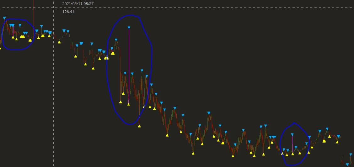
我曾经遇到同样的问题,但是使用遮罩消除了点之间的问题,而线条则会被切断(在图片中看到的粉色线条是唯一连续不为NaN的数据,因此形成了这条线)。以下是应用遮罩后的数据结果(仍然存在间隙):

xs  = df['time'].to_numpy()
series1 = np.array(df['zz'].to_numpy()).astype(np.double)
s1mask = np.isfinite(series1)

fplt.plot(xs[s1mask], series1[s1mask], ax=ax_candle, color='#FF00FF', width = 1, legend='ZZ')

enter image description here

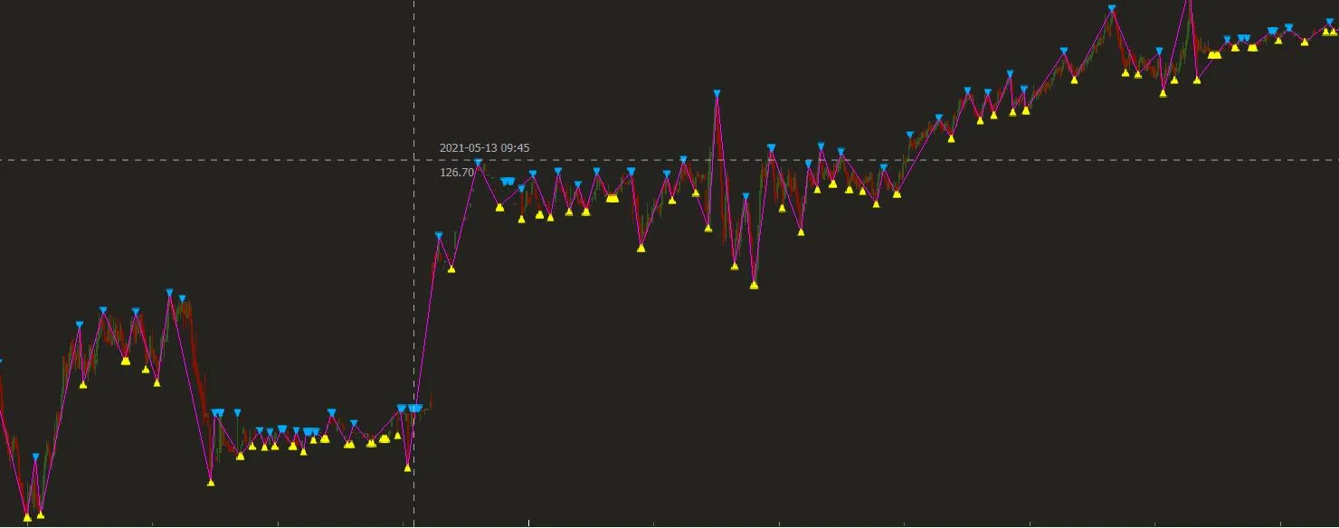
也许是因为我使用了finplot(绘制蜡烛图),所以我决定使用线性公式y2-y1=m(x2-x1)来补充缺失的Y轴点,然后制定生成缺失点之间Y值的函数。
def fillYLine(y):
    #Line Formula
    fi=0
    first = None
    next = None
    for i in range(0,len(y),1):
        ne = not(isnan(y[i]))
        next = y[i] if ne else next
    
        if not(next is None):
            if not(first is None):
                m = (first-next)/(i-fi) #m = y1 - y2 / x1 - x2
                cant_points = np.abs(i-fi)-1
                if (cant_points)>0:
                    points = createLine(next,first,i,fi,cant_points)#Create the line with the values of the difference to generate the points x that we need    
                    x = 1
                    for p in points:
                        y[fi+x] = p
                        x = x + 1
            first = next
            fi = i
        next = None
    return y

def createLine(y2,y1,x2,x1,cant_points):
    m = (y2-y1)/(x2-x1) #Pendiente
    points = []
    x = x1 + 1#first point to assign
    for i in range(0,cant_points,1):
        y = ((m*(x2-x))-y2)*-1
        points.append(y)
        x = x + 1#The values of the line are numeric we don´t use the time to assign them, but we will do it at the same order
    return points

然后我使用简单的函数调用来填补它们之间的空隙,比如 y = fillYLine(y),我的 finplot 就像这样:

x = df['time'].to_numpy()
y = df['zz'].to_numpy()
y = fillYLine(y)
fplt.plot(x, y, ax=ax_candle, color='#FF00FF', width = 1, legend='ZZ')

enter image description here

您需要注意的是,Y变量中的数据仅用于绘图,我需要在操作过程中保留NaN值(或从列表中删除它们),这就是为什么我从pandas数据集df ['zz']创建了一个Y变量的原因。

注意:我注意到数据被消除是因为如果我不掩盖X(xs),值会向左滑动在图表中,此时它们变成连续的非NaN值并且绘制连续线但向左缩小:

fplt.plot(xs, series1[s1mask], ax=ax_candle, color='#FF00FF', width = 1, legend='ZZ') #No xs masking (xs[masking])

enter image description here

这让我想到,一些人戴口罩的原因是因为他们只在意那条线或者非戴口罩数据和戴口罩数据之间没有太大差异(缺口很少,不像我的数据有很多)。

1

可能有所帮助的是,在一些尝试和错误之后,我想为Thorsten的解决方案添加一个澄清。希望这能节省用户的时间,让他们在尝试了这种方法后不再去寻找其他方法。

使用相同的方法时,我无法成功解决一个相同的问题。

from pyplot import *

尝试使用绘图。
plot(abscissa[mask],ordinate[mask])

似乎需要使用import matplotlib.pyplot as plt来正确处理NaN值,尽管我无法说出原因。

1

针对pandas数据框的另一种解决方案:

plot = df.plot(style='o-') # draw the lines so they appears in the legend
colors = [line.get_color() for line in plot.lines] # get the colors of the markers
df = df.interpolate(limit_area='inside') # interpolate
lines = plot.plot(df.index, df.values) # add more lines (with a new set of colors)
for color, line in zip(colors, lines):
  line.set_color(color) # overwrite the new lines colors with the same colors as the old lines

-1

也许我没有理解到重点,但我认为 Pandas 现在已经 自动完成此操作。以下示例有些复杂,需要互联网访问,但是中国的那一行在前几年有很多间隙,因此有一些直线段。

import pandas as pd 
import numpy as np 
import matplotlib.pyplot as plt

# read data from Maddison project 
url = 'http://www.ggdc.net/maddison/maddison-project/data/mpd_2013-01.xlsx'
mpd = pd.read_excel(url, skiprows=2, index_col=0, na_values=[' ']) 
mpd.columns = map(str.rstrip, mpd.columns)

# select countries 
countries = ['England/GB/UK', 'USA', 'Japan', 'China', 'India', 'Argentina']
mpd = mpd[countries].dropna()
mpd = mpd.rename(columns={'England/GB/UK': 'UK'})
mpd = np.log(mpd)/np.log(2)  # convert to log2 

# plots
ax = mpd.plot(lw=2)
ax.set_title('GDP per person', fontsize=14, loc='left')
ax.set_ylabel('GDP Per Capita (1990 USD, log2 scale)')
ax.legend(loc='upper left', fontsize=10, handlelength=2, labelspacing=0.15)
fig = ax.get_figure()
fig.show() 

2
不,这不会自动发生。您需要在mpd = mpd[countries].dropna()行中执行此操作。这与Nasser建议的相同,但不起作用,因为它也删除了许多有趣的数据。基本上,如果任何国家在某一年没有数据,则该年份将从图表中省略。 - Joooeey

网页内容由stack overflow 提供, 点击上面的
可以查看英文原文,
原文链接