我正在尝试绘制几条线(不是像这个例子中的条形图)。我的y值是
我的值:
我正在使用的代码并没有给我想要的结果:
float,而x值是categorical data。如何在matplotlib中实现?我的值:
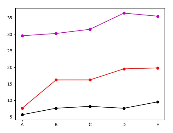
data1=[5.65,7.61,8.17,7.60,9.54]
data2=[7.61,16.17,16.18,19.54,19.81]
data3=[29.55,30.24,31.51,36.40,35.47]
我的分类:
x_axis=['A','B','C','D','E']
我正在使用的代码并没有给我想要的结果:
import matplotlib.pyplot as plt
fig=plt.figure() #Creates a new figure
ax1=fig.add_subplot(111) #Plot with: 1 row, 1 column, first subplot.
line1 = ax1.plot(str(x_axis), data1,'ko-',label='line1') #Plotting data1
line2 = ax1.plot(str(x_axis), data2,'ro-',label='line2') #Plotting data2
line3 = ax1.plot(str(x_axis), data3,'mo-',label='line3') #Plotting data3
plt.xticks(range(len(data3)), x_axis, size='small')
ax1.set_ylim(0,51)
ax1.set_ylabel('y values',fontsize=12)
#Assigning labels
lines = line1+line2+line3
labels = [l.get_label() for l in lines]
ax1.legend(lines,labels,loc='upper center', prop={'size':10}, bbox_to_anchor=(0.5, -0.13), fancybox=True, shadow=True, ncol=5)
ax1.set_xlabel('Categories',fontsize=14)
plt.setp(ax2.get_xticklabels(), visible=True)
title_string=('Plotting categories vs y values in matplotlib')
plt.suptitle(title_string, y=1.0, fontsize=17)
fig.tight_layout()
fig.subplots_adjust(top=0.92,bottom=0.2)
plt.show()
plt.savefig('myplot.jpg',bbox_inches='tight')
plt.close()
xticks来实现。如果你想要更复杂的效果,提供结果的图片会很有帮助。 - Mel