问题:
我有一个数据集,其中包含x和y值对,以及y的lower_limit和upper_limit值。
我想在plot.ly散点图中绘制x vs. y,并如果lower_limit ≤ y ≤ upper_limit, 将标记颜色设为绿色,否则为红色。
我知道可以使用2个跟踪轨迹,或者在DataFrame中添加color列。但是,我想即时生成这些颜色并仅使用一个跟踪轨迹。
示例:
考虑以下数据集:
   x   y  lower_limit  upper_limit
0  1  13           10           15
1  2  13           15           20
2  3  17           15           20
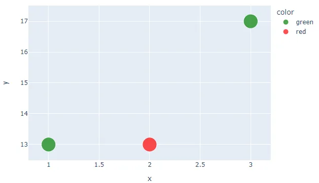
第一个标记(
x=1,y=13)应该是绿色的,因为 lower_limit ≤ y ≤ upper_limit(10 ≤ 13 ≤ 15),就像第三个一样。然而,第二个标记应该是红色的,因为
y < lower_limit。然后我想生成这个图表:
import pandas as pd
import plotly.graph_objs as go
import plotly.plotly as py
import plotly.offline as po

data = [
    [1, 13, 10, 15],
    [2, 13, 15, 20],
    [3, 17, 15, 20]
]

df = pd.DataFrame(
    data,
    columns=['x', 'y', 'lower_limit', 'upper_limit']
)

trace = go.Scatter(
    x=df['x'],
    y=df['y'],
    mode='markers',
    marker=dict(
        size=42,
        # I want the color to be green if
        # lower_limit ≤ y ≤ upper_limit
        # else red
        color='green',
    )
)

po.plot([trace])