使用lmer绘制预测值的单一图形

4

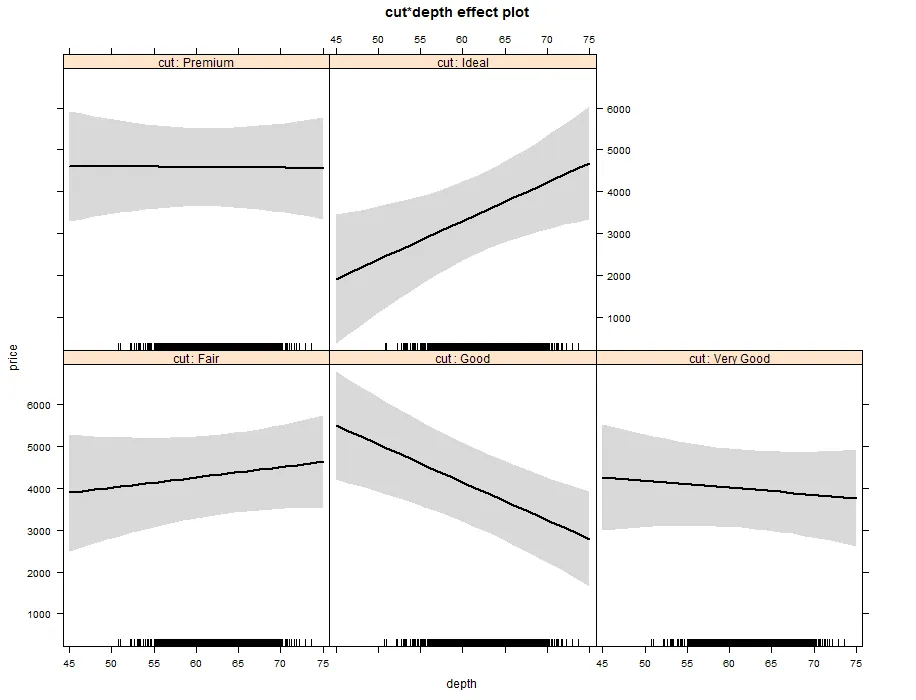
我正在处理使用lme4包创建的多层模型预测值的图表。我能够成功地使用Effect()函数实现这一点。如下所示:

library(lme4)
library(effects)
m1=lmer(price~depth*cut+(1|cut),diamonds)
plot(Effect(c("cut","depth"),m1))

enter image description here

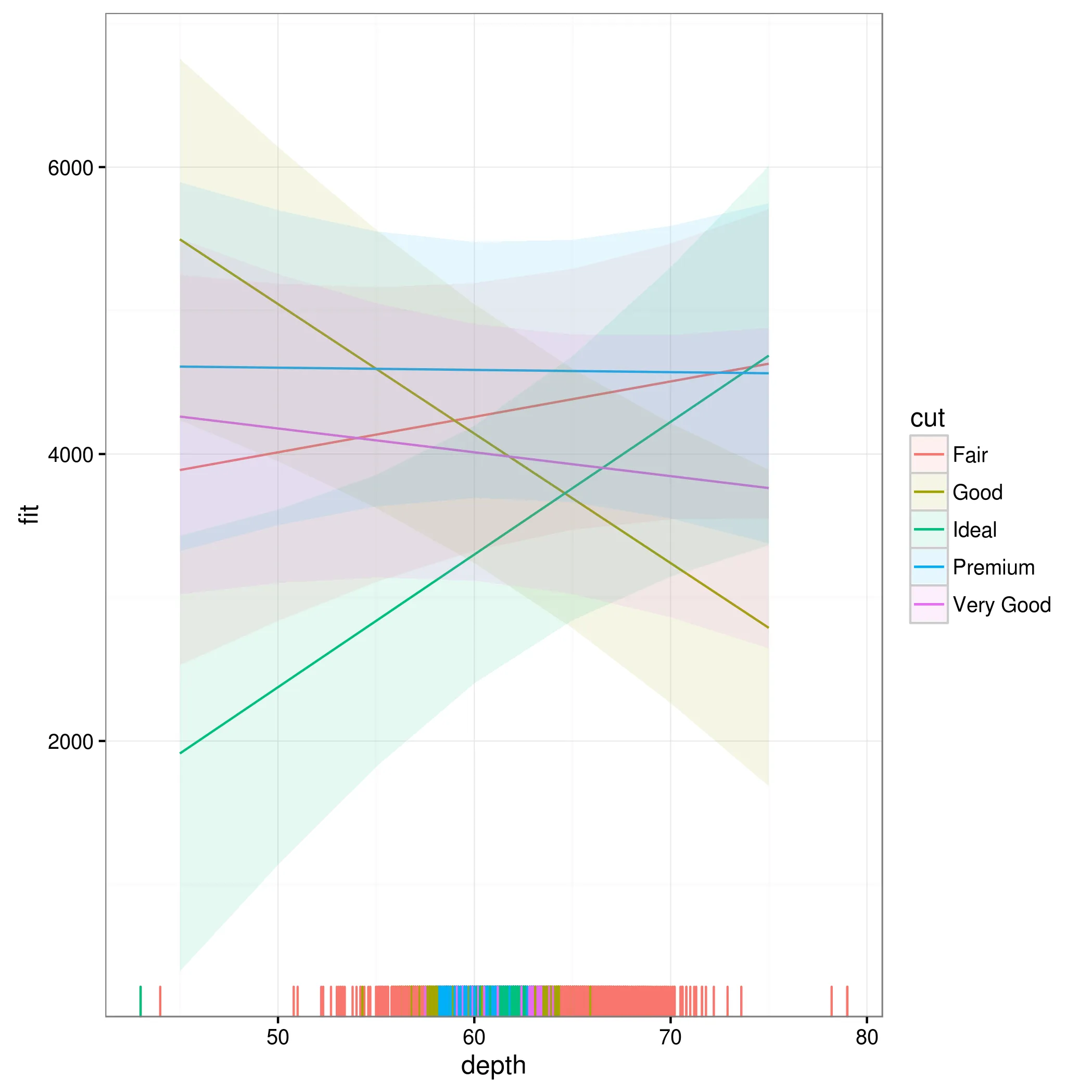
然而,我想要将这些数据作为一张图表呈现,并带有图例。使用ggplots,我可以做到这一点;但是,我会失去误差条,如下所示:

ggplot(data.frame(Effect(c("cut","depth"),m1)),
       aes(x=depth,y=fit,color=cut,group=cut))+
  geom_line()

这里输入图片描述

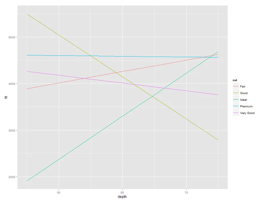
如何将带误差线的第一个图重新创建为单个图?

1个回答

8
怎么样:
library(effects)
library(lme4)
library(ggplot2)
m1 <- lmer(price~depth*cut+(1|cut),diamonds)

顺便提一句,注意这个模型毫无意义(因子同时作为固定和随机项!)。我希望你只是将其用作说明…

ee <- Effect(c("cut","depth"),m1) 

关键是使用 as.data.frame() 将效果对象转换为有用的内容...
theme_set(theme_bw())
ggplot(as.data.frame(ee),
       aes(depth,fit,colour=cut,fill=cut))+
    geom_line()+
     ## colour=NA suppresses edges of the ribbon
    geom_ribbon(colour=NA,alpha=0.1,
                            aes(ymin=lower,ymax=upper))+
     ## add rug plot based on original data
        geom_rug(data=ee$data,aes(y=NULL),sides="b")

enter image description here


网页内容由stack overflow 提供, 点击上面的
可以查看英文原文,
原文链接