我希望使用
导致结果为: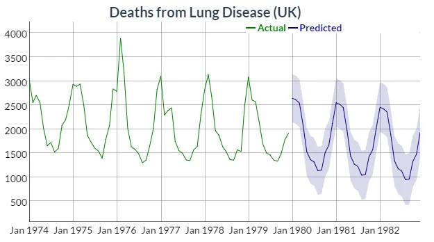 关于绘制的对象
我无法使用“forecast”包中的预测来创建这种类型的对象。
使用我的“forecast”模型“unemp.mod”,我创建了以下预测:
dygraphs绘制forecast时间序列模型的预测结果。根据文档,建议采用以下方法来绘制包含实际值的预测结果:hw <- HoltWinters(ldeaths)
p <- predict(hw, n.ahead = 36, prediction.interval = TRUE)
all <- cbind(ldeaths, p)
dygraph(all, "Deaths from Lung Disease (UK)") %>%
dySeries("ldeaths", label = "Actual") %>%
dySeries(c("p.lwr", "p.fit", "p.upr"), label = "Predicted")
导致结果为:
关于绘制的对象all有趣的是它的类别:
> class(all)
[1] "mts"    "ts"     "matrix"
> is.mts(all)
[1] TRUE
> is.ts(all)
[1] TRUE
> is.matrix(all)
[1] TRUE
str为对象all提供了更多信息:
> str(all)
 Time-Series [1:108, 1:4] from 1974 to 1983: 3035 2552 2704 2554 2014 ...
 - attr(*, "dimnames")=List of 2
  ..$ : NULL
  ..$ : chr [1:4] "ldeaths" "p.fit" "p.upr" "p.lwr"
进一步检查显示all是一个数组:
> tail(all)
         ldeaths     p.fit    p.upr     p.lwr
Jul 1982      NA 1128.3744 1656.127  600.6217
Aug 1982      NA  948.6089 1478.090  419.1282
Sep 1982      NA  960.1201 1491.429  428.8112
Oct 1982      NA 1326.5626 1859.802  793.3235
Nov 1982      NA 1479.0320 2014.306  943.7583
Dec 1982      NA 1929.8349 2467.249 1392.4206
> dim(all)
[1] 108   4
> is.array(all)
[1] TRUE
我无法使用“forecast”包中的预测来创建这种类型的对象。
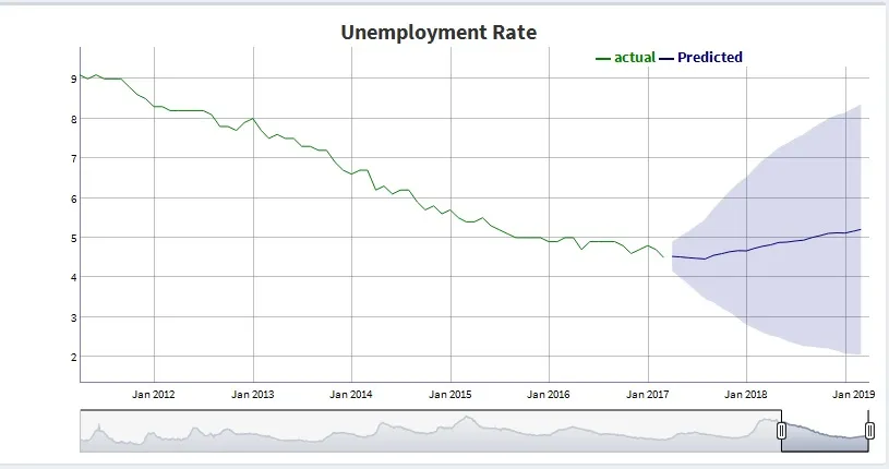
使用我的“forecast”模型“unemp.mod”,我创建了以下预测:
> f <- forecast(unemp.mod)
> f
         Point Forecast    Lo 80    Hi 80    Lo 95    Hi 95
Apr 2017       4.528274 4.287324 4.769224 4.159773 4.896775
May 2017       4.515263 4.174337 4.856189 3.993861 5.036664
Jun 2017       4.493887 4.055472 4.932303 3.823389 5.164386
Jul 2017       4.479992 3.936385 5.023599 3.648617 5.311367
Aug 2017       4.463073 3.807275 5.118871 3.460116 5.466030
虽然它看起来与示例中的数组相似,但它是完全不同的对象:
> class(f)
[1] "forecast"
> str(f)
List of 10 <truncated>
如果我尝试使用基本的R语言predict函数生成预测结果,就像示例中一样,我也会得到一个列表对象:
> predict(unemp.mod, n.ahead = 5, prediction.interval = TRUE)
$pred
          Apr      May      Jun      Jul      Aug
2017 4.528274 4.515263 4.493887 4.479992 4.463073

$se
           Apr       May       Jun       Jul       Aug
2017 0.1880140 0.2660260 0.3420974 0.4241788 0.5117221
有人有关于如何使用dygraphs创建正确对象以基于forecast模型预测绘图的建议吗?