在时间轴上将时间跨度可视化为水平的直方图/条形图

3
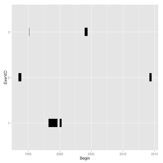
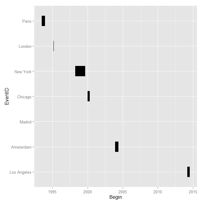
我有一个包含6个事件和它们发生时间段的csv表格。我的变量是开始日期、结束日期和事件ID。我想要创建一个横向柱状图,来展示不同类型事件持续的时间范围。X轴应该是跨越多年的日期,Y轴应该是不同种类的事件ID。理想情况下,我希望水平条形的长度代表时间跨度。一个事件会有多个时间段,即事件开始-结束,几个月后再次开始、持续一段时间并再次结束。我有大约6个事件ID,每个ID都有多个不同的发生时间段。我只想看到时间线上的发生情况,以获得一个概览......
编辑: 表格大致如下:
Begin      End          EventID
01.01.2000 01.05.2000   Chicago
03.04.1998 03.09.1999   New York
12.03.2014 16.07.2014   Los Angeles
12.12.2003 03.06.2004   Amsterdam
21.06.1993 14.12.1993   Paris
27.02.1995 15.03.1995   London
14.06.2002 15.06.2002   Madrid

我尝试了以下代码:
cities <- read.table(textConnection("Begin End EventID
01.01.2000 01.05.2000   Chicago
03.04.1998 03.09.1999   New York
12.03.2014 16.07.2014   Los Angeles
12.12.2003 03.06.2004   Amsterdam
21.06.1993 14.12.1993   Paris
27.02.1995 15.03.1995   London
14.06.2002 15.06.2002   Madrid
"), sep=" ", header=TRUE)

cities$Begin<- as.Date(cities$Begin, "%d.%m.%Y")
cities$End<- as.Date(cities$End, "%d.%m.%Y")
cities$EventID<- as.factor(cities$EvenID)
cities$Sep <- as.factor(1:length(cities$Begin))

library(ggplot2)

p <- ggplot(data=cities) + geom_segment(aes(x=Begin, xend=End, y=EventID, yend=EventID, 
group=Sep), size=12)

针对:

cities$EventID<- as.factor(cities$EvenID) 

我收到了一个错误信息,因为EventID不包含整数。

Error in `$<-.data.frame`(`*tmp*`, "EventID", value = integer(0)) : 
Replacement has 0 rows. Data has 75

我需要将EventID中的数据转换成其他格式吗?如果需要,那应该是什么格式?


这段代码无法复现,城市名称中包含空格,因此不能使用空格作为分隔符进行读取。特定的代码 cities$EventID<- as.factor(cities$EvenID) 只是一个打字错误,应该是 EvenID 应该是 EventID - Andy W
1个回答

4
这是一个使用ggplot2包制作的示例,语法使得构建此图表变得相对容易(复制您的数据需要更多代码!)
Lines <- read.table(textConnection("Begin End EventID
01.01.2000 01.05.2000 1
03.04.1998 03.09.1999 1
12.03.2014 16.07.2014 2
12.12.2003 03.06.2004 3
21.06.1993 14.12.1993 2
27.02.1995 15.03.1995 3
14.06.2002 15.06.2002 2
"), sep=" ", header=TRUE)

Lines$Begin <- as.Date(Lines$Begin, "%d.%m.%Y")
Lines$End <- as.Date(Lines$End, "%d.%m.%Y")
Lines$EventID <- as.factor(Lines$EventID)
Lines$Sep <- as.factor(1:length(Lines$Begin))

library(ggplot2)

p <- ggplot(data=Lines) + 
     geom_segment(aes(x = Begin, xend = End, y = EventID, yend = EventID, group=Sep)
     ,size =12)
p

输入图像描述

你对时间间隔的直方图的描述让我想起了这个,但那似乎不是你所问的。


通过您更新的代码,问题仅在于错别字。以下是使用您的新数据的示例(修正了 read.table 的错误,并将 EventID 转换为因子时出现的拼写错误)。

在此,我还根据最早日期将图表排序。请注意,在此示例中,实际上不需要 Sep 分组变量,因为您没有相同城市的多个时间跨度。

cities <- read.table(textConnection("Begin End EventID
01.01.2000 01.05.2000 Chicago
03.04.1998 03.09.1999 New_York
12.03.2014 16.07.2014 Los_Angeles
12.12.2003 03.06.2004 Amsterdam
21.06.1993 14.12.1993 Paris
27.02.1995 15.03.1995 London
14.06.2002 15.06.2002 Madrid
"), sep=" ", header=TRUE)

cities$Begin <- as.Date(cities$Begin, "%d.%m.%Y")
cities$End <- as.Date(cities$End, "%d.%m.%Y")
cities$EventID <- gsub("_"," ",cities$EventID)
cities$EventID <- as.factor(cities$EventID)
cities$Sep <- as.factor(1:length(cities$Begin))

#sorting levels so earliest is at top of graph
cities <- transform(cities, EventID=reorder(EventID, -rank(Begin)))

p <- ggplot(data=cities) + 
     geom_segment(aes(x=Begin, xend=End, y=EventID, yend=EventID, group=Sep), size=12)
p 

enter image description here


笔和纸可能更快! - Andy W
安迪,我还有一个问题,如果事件ID实际上是用字母写的,即它们是名称(为了上面的示例,我使用数字,但它们实际上是名称),那么我应该将事件ID转换成什么? - AC11
@AC11构建图表时并不重要。只要确保它们是因子变量,ggplot2会自动生成适当的坐标轴标签。 - Andy W
好的,虽然事件ID是字符串,但我刚刚使用了as.factor。时间段没有被绘制到ggplot中,但是每个观察结果都会出现“警告”: “已删除1行包含缺失值(geom_segment)”。这可能是由于事件ID转换引起的。 - AC11
不确定,您需要为我创建一个可重现的示例,以便我能够给出任何好的建议。日期时间是否实际编码为日期,而不是因子或字符串?还要确保具有分组变量,就像我在代码中创建的那样(称为“Sep”)。 - Andy W
显示剩余4条评论

网页内容由stack overflow 提供, 点击上面的
可以查看英文原文,
原文链接