ggplot2如何完全自定义图例?

8
有没有办法创建一个完全自定义的图例,不需要考虑我的绘图中的美学或其他任何内容?如果可能的话,我想从头设计一切。每个图例将有多少组,标题、形状、颜色、大小、线型、填充、标签、顺序等都将是什么。我已经花了将近两个工作日来尝试创建图例,使它们看起来像我想要的样子(在我有数据之后,绘图本身只花费了几分钟)。
请查看以下示例代码(随机数据,但用于演示我想要的内容):
require(dplyr)
require(RColorBrewer)

col <- brewer.pal(3, "Spectral")

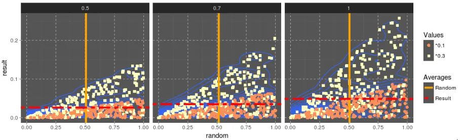
a <- data.frame(multiplier = c(0.5, 0.7, 1.0), multiplier2 = c(0.3, 0.1), random = runif(3 * 500))
a$result = a$multiplier * a$random * runif(length(a$random)) * a$multiplier2

a_grouped_by_multiplier = group_by(a, multiplier)
means = summarise(a_grouped_by_multiplier, mean_rand = mean(random), mean_res = mean(result))

ggplot(a, aes(x = random, y = result)) +
  geom_density2d(bins = 20) +
  geom_point(aes(color = factor(multiplier2)), size = 0.7) +
  geom_vline(data = means, aes(xintercept = mean_rand), color = "orange", linetype = "solid", size = 1.5, show.legend = TRUE) +
  geom_hline(data = means, aes(yintercept = mean_res), color = "red", linetype = "dashed", size = 1.5, show.legend = TRUE) +
  scale_color_manual(name = "Values", values = c(col[1], col[2]), labels = c("* 0.1", "* 0.3")) +
  facet_grid(~ multiplier) +
  theme(panel.grid.major = element_line(colour = "white", linetype = "dashed", size = 0.3),
        panel.grid.minor = element_blank(),
        panel.background = element_rect(fill = "#555555"),
        legend.key = element_rect(fill = "#555555"))

这将创建以下图表:

enter image description here

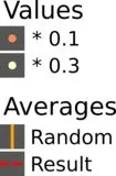
我尝试了定制无数参数以获得期望的结果。使用了所有不同的scale_*_manual函数,并使用不同的参数,使用了show.legends = FALSE,尝试了使用不同的guide_legend()参数的guide()函数,我尝试使colorlinetypesize等参数成为美学的一部分(一个接一个和全部组合),但迄今为止没有任何方法可以创建如下所示的图例(在inkscape中创建):

enter image description here

我的第一个问题是我不能得到两个图例组:一个用于“值”,一个用于“平均值”。第二个问题是由于geom_hlinegeom_vline,垂直和水平线出现在所有的图例框中。请注意,我还为geom_hlinegeom_vline使用了不同的数据帧。


简短的回答是不行,ggplot图例与美学紧密相连。但它们是非常可定制的。在这种情况下,您需要找到一种方法将平均值作为美学元素,可以通过创建虚拟数据框并使用geom_abline来实现。 - alistaire
1个回答

10

在编码方面,我成功绘制了我想要的图形,但是这种方法很丑陋。简而言之,我添加了不同的美学元素,直到我得到了至少两个具有所需元素和形状的图例组。然后,我使用scale_*_manual函数和guide()函数来覆盖一些美学元素,使图例看起来几乎像它应该的样子(但我仍然没有办法在图例框中绘制垂直线)。

以下是代码:

ggplot(a, aes(x = random, y = result)) +
  geom_density2d(bins = 20) +
  geom_point(aes(color = factor(multiplier2), shape = factor(multiplier2), fill = factor(multiplier2)), stroke = 0.01, size = 2.5) +
  geom_vline(data = means, aes(xintercept = mean_rand, color = "mean_rand", size = "mean_rand"), show.legend = FALSE) +
  geom_hline(data = means, aes(yintercept = mean_res, color = "mean_res", size = "mean_res"), linetype = 12, show.legend = FALSE) +
  scale_color_manual(values = c(col[1], col[2], "orange", "red")) +                             # Provides the desired colors for the plot
  scale_shape_manual(name = "Values", values = c(21, 22), labels = c("*0.1", "*0.3")) +         # Provides the desired shape and plots the "Values" legend
  scale_fill_manual(name = "Values", values = c(col[1], col[2]), labels = c("*0.1", "*0.3")) +  # Provides the fill for the shapes and merges the legend with the shape ("Values") legend
  scale_size_manual(name = "Averages", values = c(1.5, 1.5), labels = c("Random", "Result")) +  # Provides a legend for the Averages but looks ugly.....
  guides(color = FALSE,  # Hides the "color" legend because it has 4 values and we don't want that.
         shape = guide_legend(order = 1), # Forces the "Values" legend group to be on top
         fill = guide_legend(order = 1),  # Forces the "Values" legend group to be on top
         size = guide_legend(order = 2, override.aes = list(linetype = c(1, 12), color = c("orange", "red")))) +  # Makes the "Average" legend to look as it should, by overriding the aesthetics
  facet_grid(~ multiplier) +
  theme_dark() +
  theme(panel.grid.major = element_line(colour = "white", linetype = "dashed", size = 0.2),
        panel.background = element_rect(fill = "#555555"),
        legend.key = element_rect(fill = "#555555"))

这就是结果的样子:

在此输入图片描述


网页内容由stack overflow 提供, 点击上面的
可以查看英文原文,
原文链接