ggplot2:如何显示图例

12

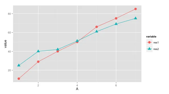
我用 ggplot2 制作了一个简单的经典图表,它是两个图形合并在一起。但是,我在显示图例时遇到了困难。图例没有显示出来。我没有使用融合和重塑的方法,只是用了经典的方式。以下是我的代码。

df <- read.csv("testDataFrame.csv")

graph <- ggplot(df, aes(A)) + 
  geom_line(aes(y=res1), colour="1") +
  geom_point(aes(y=res1), size=5, shape=12) +
  geom_line(aes(y=res2), colour="2") +
  geom_point(aes(y=res2), size=5, shape=20) +
  scale_colour_manual(values=c("red", "green")) +
  scale_x_discrete(name="X axis") +
  scale_y_continuous(name="Y-axis") +
  ggtitle("Test") 
  #scale_shape_discrete(name  ="results",labels=c("Res1", "Res2"),solid=TRUE) 

print(graph)

数据框架为:

 A,res1,res2
 1,11,25
 2,29,40
 3,40,42
 4,50,51
 5,66,61
 6,75,69
 7,85,75

有什么建议可以展示上图的图例吗?

1个回答

12
ggplot2 中,每个你设置的美学元素(如groupcolourshape)都会显示图例。为此,你需要将数据转换成以下格式:
A variable value
1     res1    11
...    ...    ...
6     res1    85
7     res2    75

使用reshape2中的melt函数,您可以实现此操作(如下所示):

require(reshape2)
require(ggplot2)

ggplot(dat = melt(df, id.var="A"), aes(x=A, y=value)) + 
      geom_line(aes(colour=variable, group=variable)) + 
      geom_point(aes(colour=variable, shape=variable, group=variable), size=4)

例如,如果您不想为点设置颜色,则只需从geom_point(aes(.))中删除colour=variable。有关更多图例选项,请访问this link

enter image description here


谢谢。我该如何更改颜色变量的名称?除了在图例中显示变量外,我能否将其重命名为“结果”等其他名称?有没有办法?对于形状,我只是删除了颜色并使用了scale_shape_discrete(name ="Results",labels = c("Res1","Res2"),solid = TRUE),它可以正常工作。不确定如何使用颜色进行更改? - SimpleNEasy
直接/简单的方法是将融合后的数据框保存到一个变量中,例如:df.m <- melt(df, id.var="A")。现在,您可以将 df.m 的列名更改为任何您想要的名称。 - Arun

网页内容由stack overflow 提供, 点击上面的
可以查看英文原文,
原文链接