我正在努力让绘图标签以特定的方式呈现。我正在使用ggplot2和tidyverse。
这是我的代码:
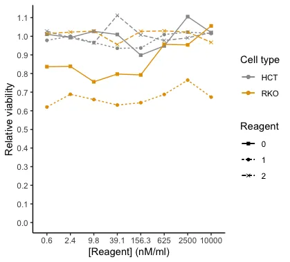
我希望图例有两个标题(=名称),一个是细胞类型HCT,另一个是细胞类型RKO。然后对于HCT和RKO,我想要具有相应颜色、线型和形状的试剂的图例。因此,基本上,我想将颜色图例分成两个单独的图例。我只是无法理解如何编写代码。这是我想要的绘图图例(请想象橙色正方形被填充):

注意:我决定不使用facet_wrap,因为我想在同一张图上显示两种细胞类型。真实数据的图看起来有些不同,而且不会那么混乱。我已经成功地用ggpubr绘制了一个"facet_wrap"图。
注意2:我也没有使用stat_summary(),因为我需要取相同试剂浓度、试剂和细胞类型的平均值。根据我的数据,我找不到使stat_summary工作的方法。
这是我目前拥有的代码:
mean_mutated <- mutated %>% group_by(Reagent, Reagent.Conc, Cell.type) %>%
  summarise(Avg.Viable.Cells = mean(Mean.Viable.Cells.1, na.rm = TRUE))
mutated_0 = mutated %>% group_by(Reagent, Reagent.Conc, Cell.type) %>% filter(Reagent=="0") %>%
  summarise(Avg.Viable.Cells = mean(Mean.Viable.Cells.1, na.rm = TRUE))
mutated_1 = mutated %>% group_by(Reagent, Reagent.Conc, Cell.type) %>% filter(Reagent=="1") %>%
  summarise(Avg.Viable.Cells = mean(Mean.Viable.Cells.1, na.rm = TRUE))
mutated_2 = mutated %>% group_by(Reagent, Reagent.Conc, Cell.type) %>% filter(Reagent=="2") %>%
  summarise(Avg.Viable.Cells = mean(Mean.Viable.Cells.1, na.rm = TRUE))

#linetype by reagent
ggplot() +
  #the scatter plot per cell type -> that way I can color them the way I want to, I believe
  #the mean/average line plot
  geom_point(mean_mutated, mapping= aes(x = as.factor(Reagent.Conc), y = Avg.Viable.Cells, shape=as.factor(Reagent), color=Cell.type)) +
  geom_line(mutated_1, mapping= aes(x = as.factor(Reagent.Conc),y = Avg.Viable.Cells, group=Cell.type, color=Cell.type, linetype = "1"))+
  geom_line(mutated_2, mapping= aes(x = as.factor(Reagent.Conc),y = Avg.Viable.Cells, group=Cell.type, color=Cell.type, linetype = "2"))+
  geom_line(mutated_0, mapping= aes(x = as.factor(Reagent.Conc),y = Avg.Viable.Cells, group=Cell.type, color=Cell.type, linetype = "0"))+

  #making the plot look prettier
  scale_colour_manual(values = c("#999999", "#E69F00")) +
  #scale_linetype_manual(values = c("solid", "dashed", "dotted")) + #for whatever reason, when I add this, the dash in the legend is removed...?
  labs(shape = "Reagent", linetype = "Reagent", color="Cell type")+
  scale_shape_manual(values=c(15,16,4), labels=c("0", "1", "2"))+
  #guides(shape = FALSE)+ #this removes the label that you don't want

  #Change the look of the plot and change the axes
  xlab("[Reagent] (nM/ml)")+ #change name of x-axis
  ylab("Relative viability")+ #change name of y-axis
  scale_y_continuous(breaks = scales::pretty_breaks(n = 10))+ #adjust the y-axis so that it has more ticks
  expand_limits(y = 0)+
  theme_bw() + #this and the next line are to remove the background grid and make it look more publication-like
  theme(panel.border = element_blank(), panel.grid.major = element_blank(),
        panel.grid.minor = element_blank(), axis.line = element_line(colour = "black"))
以下是我通过dput(df[9:32, c(1,2,3,4,5)])命令生成的数据框“mutated”的快照:
    structure(list(Biological.Replicate = c(1L, 1L, 1L, 1L, 1L, 1L,
1L, 1L, 1L, 1L, 1L, 1L, 1L, 1L, 1L, 1L, 1L, 1L, 1L, 1L, 1L, 1L,
1L, 1L), Reagent.Conc = c(10000, 2500, 625, 156.3, 39.1, 9.8,
2.4, 0.6, 10000, 2500, 625, 156.3, 39.1, 9.8, 2.4, 0.6, 10000,
2500, 625, 156.3, 39.1, 9.8, 2.4, 0.6), Reagent = c(1L, 1L, 1L,
1L, 1L, 1L, 1L, 1L, 2L, 2L, 2L, 2L, 2L, 2L, 2L, 2L, 0L, 0L, 0L,
0L, 0L, 0L, 0L, 0L), Cell.type = c("HCT", "HCT", "HCT", "HCT",
"HCT", "HCT", "HCT", "HCT", "HCT", "HCT", "HCT", "HCT", "HCT",
"HCT", "HCT", "HCT", "RKO", "RKO", "RKO", "RKO", "RKO", "RKO",
"RKO", "RKO"), Mean.Viable.Cells.1 = c(1.014923966, 1.022279854,
1.00926559, 0.936979842, 0.935565248, 0.966403395, 1.00007073,
0.978144524, 1.019673384, 0.991595836, 0.977270557, 1.007353643,
1.111928183, 0.963518289, 0.993028364, 1.027409034, 1.055452733,
0.953801253, 0.956577449, 0.792568337, 0.797052961, 0.755623576,
0.838482346, 0.836773918)), row.names = 9:32, class = "data.frame")
注意3:尽管一个列名为“Mean.Viable.Cells.1”,但这不是我正在绘制的平均值,而是之前计算的技术重复测量值的平均值。我正在从mutated_0、mutated_1和mutated_2的生物学重复中取平均值进行绘图。
