我正在尝试更改我的 ggplot 的图例标题。 这里有两个例子(部分来自 这里); 第一个是使用 sf 包的,这正是我真正使用的包。 第二个是没有该包的,似乎存在相同的问题。
使用 sf,我想要:
cities <- tibble::tribble(
~ lon, ~ lat, ~ name, ~ pop,
5.121420, 52.09074, "Utrecht", 311367,
6.566502, 53.21938, "Groningen", 189991,
4.895168, 52.37022, "Amsterdam", 779808
) %>% sf::st_as_sf(coords = c("lon", "lat"), crs = 4326)
lines_sfc <- sf::st_sfc(list(
sf::st_linestring(rbind(cities$geometry[[1]], cities$geometry[[2]])),
sf::st_linestring(rbind(cities$geometry[[2]], cities$geometry[[3]]))
))
lines <- sf::st_sf(
id = 1:2,
size = c(10,50),
geometry = lines_sfc,
crs = 4326
)
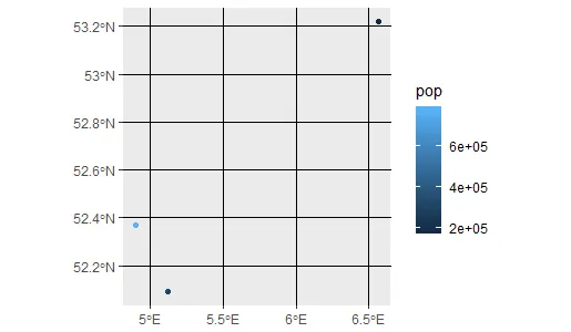
ggplot() +
geom_sf(aes(colour = pop, size=pop), data = cities)
以下是带有糟糕标题的漂亮图例:
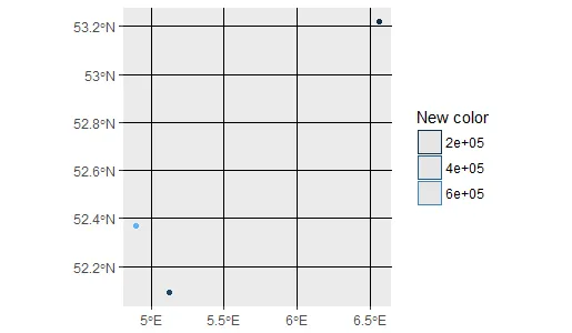
使用 这个, 我修改了我的脚本来改变图例:
ggplot() +
  geom_sf(aes(colour = pop), data = cities) +
  guides(colour=guide_legend(title="New color"))
这将会给出:
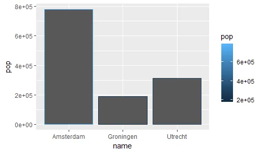
如果您没有 "sf",则使用 "geom_bar" 也会发生相同的情况:
ggplot() +
  geom_bar(aes(x=name, y=pop, colour = pop), stat="identity", data = cities)
给出:
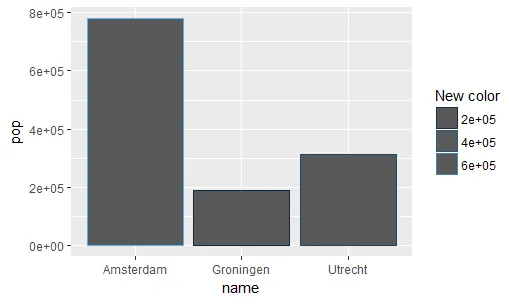
当这个条件为真时:
ggplot() +
  geom_bar(aes(x=name, y=pop, colour = pop), stat="identity", data = cities) +
  guides(colour=guide_legend(title="New color"))
给出:
有没有办法仅更改图例的标题而不是整个内容?
我的sessionInfo:
R version 3.4.3 (2017-11-30)
Platform: x86_64-w64-mingw32/x64 (64-bit)
Running under: Windows Server >= 2012 x64 (build 9200)

Matrix products: default

locale:
[1] LC_COLLATE=English_United States.1252  LC_CTYPE=English_United States.1252    LC_MONETARY=English_United States.1252
[4] LC_NUMERIC=C                           LC_TIME=English_United States.1252

attached base packages:
[1] stats     graphics  grDevices utils     datasets  methods   base

other attached packages:
[1] sp_1.2-6           rgeos_0.3-26       ggplot2_2.2.1.9000 dplyr_0.7.4        sf_0.6-1

loaded via a namespace (and not attached):
 [1] Rcpp_0.12.14           pillar_1.0.1           compiler_3.4.3         git2r_0.19.0           plyr_1.8.4
 [6] bindr_0.1              viridis_0.4.0          class_7.3-14           tools_3.4.3            digest_0.6.13
[11] viridisLite_0.2.0      memoise_1.1.0          tibble_1.4.1           gtable_0.2.0           lattice_0.20-35
[16] pkgconfig_2.0.1        rlang_0.1.6.9002       cli_1.0.0              DBI_0.7                rstudioapi_0.6
[21] rgdal_1.2-16           curl_2.8.1             bindrcpp_0.2           gridExtra_2.3          e1071_1.6-8
[26] withr_2.1.1.9000       httr_1.3.1             knitr_1.18             devtools_1.13.3        classInt_0.1-24
[31] grid_3.4.3             glue_1.1.1             R6_2.2.2               udunits2_0.13          magrittr_1.5
[36] scales_0.5.0.9000      RStudioShortKeys_0.1.0 units_0.5-1            assertthat_0.2.0       colorspace_1.3-2
[41] labeling_0.3           utf8_1.1.3             lazyeval_0.2.1         munsell_0.4.3          crayon_1.3.4
+实验室(颜色="您的标题")- Nateguide_colorbar()иҖҢдёҚжҳҜguide_legend()пјҢжӮЁзҡ„зӯ–з•Ҙе°ҶеҘҸж•ҲгҖӮ - Nate