更改 ggplot2 图例标题

11

我在R中使用ggplot2制作了一张图表。很不幸,我在这里没有足够的声望来上传该图表。现在,我想改变我的图例标题和两条线的标签名称。

因此,我将 scale_fill_continuous(name = "新图例标题", labels=c("控制组", "治疗组")) 添加到代码中。

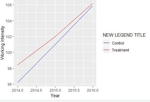
ggplot(data=descripintens, 
aes(x=syear, y=workingintensity, group= treatment, colour=factor(treatment))) + 
geom_line() +
xlab("Year") +
ylab("Working intensity") +
scale_fill_continuous(name = "New Legend Title", labels=c("Control", "Treatment"))

这是stackoverflow和ggplot2速查表中建议的内容。没有任何更改,甚至没有出现错误。

我的代码有什么问题?

谢谢!

编辑:我用于绘图的数据是一个表格,基于这个代码:

descripintens<-intensity141516 %>% 
  group_by(syear, treatment) %>%
  summarise(workingintensity=mean(intensity))

表格descripintens看起来像这样:


Translated text:

表格descripintens看起来像这样:

   syear Treatment workingintensity
1  2014     0         96.2
2  2014     1         98.4
3  2015     0         101.00000
4  2015     1         102.00000
5  2016     0         105.9
6  2016     1         106.2

1
请问您能否分享一份数据样本以使得其他人可以帮助您解决问题(请勿使用 str()head() 或截图)?您可以使用 reprexdatapasta 包来协助您完成这个过程。另外,还可以参考 Help me Help youHow to make a great R reproducible example? - Tung
我编辑了我的问题。这有帮助吗? - MARIUS
2个回答

26

你可以尝试使用这个:

ggplot(data = descripintens
       ,aes(x = syear, y = workingintensity, group = treatment,colour = factor(treatment))) +
  geom_line() +
  xlab("Year") +
  ylab("Working intensity") + 
  labs(color='NEW LEGEND TITLE')  +
  # you should specify the color also
  scale_color_manual(labels = c("Control", "Treatment")
                     ,values = c("blue", "red"))

输入图像描述


使用数据:

descripintens <- read.table(text ="   syear treatment workingintensity
1  2014     0         96.2
2  2014     1         98.4
3  2015     0         101.00000
4  2015     1         102.00000
5  2016     0         105.9
6  2016     1         106.2")

0

对于这个表格:

descripintens <- data.frame(syear =  rep(2014:2016, each = 2),
                            Treatment = rep(c(0,1), 3),
                            workingintensity = c(96.2, 98.4, 101, 102, 105.9, 106.2))

情节:

ggplot(data=data, 
       aes(x=syear, y=working_intensity, 
           group= Treatment, 
           color=factor(Treatment))) + 
  geom_line() + 
  xlab("Year") + 
  ylab("Working intensity") + 
  scale_color_discrete(name = "New Legend Title", 
                        labels=c("Control", "Treatment"))

首先,在你的尝试中,

scale_fill_continuous()

适用于连续变量,该变量映射到填充ggplot2 aesthetics。类型和映射必须与您使用的函数相匹配,在您的情况下应为:

scale_color_discrete()

网页内容由stack overflow 提供, 点击上面的
可以查看英文原文,
原文链接