如果x轴是Pandas的日期时间索引,如何绘制多色线?

11

我正在尝试使用pandas series绘制多颜色线条。我知道matplotlib.collections.LineCollection可以显著提高效率。 但是LineCollection要求线段必须是浮点数。我想使用pandas的datatime索引作为x轴。

points = np.array((np.array[df_index.astype('float'), values]).T.reshape(-1,1,2))
segments = np.concatenate([points[:-1],points[1:]], axis=1)
lc = LineCollection(segments)
fig = plt.figure()
plt.gca().add_collection(lc)
plt.show()

但这张照片无法让我感到满意。有什么解决办法吗?


Translated:

但这张照片无法让我感到满意。有什么解决办法吗?

2个回答

17
要生成一个多色线条,您需要首先将日期转换为数字,因为Matplotlib内部只使用数值。为了进行转换,Matplotlib提供了matplotlib.dates.date2num。这个函数可以理解日期时间对象,所以您需要首先将时间序列转换为日期时间,使用series.index.to_pydatetime(),然后应用date2num
s = pd.Series(y, index=dates)
inxval = mdates.date2num(s.index.to_pydatetime())

然后您可以像往常一样使用数字点,例如将其绘制为多边形或LineCollection[1,2]。
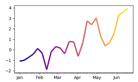
完整示例:

import pandas as pd
import matplotlib.pyplot as plt
import matplotlib.dates as mdates
import numpy as np
from matplotlib.collections import LineCollection

dates = pd.date_range("2017-01-01", "2017-06-20", freq="7D" )
y = np.cumsum(np.random.normal(size=len(dates)))

s = pd.Series(y, index=dates)

fig, ax = plt.subplots()

#convert dates to numbers first
inxval = mdates.date2num(s.index.to_pydatetime())
points = np.array([inxval, s.values]).T.reshape(-1,1,2)
segments = np.concatenate([points[:-1],points[1:]], axis=1)

lc = LineCollection(segments, cmap="plasma", linewidth=3)
# set color to date values
lc.set_array(inxval)
# note that you could also set the colors according to y values
# lc.set_array(s.values)
# add collection to axes
ax.add_collection(lc)


ax.xaxis.set_major_locator(mdates.MonthLocator())
ax.xaxis.set_minor_locator(mdates.DayLocator())
monthFmt = mdates.DateFormatter("%b")
ax.xaxis.set_major_formatter(monthFmt)
ax.autoscale_view()
plt.show()

在此输入图像描述


由于人们似乎难以抽象化这个概念,因此在这里提供了一个不使用pandas和具有独立颜色数组的相同代码片段:

import matplotlib.pyplot as plt
import matplotlib.dates as mdates
import numpy as np; np.random.seed(42)
from matplotlib.collections import LineCollection

dates = np.arange("2017-01-01", "2017-06-20", dtype="datetime64[D]" )
y = np.cumsum(np.random.normal(size=len(dates)))
c = np.cumsum(np.random.normal(size=len(dates)))


fig, ax = plt.subplots()

#convert dates to numbers first
inxval = mdates.date2num(dates)
points = np.array([inxval, y]).T.reshape(-1,1,2)
segments = np.concatenate([points[:-1],points[1:]], axis=1)

lc = LineCollection(segments, cmap="plasma", linewidth=3)
# set color to date values
lc.set_array(c)
ax.add_collection(lc)

ax.xaxis_date()
ax.autoscale_view()
plt.show()

我使用这种方法遇到了另一个问题。因为我正在绘制金融数据,所以日期时间索引不连续,例如2017/6/21 11:30:00紧接着是2017/6/21 13:30:00。但在图中,时间轴是连续的。因此,在图上会出现很多跳跃。有没有好的解决方案?再次感谢您的善良! - J. Zheng
解决什么问题?期望的结果是什么? - ImportanceOfBeingErnest
目前存在多余的时间坐标,例如2017/6/21 11:31:00,这并不包含在原始数据中。我想清除多余的时间坐标,以达到预期结果。 - J. Zheng
我已将其作为一个新问题提出。您可以前往此页面回答它。https://stackoverflow.com/questions/44690454/how-to-remove-redundant-date-time-when-x-axis-is-incontinuous-pandas-datetimeind - J. Zheng
{btsdaf} - Eric
显示剩余2条评论

1

ImportanceOfBeingErnest的回答非常好,为我节省了很多工作时间。我想分享一下如何使用上述答案根据pandas DataFrame的信号改变颜色。

import matplotlib.dates as mdates
# import matplotlib.pyplot as plt
# import numpy as np
# import pandas as pd
from matplotlib.collections import LineCollection
from matplotlib.colors import ListedColormap, BoundaryNorm

制作测试数据框。
equity = pd.DataFrame(index=pd.date_range('20150701', periods=150))
equity['price'] = np.random.uniform(low=15500, high=18500, size=(150,))
equity['signal'] = 0
equity.signal[15:45] = 1
equity.signal[60:90] = -1
equity.signal[105:135] = 1

# Create a colormap for crimson, limegreen and gray and a norm to color
# signal = -1 crimson, signal = 1 limegreen, and signal = 0 lightgray
cmap = ListedColormap(['crimson', 'lightgray', 'limegreen'])
norm = BoundaryNorm([-1.5, -0.5, 0.5, 1.5], cmap.N)

# Convert dates to numbers
inxval = mdates.date2num(equity.index.to_pydatetime())

# Create a set of line segments so that we can color them individually
# This creates the points as a N x 1 x 2 array so that we can stack points
# together easily to get the segments. The segments array for line collection
# needs to be numlines x points per line x 2 (x and y)
points = np.array([inxval, equity.price.values]).T.reshape(-1,1,2)
segments = np.concatenate([points[:-1],points[1:]], axis=1)

# Create the line collection object, setting the colormapping parameters.
# Have to set the actual values used for colormapping separately.
lc = LineCollection(segments, cmap=cmap, norm=norm, linewidth=2)

# Set color using signal values
lc.set_array(equity.signal.values)

fig, ax = plt.subplots()
fig.autofmt_xdate()

# Add collection to axes
ax.add_collection(lc)

plt.xlim(equity.index.min(), equity.index.max())
plt.ylim(equity.price.min(), equity.price.max())
plt.tight_layout()

# plt.savefig('test_mline.png', dpi=150)
plt.show()

网页内容由stack overflow 提供, 点击上面的
可以查看英文原文,
原文链接