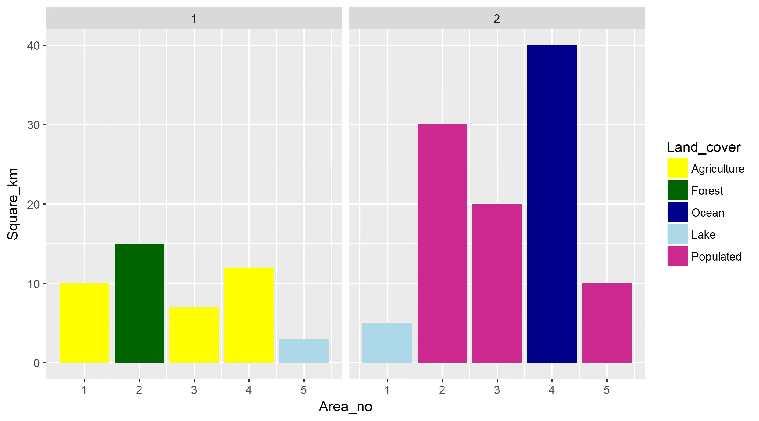
我正在尝试使用ggplot创建多个图形。这些图形是一系列的条形图,一起描述了一条线,如EXAMPLE所示(顺便说一下,是的,我知道颜色调色板很丑,但对我的受众来说,颜色盲友好很重要)。
我的问题是,我需要创建几个这样的图形,并希望所有图形的颜色保持一致。由于“类型”变量在我将要使用的几个数据集中以不同的顺序出现,因此我需要为每种类型手动设置一种颜色。我认为这个问题:How to manually fill colors in a ggplot2 histogram应该有答案,但是当我尝试时,它会将图例中的名称更改为颜色的十六进制定义,但颜色本身会回到ggplot的默认调色板。
这是我目前的代码:
  cbbPalette <- c("#000000", "#E69F00", "#56B4E9", "#009E73", "#F0E442", "#0072B2", "#D55E00", "#CC79A7")

 ggplot()+
    scale_fill_manual(values=cbbPalette)+
    geom_bar(data=subset(eten, Type=="Waste Wood"), aes(x=Tprod, y=acost, fill=cbbPalette[1], width=MGGEY+25), stat="identity")+
    geom_bar(data=subset(eten, Type=="Agricultural Residue"), aes(x=Tprod, y=acost, fill=cbbPalette[2], width=MGGEY+25), stat="identity")+
    geom_bar(data=subset(eten, Type=="Forest Residue"), aes(x=Tprod, y=acost, fill=cbbPalette[3], width=MGGEY+25), stat="identity")+
    geom_bar(data=subset(eten, Type=="Herbaceous Energy Crop"), aes(x=Tprod, y=acost, fill=cbbPalette[4], width=MGGEY+25), stat="identity")+
    geom_bar(data=subset(eten, Type=="MSW"), aes(x=Tprod, y=acost, fill=cbbPalette[5], width=MGGEY+25), stat="identity")+
    scale_y_continuous("Average Cost", labels = dollar, expand=c(0,0))+
    scale_x_continuous("Million Gallons of Gasoline Equivalent", expand=c(0,0))+
    theme(legend.position="bottom", panel.background=element_rect(colour = NA, fill = "white"), axis.line=element_line(), panel.grid.major.y=element_line(colour="black"), panel.grid.minor=element_blank())
我的R语言水平相当低,所以我可能会错过一些简单的东西,但是我自己无法让它运作。提前感谢您的帮助。
更新:我无意中粘贴了一个错误版本的代码,“fill”命令已经恢复到最好的猜测了。一个示例数据集在这里。