在barplot ggplot中为每个组手动设置颜色

4
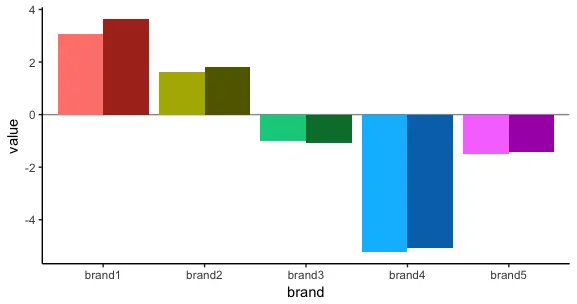
我需要为条形图中的每个组手动设置颜色。目前使用fill=time来确定颜色。我们有5个品牌,每个品牌有2个不同月份的值。我需要按品牌分组,同时需要一种显示哪个棒表示哪个月(时间)的方法。我可以做到这一点,但我希望能够为每个棒组着色。例如:brand1 bars = red,brand2 bars = blue等,同时仍然保持fill = time。 以下是我的代码:
colors <- c("#98999B", "#F4C400", "#CB003D", "#6BABE5", "#E65400", "#542C82")

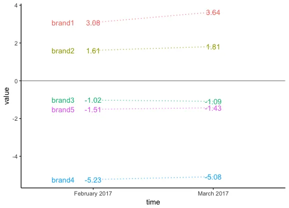
time <- c("February 2017","March 2017","February 2017","March 2017","February 2017","March 2017","February 2017","March 2017","February 2017","March 2017")
value <- as.numeric(c("3.08","3.64","1.61","1.81","-1.02","-1.09","-5.23","-5.08","-1.51","-1.43"))
brand <- c("brand1","brand1","brand2","brand2","brand3","brand3","brand4","brand4","brand5","brand5")

Monthly_BMS_df <- as.data.table(cbind(time,value,brand))

bar <- ggplot(Monthly_BMS_df, aes(brand, value, fill = time)) + 
  geom_bar(stat="identity", position = "dodge") +
 theme(legend.position='none') + scale_fill_manual(values=colors)

ggplotly(bar, width=1000,height=350)
1个回答

8
一种选择是创建一个包含不同色调的HCL颜色调色板,每个品牌都有不同的色调,并且不同品牌在不同月份具有相同的连续亮度。例如:
library(ggplot2)
library(data.table)
library(plotly)

Monthly_BMS_df <- data.table(time, value, brand)

创建颜色调色板:
nb = length(unique(Monthly_BMS_df$brand))
nm = length(unique(Monthly_BMS_df$time))

colors = apply(expand.grid(seq(70,40,length=nm), 100, seq(15,375,length=nb+1)[1:nb]), 1, 
               function(x) hcl(x[3],x[2],x[1]))

在下面的代码中,我们使用fill=interaction(time, brand)来映射每个品牌和月份组合的不同颜色。然后scale_fill_manual分配我们创建的调色板。亮度逐渐减小,所以三月比二月更暗。
bar <- ggplot(Monthly_BMS_df, aes(brand, value, fill=interaction(time, brand))) + 
  geom_hline(yintercept=0, colour="grey60") +
  geom_bar(stat="identity", position = "dodge", show.legend=FALSE) +
  scale_fill_manual(values=colors) +
  theme_classic()

ggplotly(bar, width=1000, height=350) 

enter image description here

作为上述图表的替代方案,线性图可能更容易比较每个品牌的趋势。
library(dplyr)

ggplot(Monthly_BMS_df, aes(time, value, group=brand, colour=brand)) + 
  geom_hline(yintercept=0, colour="grey60") +
  geom_text(data=Monthly_BMS_df %>% filter(time==min(time)),
            aes(label=brand), position=position_nudge(-0.25)) +
  geom_line(linetype="12", alpha=0.5, size=0.7) +
  geom_text(aes(label=value)) +
  guides(colour=FALSE) +
  theme_classic()

enter image description here


答案看起来非常有用。如果能解释一下颜色调色板的创建过程,那就更好了! - tlask

网页内容由stack overflow 提供, 点击上面的
可以查看英文原文,
原文链接