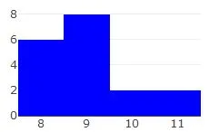
我正在使用R中的plotly包制作直方图,下面是图表。
这是我的代码:
plot_ly(test, x = ~count, type = 'histogram', marker = list(color = 'blue'))
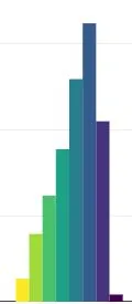
我想知道是否有一种方法可以从颜色角度使图表更加直观(例如,每个柱状图使用不同的颜色),如下所示的图表。
这是我在网上找到的一个例子:
提前致谢。
plot_ly(test, x = ~ count, type = 'histogram',
        marker = list(color = viridis::viridis_pal(option = "C", direction = -1)(4)))
plot_ly(test, x = ~count, color = ~count) %>%
  add_histogram()