迄今为止,我已经根据这里的示例成功地更改了直方图中单个条形的颜色。
test <- rnorm(100);
h <- hist(test);
b <- cut(1, h$breaks);
clr <- rep("grey", length(h$counts));
clr[b] <- "red";
plot(h, col=clr);
我想要能够更改直方图柱状图中在特定x轴值以上的颜色,例如在示例中分布函数中大于1的部分。我遇到麻烦的部分是我不完全理解cut()返回的因素。
基本上,您需要在 test 上使用逻辑选择器,而不是在 cut 上使用。
以下是您的 cut 对象的外观:
> bks <- cut(test,10)
这些等级是字符类型:
levels(bks) 1 "(-2.53,-2.01]" "(-2.01,-1.5]" "(-1.5,-0.978]" "(-0.978,-0.459]" [5] "(-0.459,0.0596]" "(0.0596,0.578]" "(0.578,1.1]" "(1.1,1.62]"
[9] "(1.62,2.13]" "(2.13,2.65]"
此数据为数字类型:
> head(as.numeric(bks))
[1] 5 6 6 6 3 5
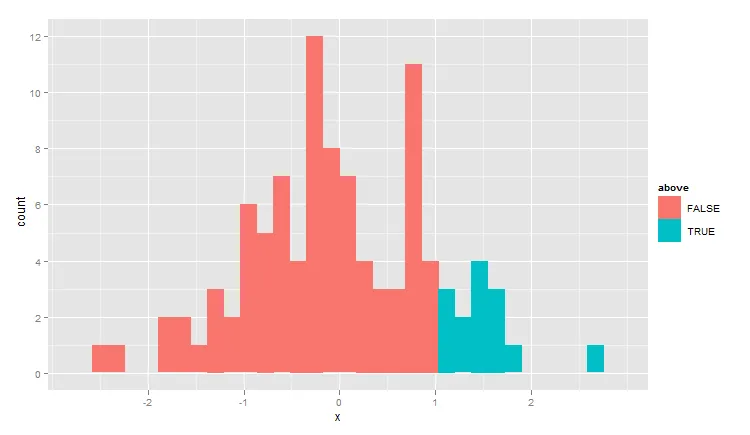
以下是使用ggplot2而不是手动裁剪等操作的解决方案:
test <- rnorm(100)
dat <- data.frame( x=test, above=test>1 )
library(ggplot2)
qplot(x,data=dat,geom="histogram",fill=above)
更改颜色向量clr,使其在柱状图大于1时显示红色,否则显示灰色。
clr <- ifelse(h$breaks < 1, "grey", "red")[-length(h$breaks)]
hist函数很难让图形变得漂亮。 - Richie Cotton?geom_histogram页面上的示例非常详细。但是阅读ggplot2书籍无疑是掌握语法的最佳方式。 - Richie Cotton
hist(test, breaks=c(-3,-2,-1,0,0.5,1,1.5,2,2.5,3)时。 - Assad Ebrahimqplot(x, data = dat, geom = "histogram", fill = test > 1)。 - Alex Trueman