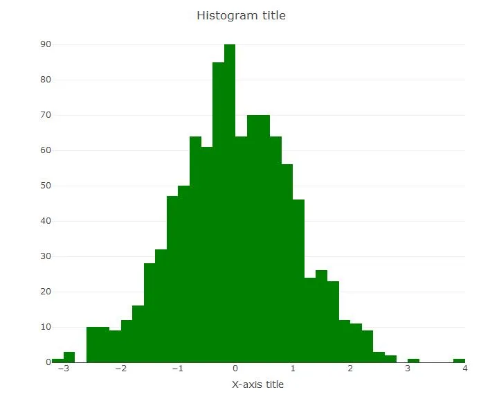
我正在尝试绘制一个带有特定颜色的直方图,因为目的是从两个不同的数据框创建两个直方图,并且我不想用默认的蓝色呈现它们两个。我知道解决方案将涉及将ggplo2对象转换为plotly,但我想找到一种在plotly代码中解决这个小问题的方法。
基本的plotly直方图代码如下:
我尝试过的两种解决方案都不起作用:
1)第一次尝试:
它返回以下警告消息:
第二次尝试:
它返回以下警告信息:
任何建议?
    plot_ly(x=~dataframe$variable, type="histogram") %>%
    layout(title="Histogram title", xaxis=list(title="X-axis title"))
我尝试过的两种解决方案都不起作用:
1)第一次尝试:
    plot_ly(x=~dataframe$variable, type="histogram", color="green") %>%
    layout(title="Histogram title", xaxis=list(title="X-axis title"))
它返回以下警告消息:
    In RColorBrewer::brewer.pal(N, "Set2") :
    minimal value for n is 3, returning requested palette with 3 different levels
第二次尝试:
    plot_ly(x=~dataframe$variable, type="histogram", colour="green") %>%
    layout(title="Histogram title", xaxis=list(title="X-axis title"))
它返回以下警告信息:
    'histogram' objects don't have these attributes: 'colour'
    Valid attributes include:
    'type', 'visible', 'showlegend', 'legendgroup', 'opacity', 'name', 'uid', 'ids', 'customdata', 'hoverinfo', 'hoverlabel', 'stream', 'x', 'y', 'text', 'orientation', 'histfunc', 'histnorm', 'cumulative', 'autobinx', 'nbinsx', 'xbins', 'autobiny', 'nbinsy', 'ybins', 'marker', 'error_y', 'error_x', '_deprecated', 'xaxis', 'yaxis', 'xcalendar', 'ycalendar', 'idssrc', 'customdatasrc', 'hoverinfosrc', 'xsrc', 'ysrc', 'textsrc', 'key', 'set', 'frame', 'transforms', '_isNestedKey', '_isSimpleKey', '_isGraticule'
任何建议?