我想用ggplot2中的线条/条形图来展示两点之间的差异。
假设我们有一些收入和支出的时间序列数据。我们不仅想要可视化它们,还想展示收支平衡(=收入-支出)。此外,我们还想指示平衡是正的(=顺差)还是负的(=逆差)。
我尝试了几种方法,但都没有产生令人满意的结果。下面是一个可再现的示例。
# Load libraries and create LONG data example data.frame
library(dplyr)
library(ggplot2)
library(tidyr)

df <- data.frame(year  = rep(2000:2009, times=3),
                 var   = rep(c("income","spending","balance"), each=10),
                 value = c(0:9, 9:0, rep(c("deficit","surplus"), each=5)))
df
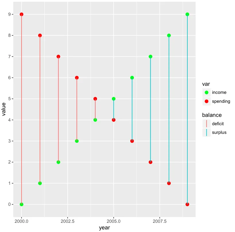
1. 使用LONG数据的方法
毫不意外,它无法处理LONG数据,因为geom_linerange参数ymin和ymax无法正确指定。使用ymin=value, ymax=value肯定是错误的方式(期望的行为)。使用ymin=income, ymax=spending也显然是错误的(期望的行为)。
df %>%
ggplot() +
  geom_point(aes(x=year, y=value, colour=var)) +
  geom_linerange(aes(x=year, ymin=value, ymax=value, colour=net))

#>Error in function_list[[i]](value) : could not find function "spread"
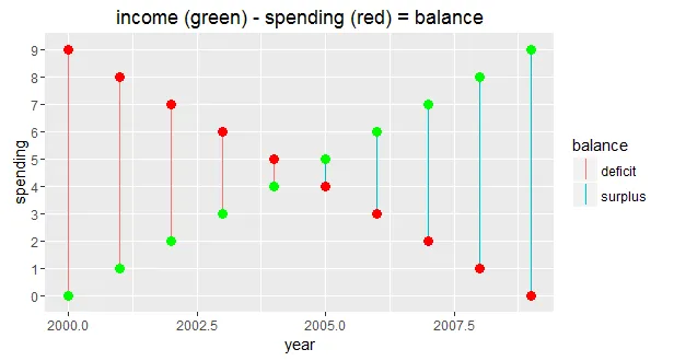
2.使用WIDE数据的方法
我几乎用WIDE数据解决了它。图看起来很好,但是geom_point(s)的图例缺失(预期行为)。仅仅在两个geom_point(s)中添加show.legend = TRUE不能解决问题,因为这会覆盖geom_linerange的图例。此外,我更希望将geom_point的代码行合并为一个(见1.Approach)。
df %>%
  spread(var, value) %>%
ggplot() +
  geom_linerange(aes(x=year, ymin=spending, ymax=income, colour=balance)) +
  geom_point(aes(x=year, y=spending), colour="red", size=3) +
  geom_point(aes(x=year, y=income), colour="green", size=3) +
  ggtitle("income (green) - spending (red) = balance")
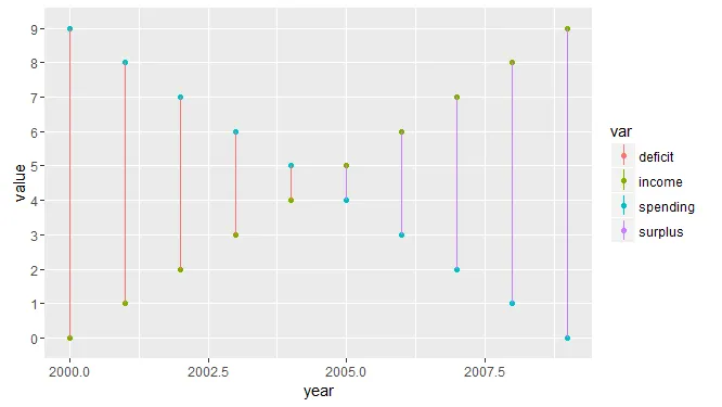
3.使用长宽数据的方法
将1.方法与2.方法结合起来,得到另一个不令人满意的图表。图例不能区分平衡和var(预期行为)。
ggplot() +
  geom_point(data=(df %>% filter(var=="income" | var=="spending")),
             aes(x=year, y=value, colour=var)) +
  geom_linerange(data=(df %>% spread(var, value)),
                 aes(x=year, ymin=spending, ymax=income, colour=balance))
- 有没有(优雅的)解决方案?
- 我应该使用其他的
geom而不是geom_linerange吗? - 我的数据格式是否正确?