如何使用`ggplot2`可视化成对比较?

8

问题

有没有一种简单的解决方案可以在使用ggplot构建的箱线图上直观地显示成对比较及其p值(或仅为.******)?

最好有一个内置函数(或类似便利工具)。


下面是一个可以操作的示例...

虚拟数据

require(ggplot2)
set.seed(11)
n=15
mu=1.2
d = data.frame(y=c(rnorm(n), rnorm(n), rnorm(n,mu), rnorm(n,mu)),x=rep(LETTERS[1:4],each=n))
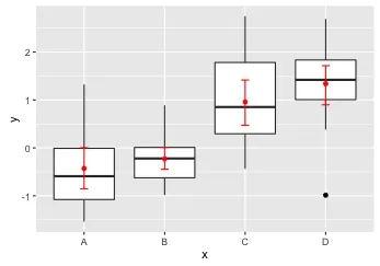
图形

ggplot(d, aes(y=y, x=x)) + geom_boxplot()

在此输入图片描述

统计分析


(注:本段内容为标题,无需翻译)
m = aov(data=d, y~x)
anova(m)

# Analysis of Variance Table

# Response: y
#           Df Sum Sq Mean Sq F value    Pr(>F)    
# x          3 34.074  11.358  16.558 8.021e-08 ***
# Residuals 56 38.414   0.686   
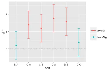


TukeyHSD(m)$x
         diff        lwr       upr        p adj
B-A 0.1989620 -0.6018277 0.9997517 9.123300e-01
C-A 1.3858613  0.5850716 2.1866510 1.504711e-04
D-A 1.7658291  0.9650394 2.5666188 1.639309e-06
C-B 1.1868993  0.3861096 1.9876890 1.337608e-03
D-B 1.5668671  0.7660774 2.3676568 1.824795e-05
D-C 0.3799678 -0.4208219 1.1807575 5.941266e-01
1个回答

13

以下是几个选项:

# Add means and bootstrap confidence intervals to the boxplots
ggplot(d, aes(y=y, x=x)) + 
  geom_boxplot() +
  stat_summary(fun.data=mean_cl_boot, geom="errorbar", colour="red", width=0.1) +
  stat_summary(fun.y=mean, geom="point", colour="red")

enter image description here

# Anova
m = aov(data=d, y~x)
anova(m)

tky = as.data.frame(TukeyHSD(m)$x)
tky$pair = rownames(tky)

# Plot pairwise TukeyHSD comparisons and color by significance level
ggplot(tky, aes(colour=cut(`p adj`, c(0, 0.01, 0.05, 1), 
                           label=c("p<0.01","p<0.05","Non-Sig")))) +
  geom_hline(yintercept=0, lty="11", colour="grey30") +
  geom_errorbar(aes(pair, ymin=lwr, ymax=upr), width=0.2) +
  geom_point(aes(pair, diff)) +
  labs(colour="")

enter image description here


"mean_cl_boot" 在平衡设计中似乎不能提供与 "TukeyHSD()" 相同的ymin、ymax,并且在不平衡设计中似乎也不能提供相同的平均值。 - Brian D

网页内容由stack overflow 提供, 点击上面的
可以查看英文原文,
原文链接