我想使用R的gglot2包中的条形图来可视化时间序列相对于其基线值的偏移。例如,考虑以下合成数据:
baseline = 400
steps <- sample(0:10,50,replace=TRUE) - sample(0:10,50,replace=TRUE)
value <- cumsum(steps) + baseline
time = 1:50
data <- data.frame(time,value)
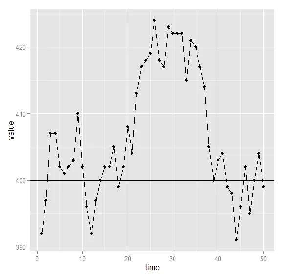
print(value)
[1] 400 400 397 397 393 400 394 395 389 389 385 395 400 399 405 403 399 401 399 401
[21] 401 401 398 397 395 395 401 402 393 400 399 398 406 412 417 413 410 401 400 399
[41] 394 401 406 406 401 404 411 413 404 402
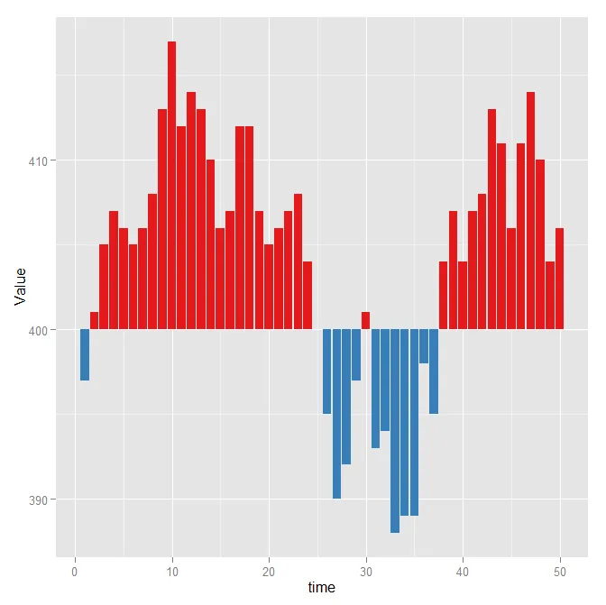
我可以按照原始比例绘制图表,但这并不真正具有信息价值。
longdata <- ddply( data, "value", transform, posneg=sign(value-baseline) )
longdata[longdata$posneg == 0,'posneg'] <- 1
p_aes <- aes( time, value, fill=factor(posneg))
p_scale <- scale_fill_brewer( palette='Set1', guide=FALSE )
p_geom <- geom_bar( stat='identity', position='identity' )
ggplot(longdata) + p_aes + p_scale + p_geom
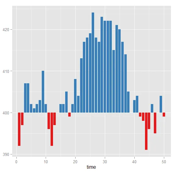
通过沿着y轴(即y = value - baseline)调整美学,我得到了想要展示的图表,这非常好且易于理解。
longdata <- ddply( data, "value", transform, posneg=sign(value-baseline) )
longdata[longdata$posneg == 0,'posneg'] <- 1
p_aes <- aes( time, value-baseline, fill=factor(posneg))
p_scale <- scale_fill_brewer( palette='Set1', guide=FALSE )
p_geom <- geom_bar( stat='identity', position='identity' )
ggplot(longdata) + p_aes + p_scale + p_geom
很不幸,y轴的比例现在已经改变为相对于基线的偏移量,即“值-基线”。但我希望y轴保留原始值(在380到420之间的值)。
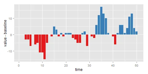
有没有办法在第二个图表中保留原始的y轴比例?您有没有其他关于可视化与目标值差异的建议?