R - ggplot2 - 获取两组数据之间差异的直方图

4
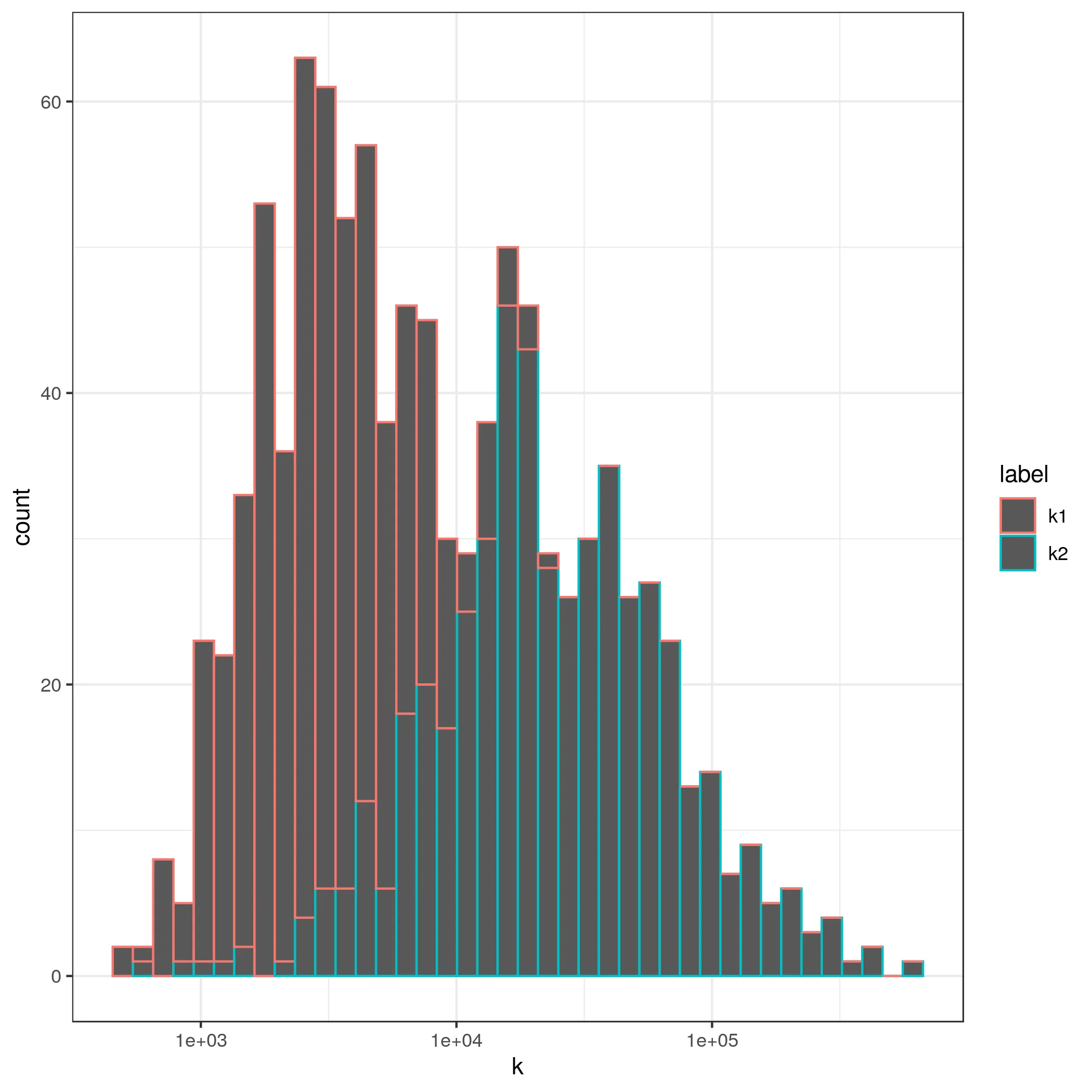
假设我有一个包含两个重叠组的直方图。这是ggplot2的一个可能命令和假想输出图形。
ggplot2(data, aes(x=Variable1, fill=BinaryVariable)) + geom_histogram(position="identity")

重叠的直方图

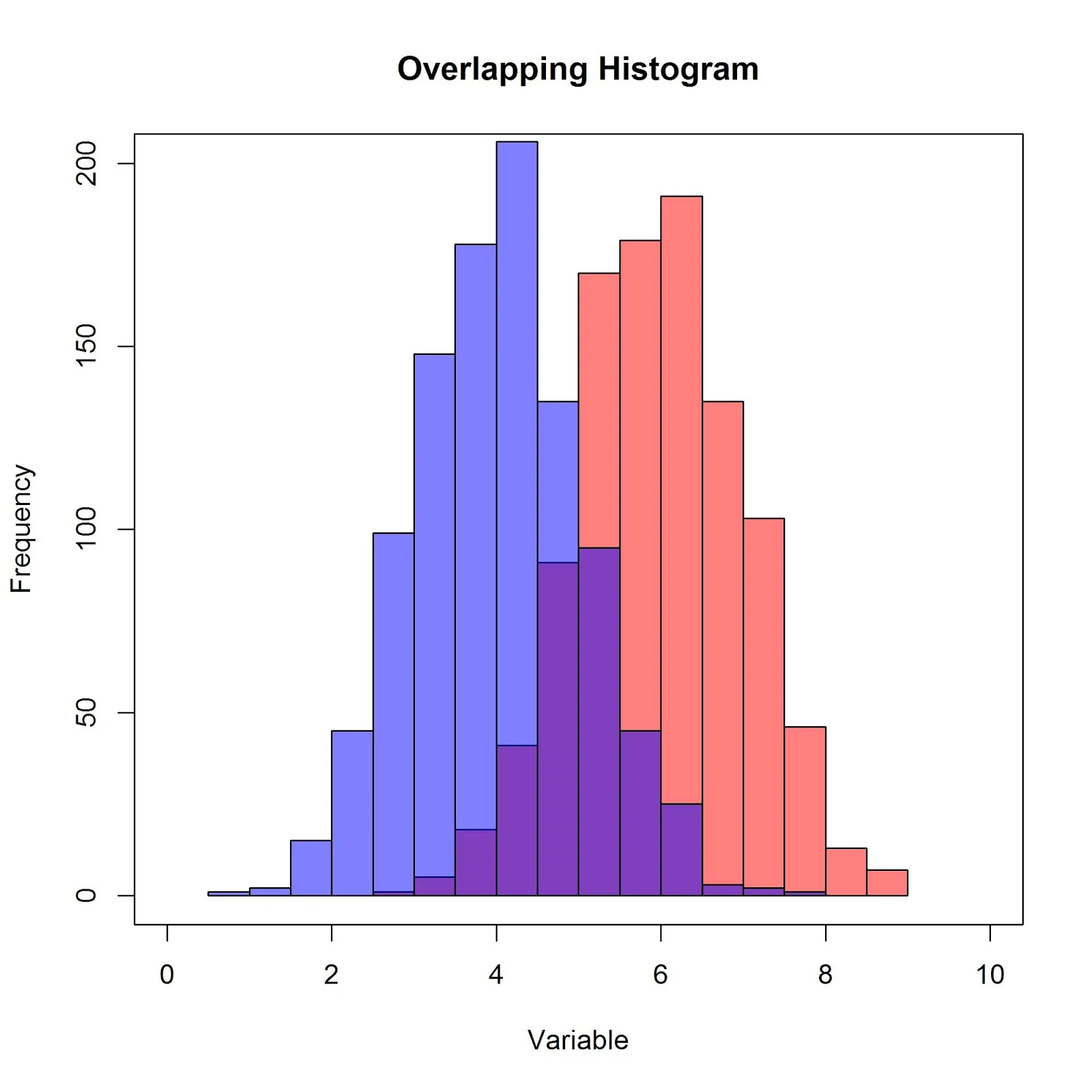
我有每个事件的频率或计数。 我想做的是在每个区间内获取两个事件之间的差异。 这可行吗?如何实现?

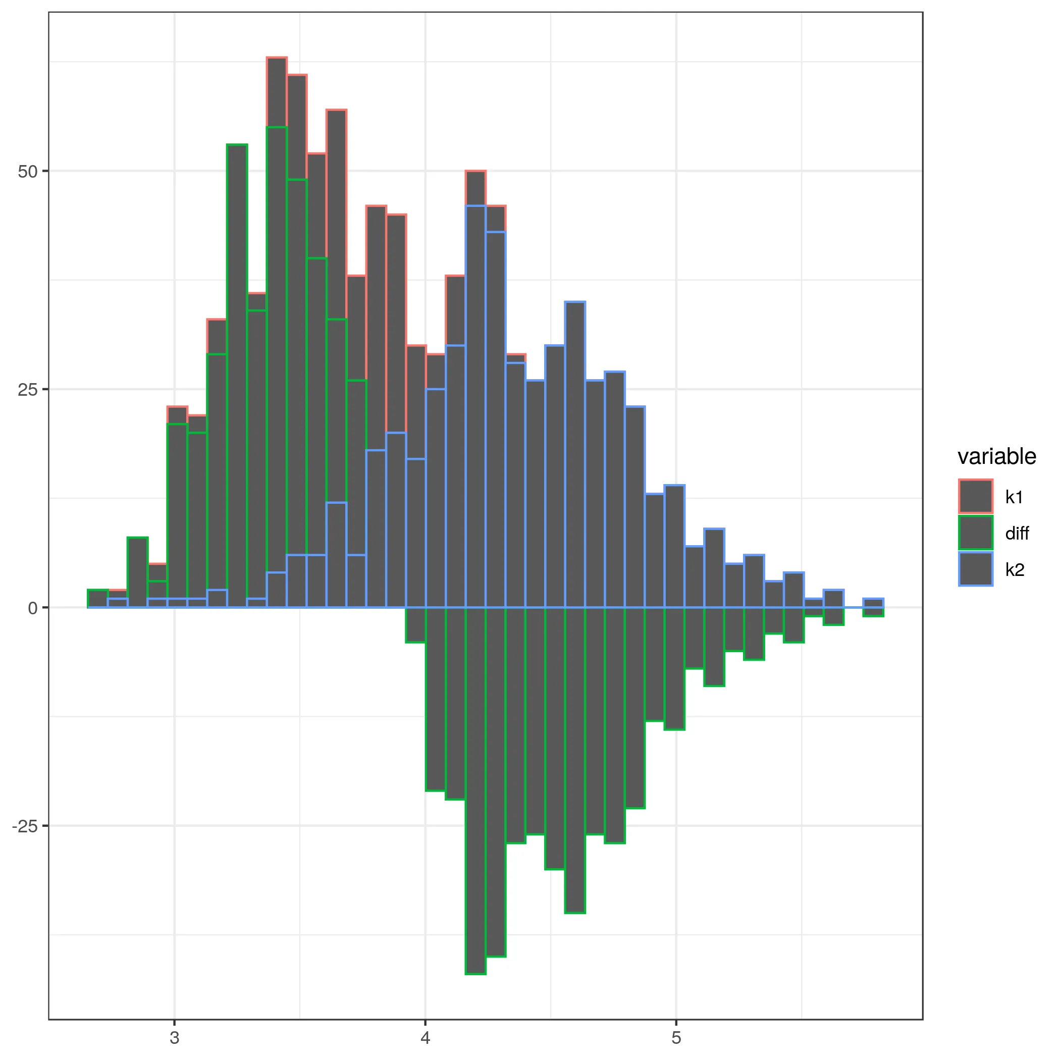
例如,如果我们将 RED 减去 BLUE:

  • x=2 的值约为 -10
  • x=4 的值约为 40-200=-160
  • x=6 的值约为 190-25=155
  • x=8 的值约为 10

我更喜欢使用 ggplot2,但其他方法也可以。 我的数据框设置为类似于这个玩具示例(实际维度为 25000 行 x 30 列)编辑:这里有一个可用的示例数据 GIST 示例

ID   Variable1   BinaryVariable
1     50            T          
2     55            T
3     51            N
..    ..            ..
1000  1001          T
1001  1944          T
1002  1042          N

从我的例子可以看出,我对绘制直方图来单独表示每个二元变量(T或N)的Variable1(一个连续变量)很感兴趣。但是我真正想要的是它们频率之间的差异。

2个回答

3

因此,为了实现这一点,我们需要确保直方图所使用的“箱子”对于指示变量的两个级别都是相同的。以下是一个有些天真的解决方案(在基本的R中):

df = data.frame(y = c(rnorm(50), rnorm(50, mean = 1)),
                x = rep(c(0,1), each = 50))
#full hist
fullhist = hist(df$y, breaks = 20) #specify more breaks than probably necessary
#create histograms for 0 & 1 using breaks from full histogram
zerohist = with(subset(df, x == 0), hist(y, breaks = fullhist$breaks))
oneshist = with(subset(df, x == 1), hist(y, breaks = fullhist$breaks))
#combine the hists
combhist = fullhist
combhist$counts = zerohist$counts - oneshist$counts
plot(combhist)

因此,我们根据完整数据的直方图中的值指定要使用多少个间隔,然后计算每个间隔处计数的差异。 提示:检查hist()的非图形化输出可能会有所帮助。

0
这里提供了一个使用ggplot的解决方案,正如所需。 关键思路是使用ggplot_build获取由stat_histogram计算的矩形。从中可以计算出每个bin中的差异,然后使用geom_rect创建一个新的图表。

设置并创建一个带有对数正态数据的模拟数据集

library(ggplot2)
library(data.table)
theme_set(theme_bw())
n1<-500
n2<-500
k1 <- exp(rnorm(n1,8,0.7))
k2 <- exp(rnorm(n2,10,1))
df <- data.table(k=c(k1,k2),label=c(rep('k1',n1),rep('k2',n2)))

创建第一个图表

p <- ggplot(df, aes(x=k,group=label,color=label)) + geom_histogram(bins=40) + scale_x_log10()

Histogram without showing differences

使用ggplot_build获取矩形

p_data <- as.data.table(ggplot_build(p)$data[1])[,.(count,xmin,xmax,group)]
p1_data <- p_data[group==1]
p2_data <- p_data[group==2]

通过x坐标连接来计算差异。请注意,y值不是计数,而是第一个图的y坐标。

newplot_data <- merge(p1_data, p2_data, by=c('xmin','xmax'), suffixes = c('.p1','.p2'))
newplot_data <- newplot_data[,diff:=count.p1 - count.p2]
setnames(newplot_data, old=c('y.p1','y.p2'), new=c('k1','k2'))

df2 <- melt(newplot_data,id.vars =c('xmin','xmax'),measure.vars=c('k1','diff','k2'))

绘制最终图表

ggplot(df2, aes(xmin=xmin,xmax=xmax,ymax=value,ymin=0,group=variable,color=variable)) + geom_rect()

Final histogram with bars showing the difference between two distributions.

当然,比例尺和图例仍需要修正,但那是另一个话题。


网页内容由stack overflow 提供, 点击上面的
可以查看英文原文,
原文链接