如何使用ggplot更改箱线图的轮廓颜色?

4

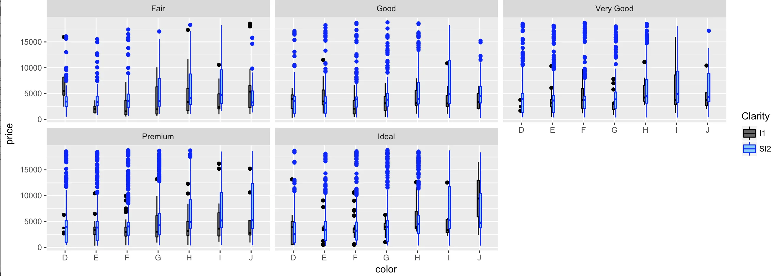
我的数据中所有数值都相同,因此它们在箱线图中只呈现为一条线。然而,这意味着我无法区分不同组别,因为填充颜色不会显示出来。如何更改箱线图轮廓的特定颜色。

注意:我不希望所有轮廓颜色都是相同的颜色,就像代码的下一行所示:

library(dplyr)
library(ggplot2)

diamonds %>% 
      filter(clarity %in% c("I1","SI2")) %>% 
    ggplot(aes(x= color, y= price, fill = clarity))+
      geom_boxplot(colour = "blue")+
      scale_fill_manual(name= "Clarity", values = c("grey40", "lightskyblue"))+
      facet_wrap(~cut)

相反,我希望所有用灰色(grey40)填充的I1绘图都以黑色轮廓呈现,而用lightskyblue填充的SI2绘图则以蓝色轮廓呈现。

以下方法似乎无效:

geom_boxplot(colour = c("black","blue"))+

或者

scale_color_identity(c("black", "blue"))+

或者

scale_color_manual(values = c("black", "blue"))+

3
{btsdaf} - Andrey Kolyadin
2
{btsdaf} - lukeA
Perfect, thank you. - mckisa
1个回答

4

您需要:

  1. 在美学上添加color = clarity
  2. 使用所需的颜色将scale_color_manual添加到ggplot对象中
  3. 命名scale_color_manualscale_fill_manual相同,以获得单个组合图例

代码:

library(dplyr)
library(ggplot2)
diamonds %>% 
    filter(clarity %in% c("I1","SI2")) %>% 
    ggplot(aes(x= color, y= price, fill = clarity, color = clarity))+
        geom_boxplot()+
        scale_fill_manual(name= "Clarity", values = c("grey40", "lightskyblue"))+
        scale_color_manual(name = "Clarity", values = c("black", "blue"))+
        facet_wrap( ~ cut)

情节:

在这里输入图片描述


注:本文涉及IT技术,旨在将内容翻译成通俗易懂的语言。

1
{btsdaf} - mckisa

网页内容由stack overflow 提供, 点击上面的
可以查看英文原文,
原文链接