如何使用gganimate制作堆叠条形图?

3

我正在尝试在四个堆叠的柱状图之间进行过渡。输出结果不完全符合我的预期,我还没有找到是代码错误还是gganimate R包中的错误。

以下是我使用的数据框:

df <- structure(list(name = c("variable", "variable", "variable", "variable",    
    "variable", "variable", "variable", "variable", "variable", "variable", 
    "variable", "variable", "variable"), groups = structure(c(3L, 
    3L, 3L, 3L, 2L, 2L, 2L, 1L, 1L, 1L, 4L, 4L, 4L), .Label = c("group 1", 
    "group 2", "group 3", "group 4"), class = "factor"), score = structure(c(4L, 
    3L, 2L, 1L, 3L, 2L, 1L, 3L, 2L, 1L, 3L, 2L, 1L), .Label = c("4", 
    "3", "2", "1"), class = c("ordered", "factor")), percentage = c(8, 
    38, 38, 16, 17.1428571428571, 40, 42.8571428571429, 40, 20, 40, 
    5, 65, 30), percentage2 = c("8%", "38%", "38%", "16%", "17.1%", 
    "40%", "42.9%", "40%", "20%", "40%", "5%", "65%", "30%"), label = c(0.04, 
    0.27, 0.65, 0.92, 0.0857142857142857, 0.371428571428571, 0.785714285714286, 
    0.2, 0.5, 0.8, 0.025, 0.375, 0.85)), row.names = c(NA, -13L), class = "data.frame")

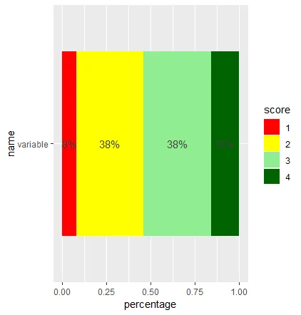
当我制作只包含群组变量一个阶段的堆积条形图时,我会得到如下结果:

library(ggplot2)
library(dplyr)

ggplot(filter(df, groups == "group 3"),
       aes(x = name, y = percentage, fill = score)) +
    geom_bar(stat = "identity", position = "fill", width = 0.8) +
    geom_text(aes(y = label, label = percentage2), color = "grey25") +
    coord_flip() +
    scale_fill_manual(values=c("darkgreen", "lightgreen", "yellow", "red"), 
                      guide = guide_legend(reverse = TRUE), drop=FALSE) 

enter image description here

但是当我尝试添加gganimate动画来展示四个不同的组阶段时,出现了这种情况:

library(gganimate)

ggplot(df, aes(x = name, y = percentage, fill = score)) +
    geom_bar(stat = "identity", position = "fill", width = 0.8) + 
    geom_text(aes(y = label, label = percentage2), color = "grey25") +
    coord_flip() +
    scale_fill_manual(values = c("darkgreen", "lightgreen", "yellow", "red"), 
                      guide= guide_legend(reverse = TRUE), drop = FALSE) + 
    transition_states(groups, transition_length = 2, state_length =  1)

在此输入图片描述

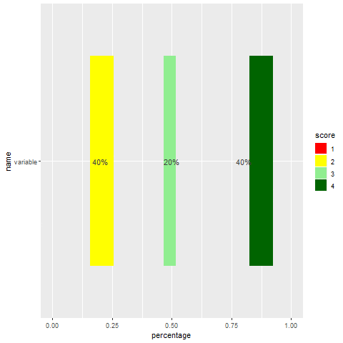
似乎将所有组的百分比(条形长度)同时添加到动画中。我想要四个不同组的堆叠条形图之间的过渡,没有空隙。如何使这个动画在条形之间做出无缝的过渡?


1
我认为很明显这不是我想要的。你想要什么?什么是“正确的方式”? - Roman
@Roman 我稍微修改了一下文本,希望现在更清晰了。 - rdatasculptor
1
@Roman,感谢您的编辑! - rdatasculptor
不用谢,我现在正在撰写一篇长篇回复 :-) - Roman
1
@Roman 我很期待!thomasp85说这是一个bug:https://twitter.com/thomasp85/status/1052142237667270658?s=09 - rdatasculptor
您的数据可能需要改进:添加百分比观测值为
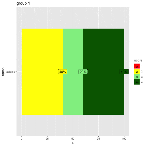
0的行,以使动画更加流畅(请参见“得分1”)。 - Roman
1个回答

2

1

肯定是可以做到的,但在当前版本的gganimate中,您需要编辑您的数据框。

代码

g <- ggplot(df, aes(x = name, y = c, fill = score, group = score)) +
    geom_col(position = "identity", width = 0.8) +
    coord_flip() +
    labs(title = "{closest_state}") +
    geom_label(aes(y = c, label = percentage2)) +
    scale_fill_manual(values = c("darkgreen", "lightgreen", "yellow", "red"), 
                      guide= guide_legend(reverse = TRUE), drop = FALSE) +
    transition_states(groups, transition_length = 2, state_length = 1)
animate(g, nframes = 100)

数据

df$c <- ave(df$percentage, df$group, FUN=cumsum)
df <- df[order(df$groups, df$score, df$c), ]

df
       name  groups score percentage percentage2      label         c
10 variable group 1     4   40.00000         40% 0.80000000 100.00000
9  variable group 1     3   20.00000         20% 0.50000000  60.00000
8  variable group 1     2   40.00000         40% 0.20000000  40.00000
7  variable group 2     4   42.85714       42.9% 0.78571429 100.00000
6  variable group 2     3   40.00000         40% 0.37142857  57.14286
5  variable group 2     2   17.14286       17.1% 0.08571429  17.14286
4  variable group 3     4   16.00000         16% 0.92000000 100.00000
3  variable group 3     3   38.00000         38% 0.65000000  84.00000
2  variable group 3     2   38.00000         38% 0.27000000  46.00000
1  variable group 3     1    8.00000          8% 0.04000000   8.00000
13 variable group 4     4   30.00000         30% 0.85000000 100.00000
12 variable group 4     3   65.00000         65% 0.37500000  70.00000
11 variable group 4     2    5.00000          5% 0.02500000   5.00000

========================

解释

为什么?在gganimate版本"0.9.9.9999"中,动画图将无法正确分组和堆叠(正如您正确指出的那样,这是一个错误)。这就是为什么您需要:

  1. 对条形图的位置(变量c)进行特征工程
  2. c的降序大小排序条形图(以使更大的图形不会覆盖较小的图形)

非常有帮助的是,将代码简化为必要的部分:

g <- ggplot(df, aes(x = "", y = c, fill = score, group = score)) +
    geom_col(position = "identity") +
    labs(title = "{closest_state}") +
    transition_states(groups, transition_length = 2, state_length = 1)
    animate(g, nframes = 10)

这比原代码要容易处理得多。在那里,很明显问题出在 y =(例如,c,百分比),group =(例如,分数,组)和 position =(例如,堆叠,闪避,闪避2,身份,填充)的相互作用上。

如果您有任何问题,请随时向我发送消息。


网页内容由stack overflow 提供, 点击上面的
可以查看英文原文,
原文链接